Find Your Next Goodreads

Giving Goodreads a fresh chapter:
a modern, personalized experience for today’s readers
I started this project thinking I’d focus on spoilers and notetaking. But after talking with six users, I uncovered a bigger issue: no one was using Goodreads to actually find their next book. Instead, people described the platform as outdated, impersonal, and clunky compared to newer competitors like Fable. That insight shifted my approach entirely. Rather than polishing small features, I set out to rethink Goodreads with a fresher, more personalized experience designed to keep readers engaged.


Background
Project Type:
Mobile application
Role:
Product Design, UX/UI Design, Research, User Flows, Prototyping, Testing
Timeline:
3 weeks
Figma, FigJam, Figma Slides, Google Docs, Google Sheets, Google Slides, Zoom, Calendly
Tools:
The Problem:

The core issue wasn’t just outdated visuals—it was a lack of personalization. For users, this meant the platform often felt impersonal and unhelpful, leaving them disconnected from recommendations and less motivated to explore beyond basic book tracking. With many competitors offering the same features plus more engaging experiences, Goodreads risked losing its loyal base and its role as a go-to resource for readers. Without evolving into a more tailored, user-centered platform, both readers and the company would continue missing opportunities for deeper connection.

Before vs. After

Research
Competitive Analysis
Competitors in the book-tracking space share many of the same core features, but their communities feel very different. While Goodreads relies on large-scale reviews, newer apps like StoryGraph and Glose focus on smaller, progress-based conversations, and Fable leans into curated book clubs and cross-media content.
Users described Goodreads as dated compared to these modern, mobile-first platforms, signaling that the biggest opportunity lies in rethinking personalization and creating a fresher, more engaging experience to keep readers invested.
User Interviews
I interviewed six potential users over Zoom.

I focused the interviews around understanding social interactions and online behaviors, imagining I would be focusing the project on spoiler avoidance and book discussion.
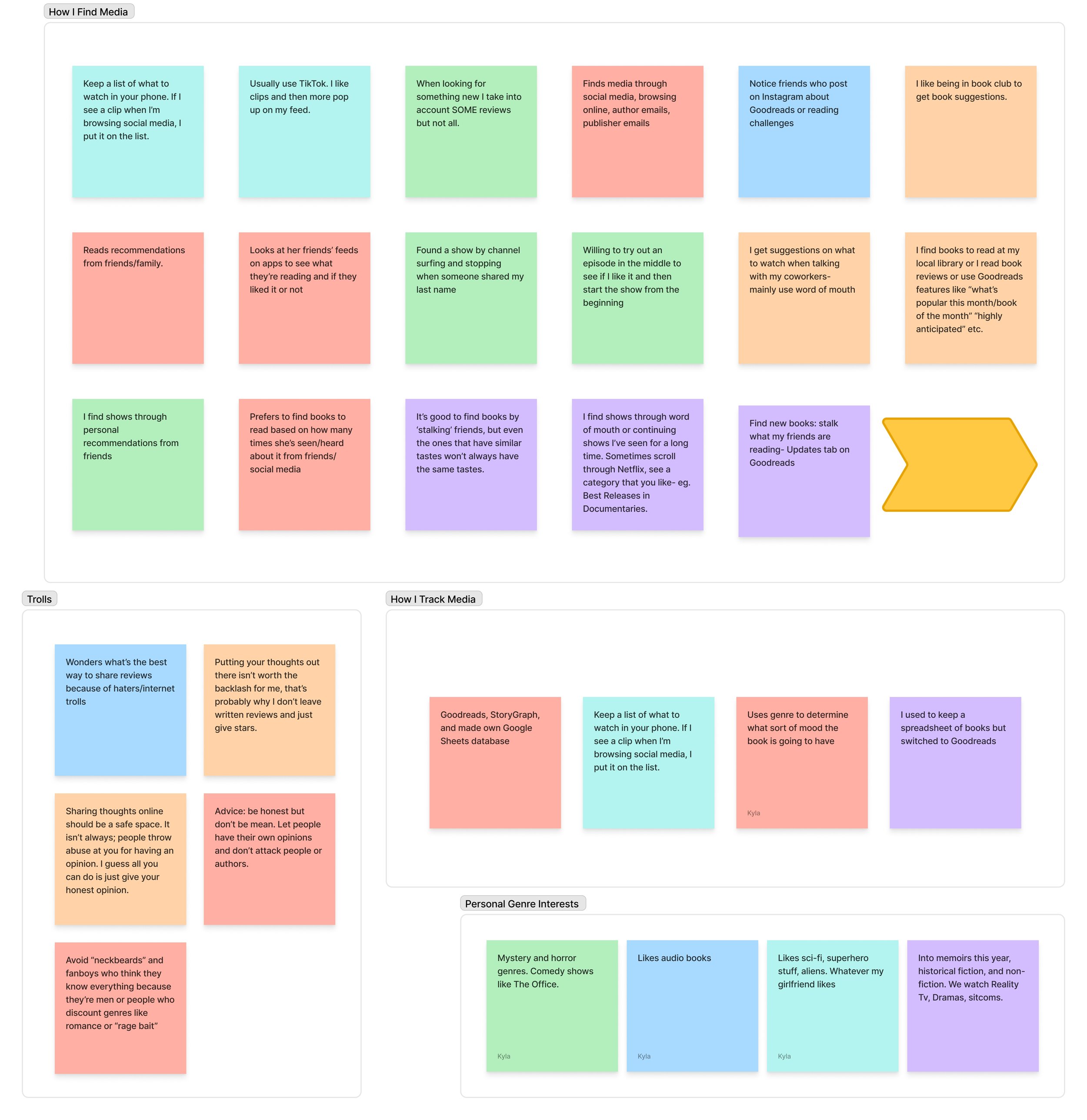
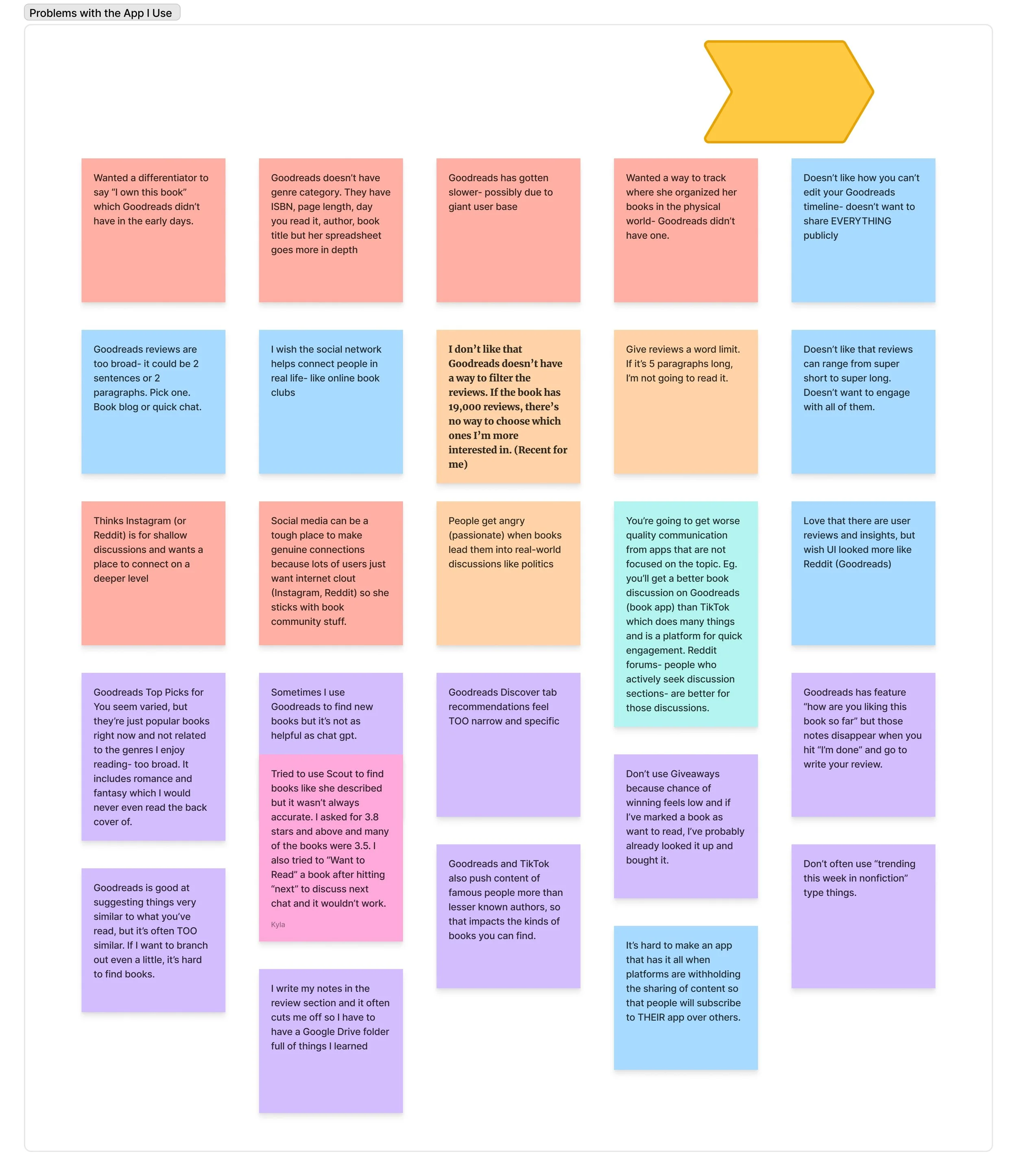
Then I sorted all of the information they gave me into this affinity map. Below are the key groupings:
Key Affinity Map Groupings
-
![]()
How I Find Media
-
![]()
Problems with the App I Use
-
![]()
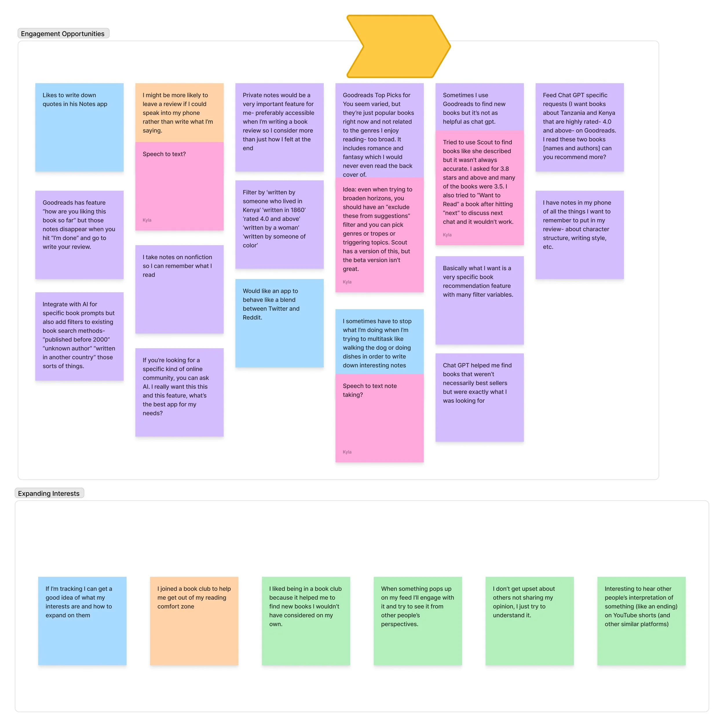
Engagement Opportunities
Key Research Findings
No one uses Goodreads to find new books
Given Goodreads’ positioning as a reading and discovery platform, I was surprised to learn that none of the users I interviewed relied on it to find new books. They described recommendations as either too narrow—suggesting near-duplicates of what they had just read—or too broad, with promoted titles that felt impersonal and irrelevant.
Users were relying on word of mouth or turning to chatGPT to find their next good read.
Users are dissatisfied with the current reviews system.
Readers were frustrated by the lack of filtering options in Goodreads’ review system, especially for popular books with thousands of reviews. It was difficult to surface the types of reviews they were looking for. In addition, the system lacked consistency—some users treated reviews as personal notes, writing extremely long entries, while others wished for shorter, more concise takes and even suggested a word limit.
Users felt there should be space for both- a place for quick comments about a book, and a place for longer, more engaged discussions.
I created two personas using the information I gleaned from user interviews to ensure that I would continue to empathize with and design for my users throughout the design process.
Personas:
-

Avery Adams
THE ANALYTICAL ANNOTATOR
Avery is an optimistic 24-year-old accountant who loves diving deep into books, taking thoughtful notes, and sharing insights with friends. She enjoys writing reviews to reflect on her reading experiences, but her fear of spoilers often limits online engagement—and she sometimes finds it hard to discover her next great read.
PAIN POINTS
–Avery can’t find relevant book reviews (because there is no review sorting)
–She can’t look at notes in the app/ see prompts for leaving reviews
–The app’s book suggestion features are either too specific or too general for her.
-

Rick Reynolds
THE RELAXED READER
Rick is an adventurous 35-year-old engineer who enjoys reading and audiobooks. Viewing reading as a journey, he doesn’t mind spoilers and sometimes even seeks them out. He finds his next read through social media and loves sharing cool quotes with friends, but doesn’t want to feel obligated to read lengthy reviews just to join the conversation.
PAIN POINTS
-Rick prefers to avoid long reviews to stay engaged
–He wants control over what appears on his public timeline
–He wants to engage in meaningful, two-way conversations where people respond

Define User Problems
-

When Recommendations Miss the Mark
Users consistently described Goodreads as impersonal. Recommendations felt generic—either repetitive echoes of books they’d already read or broad promotions that didn’t match their interests. Beyond tracking progress, the platform didn’t adapt to individual reading habits or preferences, leaving readers to do the heavy lifting of discovery themselves.
-

Design That Hasn't Evolved with Readers
In addition to weak personalization, users felt the platform’s interface hadn’t kept up with modern standards. They compared Goodreads to newer, mobile-first apps that offered cleaner visuals, more intuitive navigation, and features that felt designed for today’s readers. Goodreads’ dated look and clunky experience made the platform feel stagnant rather than dynamic and engaging.
Prioritize
I then prioritized my list of product features based on what would alleviate the most user pain, taking into account the amount of effort it would likely take to design these things, and came up with 3 “Must Have” Features for my product.
Account Personalization
With optional account personalization, Avery is connected to fellow readers who share her interests, giving her a dedicated space to dive deep into plot theories without relying on reviews as an outlet. As a result, her public reviews become more concise and focused. This, in turn, helps readers like Rick quickly scan reviews and make informed decisions about what to read next—streamlining the experience for both detailed discussers and quick browsers alike.
2. Updated Reviews
With new filtering tools, Avery and Rick can quickly sort reviews to find exactly the information they’re looking for, even on books with thousands of entries. This reduces the time spent scrolling and makes reviews more actionable. Additionally, the option to leave half-star ratings gives them more flexibility to express nuanced opinions, making the overall review system more accurate and reliable for future readers.
3. Clubs and Community
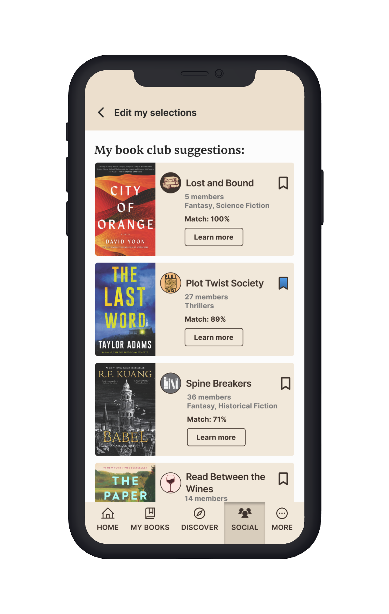
Book clubs create a space where Avery can dive into rich discussions without the worry of spoilers, since everyone is reading at the same pace. For James, they open the door to new reading horizons—introducing him to books he might never have picked up on his own, while also giving him a community to share the experience with.
User Flows
Keeping my primary objectives in mind, I began by mapping the flows from the user’s perspective—considering how they would navigate the site, obstacles they might face, and alternate goals they might pursue.
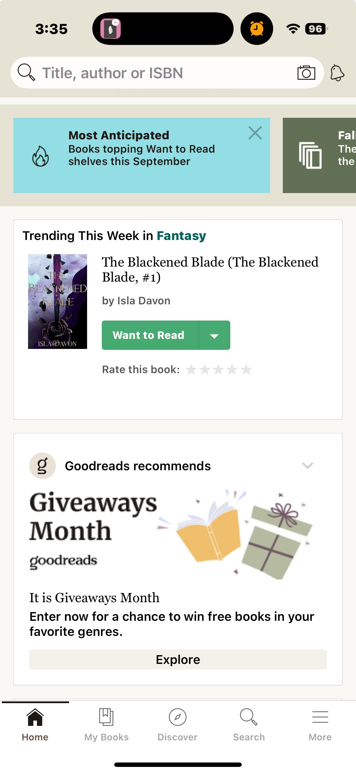
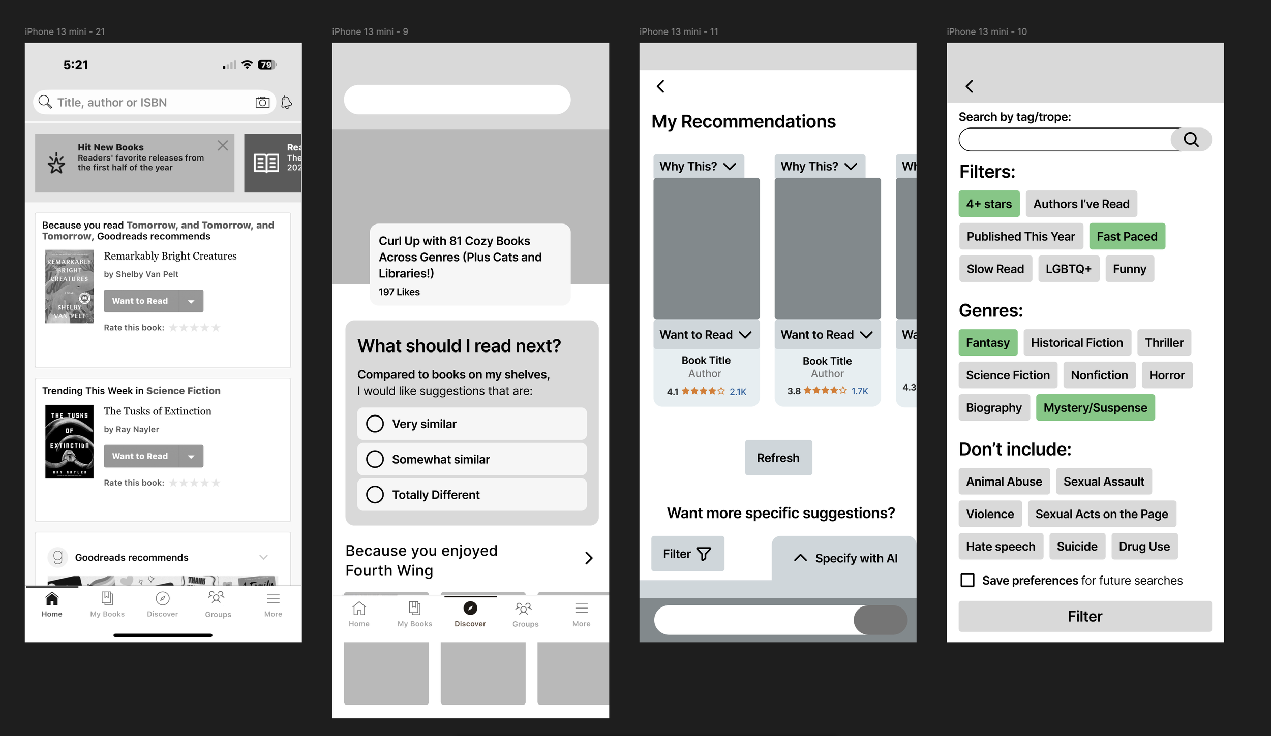
Personalized Book Suggestions
The first step in “Finding Your Next Good Read” began with personalized book suggestions. My initial concept involved a short survey, followed by filters and AI interaction to refine results. However, after testing, I streamlined the flow to keep it simple, ensuring users could still discover tailored recommendations without added friction
Leave A Review
While this flow wasn’t developed further due to time constraints and its lower priority in the book-finding journey, it remains an important part of the overall product experience. Enhancing the review process would directly support the “find a review” flow by ensuring reviews are more useful, searchable, and engaging—making it a clear next step for future development.
Find a Book Club
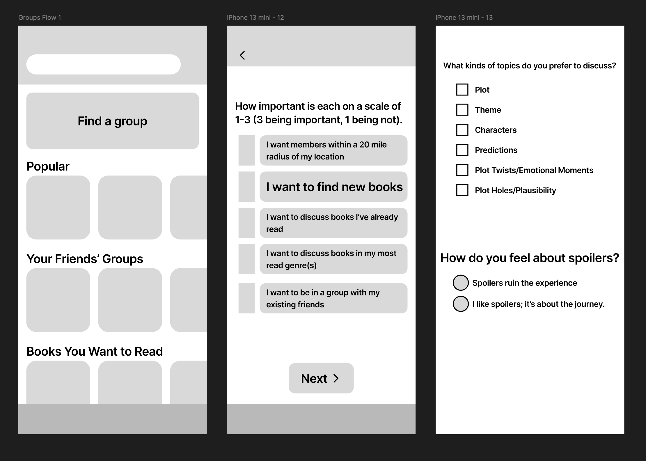
The goal of this flow was to make finding the right book club both effortless and precise. Drawing from interview insights, I designed a questionnaire that captured key details—like preferred discussion topics, spoiler comfort levels, and reading habits—while keeping the experience streamlined and engaging. This ensured users could quickly connect with book clubs that truly fit their needs.
Find A Review
Finding a review is a familiar task for most users, so the goal of this flow wasn’t to reinvent the process. Instead, the focus was on clarity and efficiency—making it as simple and direct as possible for readers to access the insights they need.
Design
Low Fidelity Wireframes
Recognizing the importance of iteration, I sketched a few versions of each flow in low-fidelity for every mobile screen before moving into mid-fidelity designs in Figma.
To explore different ways of integrating a survey-driven discovery flow, I designed two variations of the Find a Book experience.
Version A
Survey entry card placed at the top of the Discover page.
Selecting the card opened a new screen with radio buttons, letting users choose whether they wanted recommendations very similar, somewhat similar, or different from their past reads.
A results page displayed book suggestions with explanations of why they were recommended, plus options to filter or consult AI for more tailored results.
Version B
Survey entry card placed beneath the hero section of the Discover page.
The AI option was introduced earlier—on the radio selection screen—so users could get AI-driven suggestions immediately.
The results page included the same core components as Version A but tested a different layout.
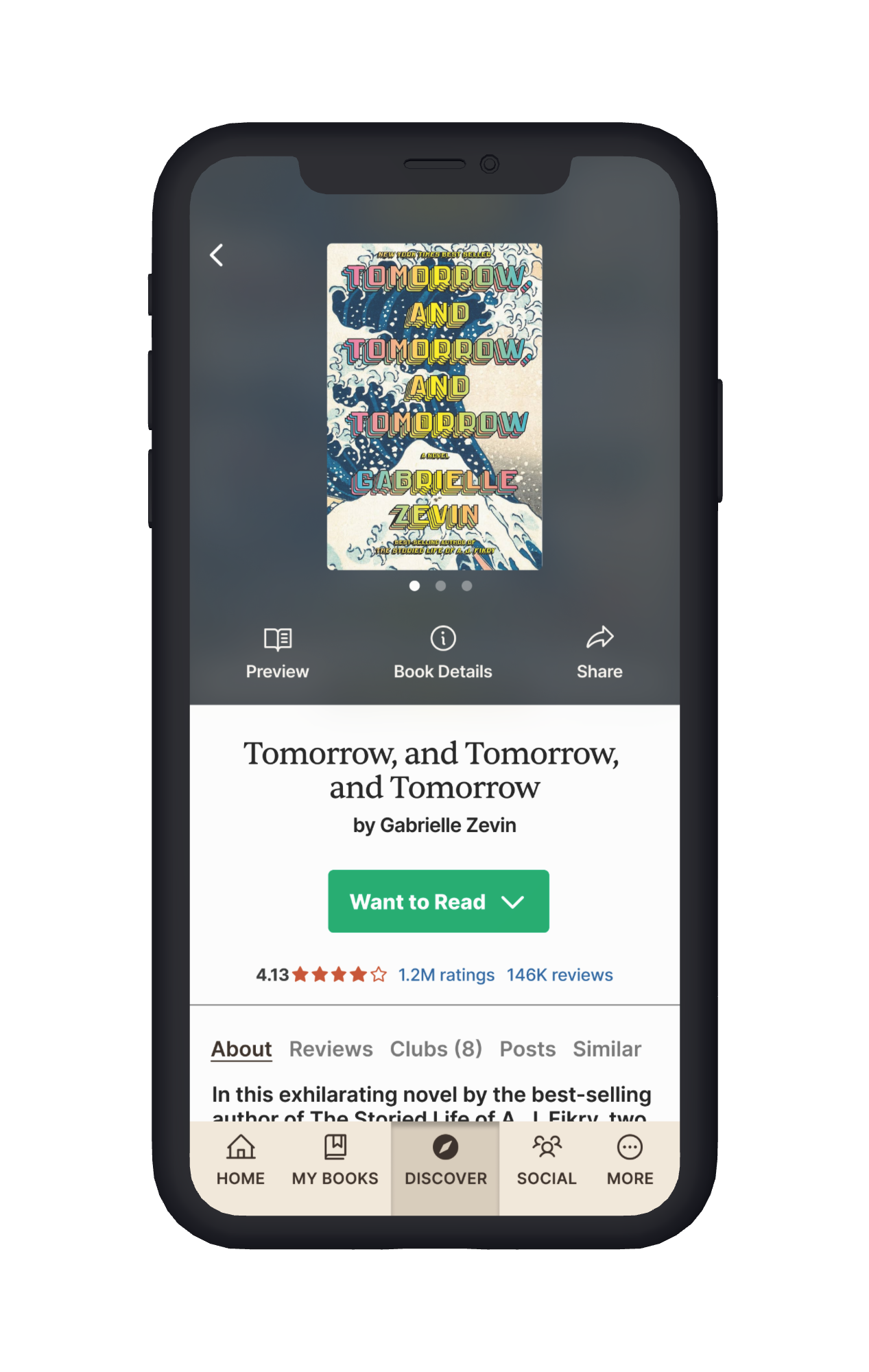
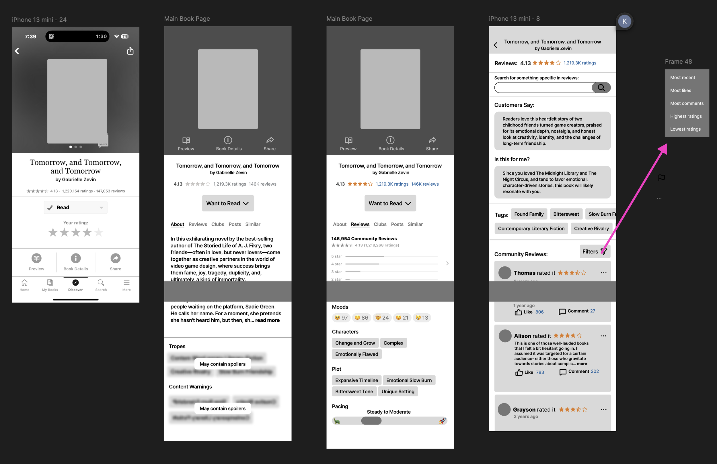
The Find a Review flow was simpler to design since it already existed in the app; my role was to enhance it with new features, such as an AI-generated review summary, to better support users.
Screen 1: Displays the book cover, title, and key details, followed by the familiar Want to Read button, book description, and reviews.
Screen 2: Shows the distribution of all user reviews broken down by star ratings at the top, with individual user reviews below.
Screen 3: Replaces the star breakdown with filters, allowing users to sort reviews based on their preferences.
Mid-Fidelity Wireframes
At the mid-fidelity stage, I focused on designing with real content to ensure the layout supported the experience rather than forcing text into a template.
During this process, I expanded the book club survey to include a question about location (for those interested in meeting in person) and an option to join clubs where friends were already members.
I placed the survey under Discover to reinforce its role in helping readers find new content, and began testing with a simplified, black-and-white version of the Goodreads homepage to confirm users could easily navigate to it right from the start.

Mid-Fidelity Testing
Mid-fidelity testing confirmed that my design direction was resonating with users, while also highlighting specific opportunities to refine clarity and flow. Here’s what I learned:
Book Discovery: Users wanted AI support and filters available earlier in the process.
Reviews: Several preferred seeing an AI-generated review summary before diving into individual reviews.
Navigation Cues: Some users didn’t realize the review rating chart was clickable, so affordance needed improvement.
Book Club Survey: Page 2 felt too wordy, leading to a streamlined reformat.
A/B Testing: Participants’ preferences were split between my new book page design and the existing model. Since all found my version easy to navigate, I moved forward with it.
UI Redesign
Moving from mid- to high-fidelity was all about striking the right balance: modernizing Goodreads’s look without losing the familiar identity users already knew. My goal was to refresh, not reinvent.
Small but intentional updates—like rounding card corners, refining navigation icons, removing extraneous buttons, and brightening Goodreads’s signature beige—brought new life to the interface while still feeling unmistakably 'Goodreads.' These subtle shifts made the platform feel more current, approachable, and user-friendly, without alienating its loyal community.
Before
After
High Fidelity Wireframes
For the book’s about page, I preserved Goodreads’ appreciation for white space while addressing pain points. I added navigation tabs (About, Reviews, Clubs, Posts, Recommendations) so users wouldn’t have to endlessly scroll and replaced random reviews with an AI-generated summary to highlight key insights up front.
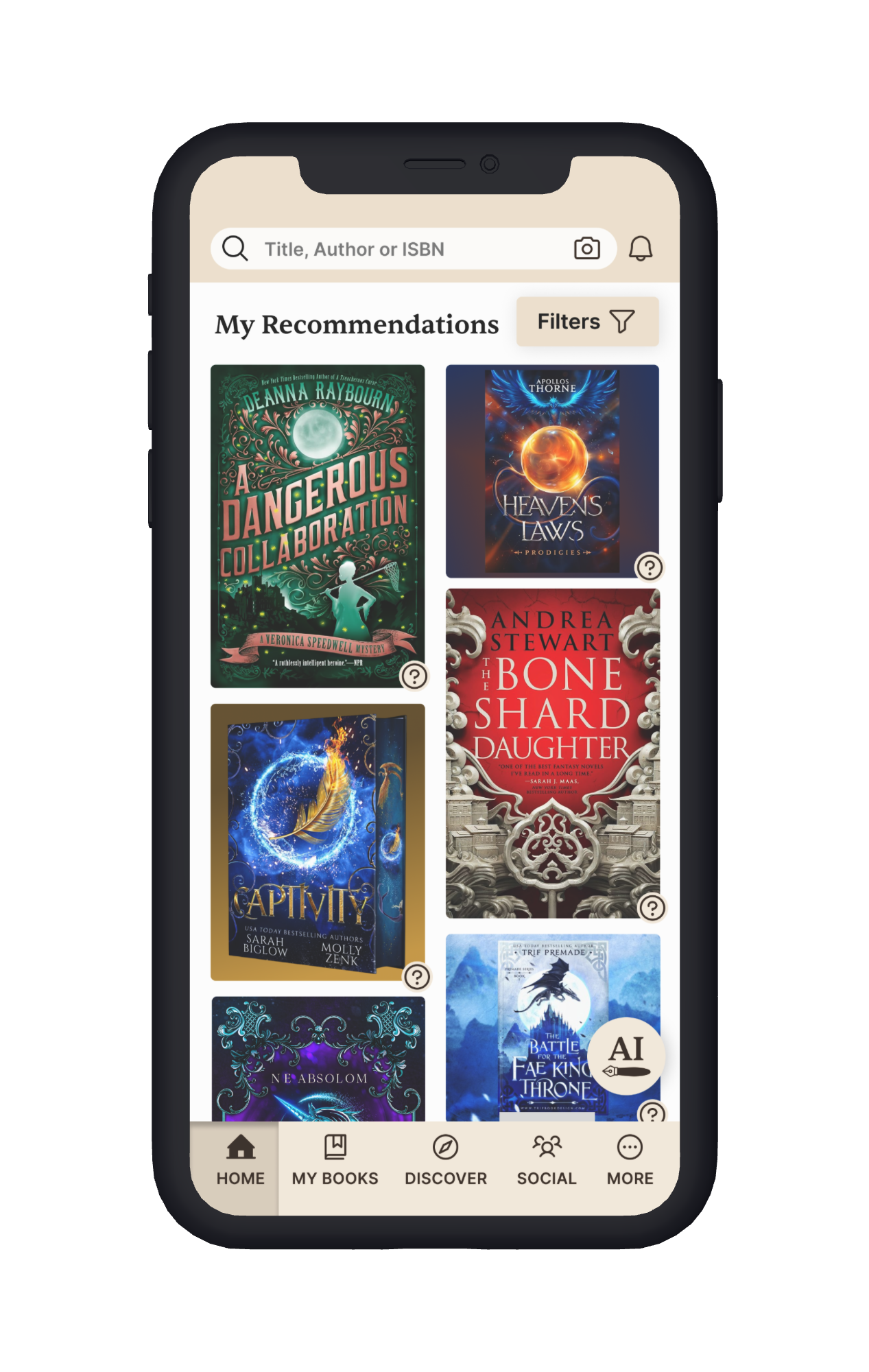
The recommendations screen was inspired by Pinterest’s organized but dynamic grid, designed to engage users visually through book covers while also providing context for each suggestion via a simple question-mark icon.
Filters were built to be extensive yet approachable, with intuitive icons—including careful consideration for the “Don’t include” section to avoid negative connotations. To guide attention, the CTA remains Goodreads’ signature green while the search bar is the only dark surface on the page, ensuring users don’t skim past it.
For reviews, I kept Goodreads’ emphasis on white space while updating the UI for a cleaner, fresher look. I darkened the search bar for visibility and added a “Sort by” filter so users can quickly find the perspectives most relevant to them.
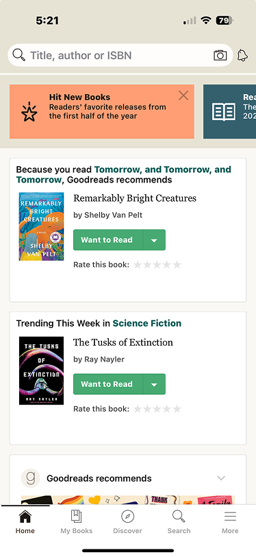
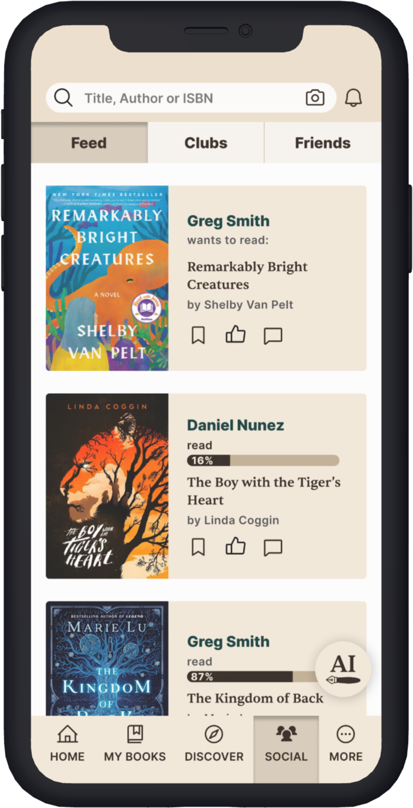
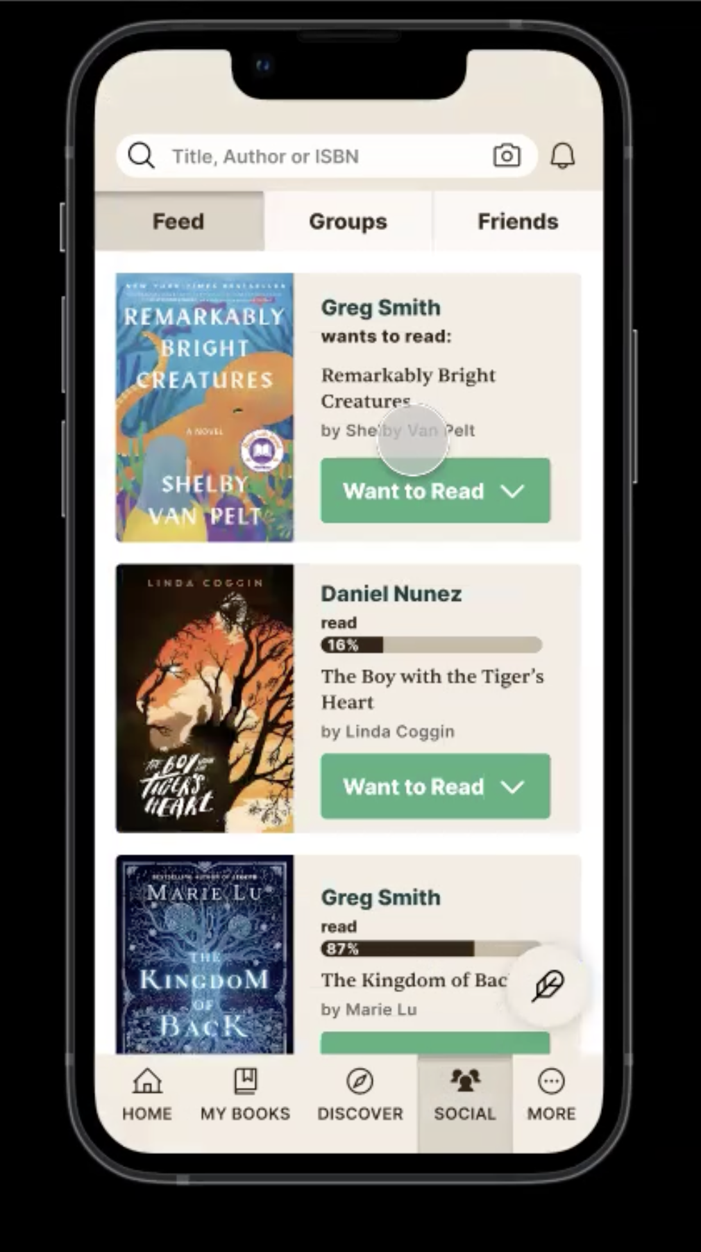
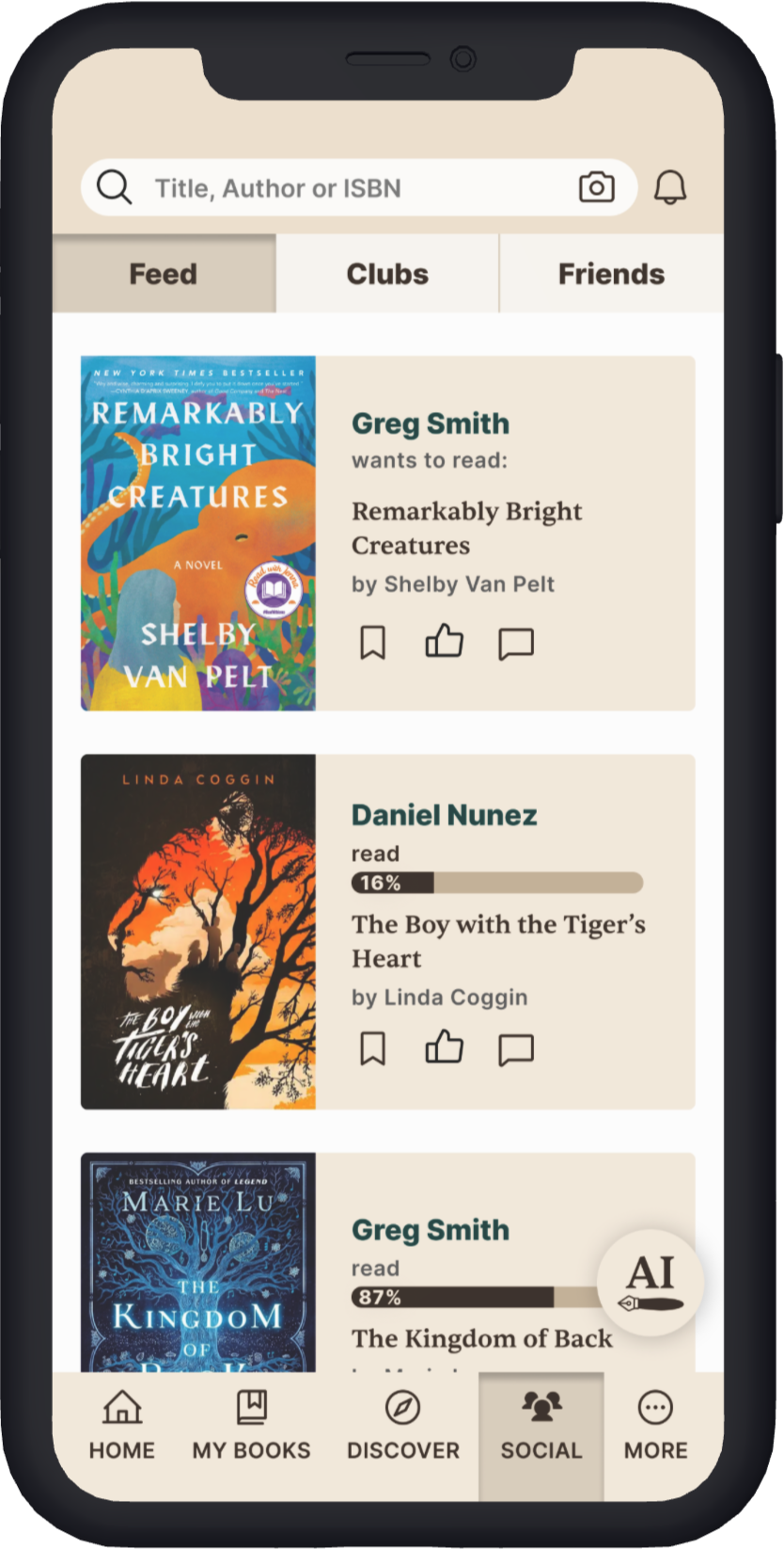
The user feed was redesigned to reduce clutter while retaining Goodreads’ signature beige-and-white palette. I streamlined interactions by consolidating redundant buttons, added progress bars so users could visualize their reading, and reformatted “Goodreads Recommends” cards to clarify why content appeared in their feed.
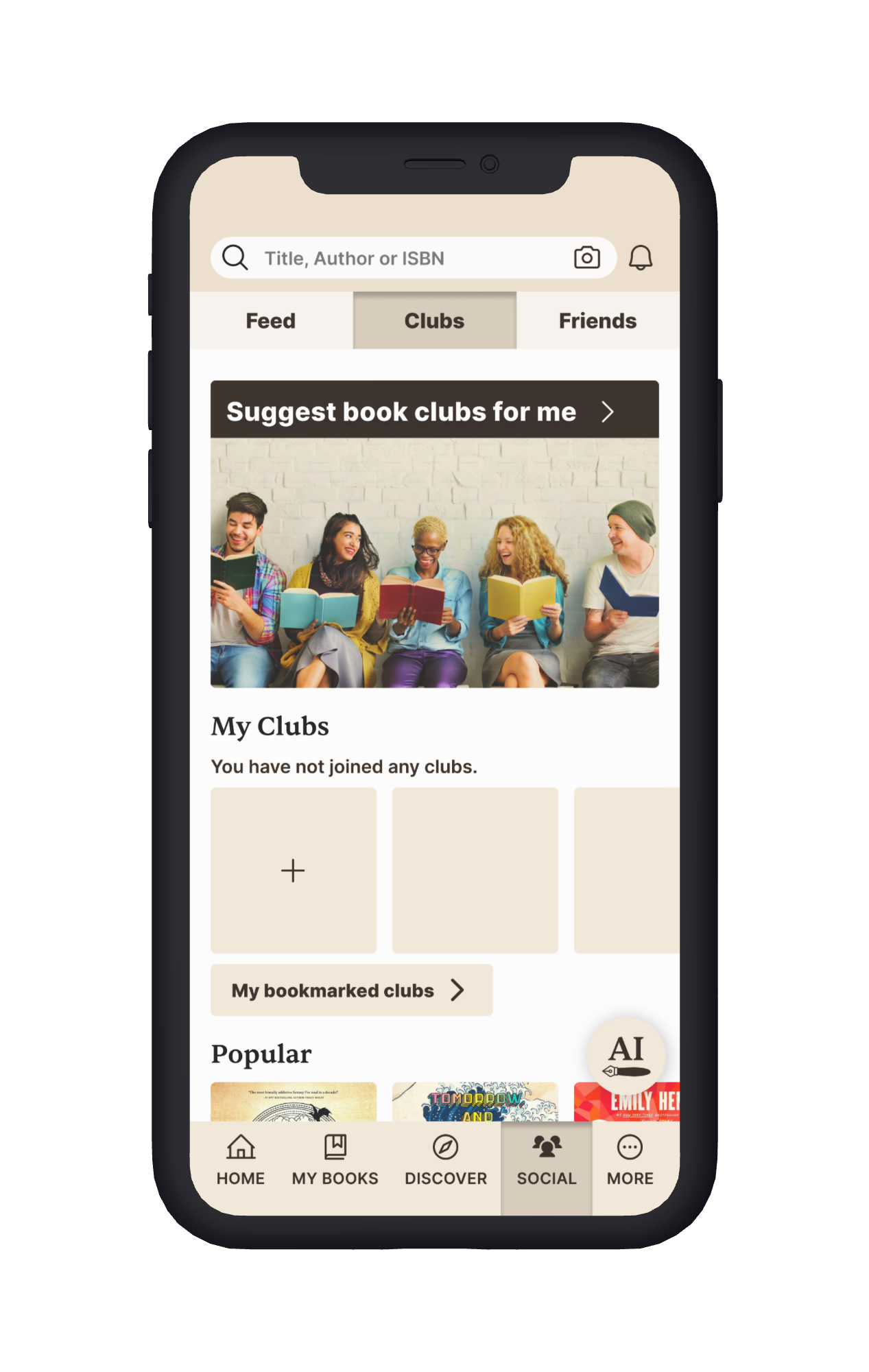
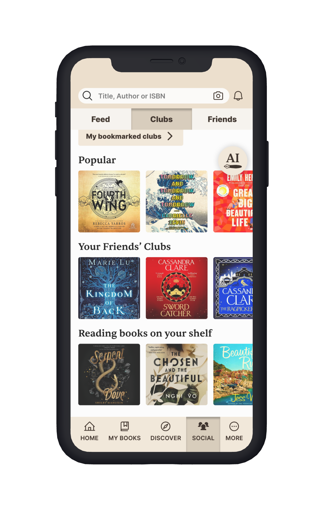
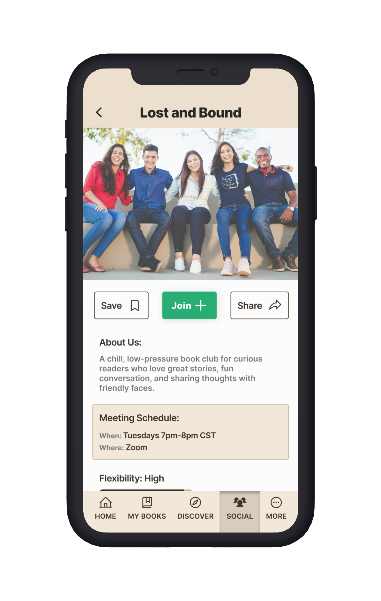
For book clubs, I considered multiple entry points: creating a new club, browsing saved ones, or discovering popular groups. The redesigned flow emphasizes the “Find a Book Club” quiz.
This is the second page of the book club quiz, built with conditionals in Figma to surface tailored follow-up questions (e.g., asking for a zip code if a user wanted in-person meetups). Sliders were designed with large touch targets, and text hierarchy with icons reduced visual overwhelm.
On the club detail page, I added practical tools like a flexibility rating, group expectations, completion percentages, and book history, all to help users quickly gauge whether a club fit their reading style and interests.
I tested the high-fidelity prototype with five users over Zoom. I had Zoom users share their screen with me and click through my prototype while articulating their thoughts to get as many insights as possible.

Iterations
After testing the high-fidelity prototype, I refined several key areas to improve clarity, discoverability, and interactivity. To better understand how the final prototype evolved, here are some of the initial high fidelity versions of my designs:


Clarity & Recognition →I reformatted the publication decades filter in the “My Recommendations” flow for better readability, and created a custom AI icon (“Penn”) so users could easily recognize its purpose.
Discoverability → I recolored, repositioned, and added a secondary entry point for the community reviews button in the Review flow to ensure the feature wasn’t overlooked.
Engagement → I redesigned the book club quiz visuals and layout to make the experience more recognizable, approachable, and inviting.
Interactivity & Personalization → I learned Figma variables to build conditional follow-up questions (e.g., showing a zip code prompt only when users wanted in-person clubs), making the prototype smarter and more dynamic.
Consistency → Added permanent book club logos so groups remain recognizable even as their current reads change.
Together, these changes not only made the experience clearer and more engaging for users, but also helped me sharpen my skills in clarity, interactivity, and scalable design solutions
Final High-Fidelity Prototype

Outcome and Next Steps
Impact of the Redesign
My solutions directly addressed Goodreads’ biggest user pain points, focusing on usability, clarity, and personalization. By testing with real Goodreads readers, I ensured the redesigns were intuitive, detailed enough to support diverse reading habits, and flexible enough to help users find exactly what they were looking for. The result was a more user-friendly experience that aligned with readers’ real goals and needs.
Personal Takeaways
This project pushed my Figma skills forward in meaningful ways. I learned how to use variables to create more realistic, interactive prototypes, and relied heavily on components—nesting them inside one another and setting prototype interactions at the component level—to streamline updates and save time. I also discovered how to set up exclusive selections for survey pages, such as radio buttons. Beyond the technical skills, I enjoyed the challenge of modernizing existing pages while staying consistent with Goodreads’ branding, a balance that sharpened both my design eye and my problem-solving approach.
Next Steps
To build on this progress, I would refine the reviews system—introducing tags (AI or user-generated) to improve recommendations, adding optional word limits to make reviews more scannable, and letting readers tag moods to enhance personalization.
I would also explore note-taking and asynchronous discussion features, giving users spoiler-free ways to capture and share insights, reference their notes when writing reviews, and engage more meaningfully with friends.
Want to see more from Kyla?
I draw too! :)
(See image below)