
BandTogether
What it took to build a platform for learning, jamming, and making real music together.
Designing a music platform that blends AI with human creativity to guide learning, spark collaboration, and keep musicians moving forward.
Background
Project Type:
Mobile-First Responsive Website
Role:
Product Design, UX/UI Design, Branding, User Flow, Research, Prototyping, Testing
Timeline:
12 weeks
Tools:
Figma, FigJam, Figma Slides, Miro, Google Docs, Google Sheets, Google Slides, Zoom


Sign Up
BandTogether
The Problem:
Many musicians give up when progress feels slow or motivation fades—but learning music offers lasting benefits, from improved focus and creativity to emotional expression and confidence. My goal was to help users stick with learning long enough to experience those rewards.
Research
To understand the current music-learning landscape, I analyzed three major platforms—Yousician, Musora, and FenderPlay—along with one indirect competitor, YouTube. This gave me a sense of what features were common (like real-time feedback, free trials, and support for multiple instruments), what users seemed to value, and what was missing. On the surface, these apps were highly rated and packed with helpful tools—so how could I improve on something that already seemed to work?
That question led me to deeper secondary research. Scanning Reddit threads and forum posts, I uncovered a more nuanced perspective. Some users shared frustrations about buggy software, while others talked about the downsides of heavy gamification. A few admitted they felt like they were just “playing along” with the app and not truly learning. They wouldn’t be able to reproduce songs without the app showing them the steps in real time. Despite the popularity of these platforms, it was clear there was still room for something better—something that combined effective learning with real musical growth and lasting engagement.
User Interviews

I interviewed multiple musicians over Zoom. Each fit in one of three categories:
Practicing musicians
Musicians who quit
Music teachers

Competitive Analysis
I asked them questions like:
Tell me about a time you felt excited or motivated to learn. What influenced that?
When did it become harder to stay motivated? What contributed to this?
What advice would you give to someone just starting their musical learning journey?
Then I sorted all of the information they gave me into this affinity map:
I created three personas using the information I gleaned from User Interviews to ensure that I would continue to empathize with and design for my users throughout the design process.
Personas:
-

Bea
THE BAFFLED BEGINNER
Bea is a high school student who doesn’t have a lot of free time, so she needs to build a solid practice routine and find a place she can go to for feedback and questions. She’s just starting out her musical journey and wants to have fun learning and progress quickly.
-

James
THE JADED JAMMER
James is a software engineer who has been playing piano recreationally for years. He’s become less interested in playing as he doesn’t get the same sense of achievement that he used to when he first started playing, but if new creative and collaborative paths were open to him, he might be able to reignite that spark.
-

Paige
THE PASSIONATE PROFESSIONAL
Paige lives and breathes music. She is a music teacher by day and a music tutor by night, always doing her best to help her students, but she can’t be available to them 24/7. She needs a tool that will help her students continue to progress when she can’t physically meet with them, and a way to provide exercises and lessons that she can listen to and give feedback in her spare time.
Define User Problems
-
The Social Aspect
Users are encouraged by collaboration, discourse, community, and competition.
-

Ah-ha Moments
Users expect instant gratification and need help to continuously recognize their progress once they’e advanced beyond the beginning stages.
-
Fun, But Structured
Users don’t want learning to feel like homework—but without structure, it’s easy to lose direction, get discouraged, and give up.
Ideate
I used multiple brainstorming exercises to explore the full range of feature possibilities.
Prioritize
I then prioritized my list of product features based on what would alleviate the most user pain, taking into account the amount of effort it would likely take to design these things, and came up with 5 “Must Have” Features for my product.
Account Creation
With this universally employed feature, Bea can track her music lessons, James can store all of the songs he’s creating, and Paige can keep all of her students’ assignments sorted within the site.
2. Account Personalization
With this, Bea can set her ideal practice schedule and receive AI-generated learning suggestions based on her personal interests. James can find new user song posts that align with his favorite music style, and Paige can use students’ self-reported preferences to help recommend exercises that they will truly enjoy learning.
3. Collaboration
Bea can take inspiration from more practiced musicians, James will rediscover his passion for music making new songs with fellow creatives, and Paige can post exercises for her students to play along with, as well as making some music of her own with other professionals.
4. Feedback
Bea can ask her burning questions and receive answers from fellow musicians and mentors alike. Paige can share her expertise with new musicians– even the ones she’s not mentoring– and James will have the unique experience of asking for help when he needs it and also helping those who aren’t as far along in their musical journeys.
5. A Search Function
With all this content on the site, users need a quick and easy place to access what they want. James remembers hearing a song post he wanted to collaborate with but forgot to bookmark it? No problem, he can search for it. Paige wants to recommend a specific exercise to a student but can’t remember where she found it? She can search for it. Bea wants to learn a new skill outside of her mentor’s and learning path suggestions. She can search for that too.
Organize
I performed an open card sort with four different users to get a sense of the terminology they would use and which organizational patterns they would expect to encounter.
Card Sorting
Combining Results
I then performed my own card sort by defining the main categories my participants created and seeing if all the cards could sensibly be sorted into these sections.
Final Card Sort (for Confirmation)
I checked with my last participant to see if she could replicate my own card sort results in a hybrid card sort. With a few minor differences, our results were consistent.
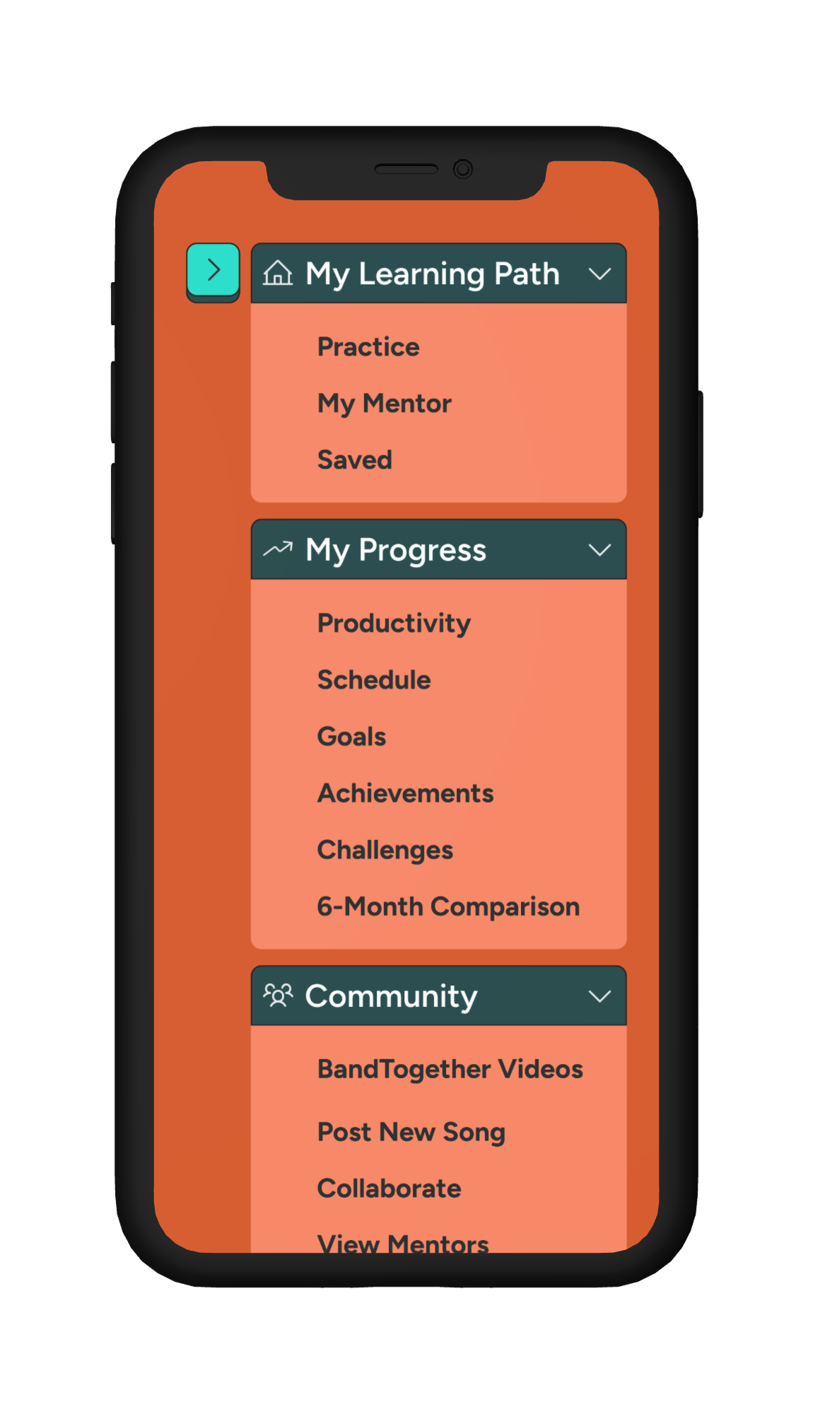
Sitemap
I turned the results of my card sort into the sitemap below.
User Flows
First I approached the flows from the user’s perspective, imagining how they might navigate the site to arrive at what they desire, what issues they might encounter or alternate things they might desire.
Sign Up
I considered users who join solely to post collaborative videos, not to learn. An onboarding quiz suggesting lessons they don’t need would only frustrate them—so I asked: what would their ideal user flow look like?
Post a Collaboration
What about a user ready to post a collaborative video—but stuck on the perfect title? They've completed every other step but don’t want to publish until the name feels just right. How might we support that user—letting them save their progress without forcing them to go public too soon?
Sign up via Text Message
And then there’s the user who just wants to jam with a friend but hasn’t signed up yet—how can we get them onboarded quickly and easily, without friction or frustration?
Task Flows
I broke the two most important user flows into task flows to pinpoint exactly what needed to be built for users to accomplish their goals smoothly.

Design
I began by making a low-fidelity wireframe sketch of each of the most important screens.
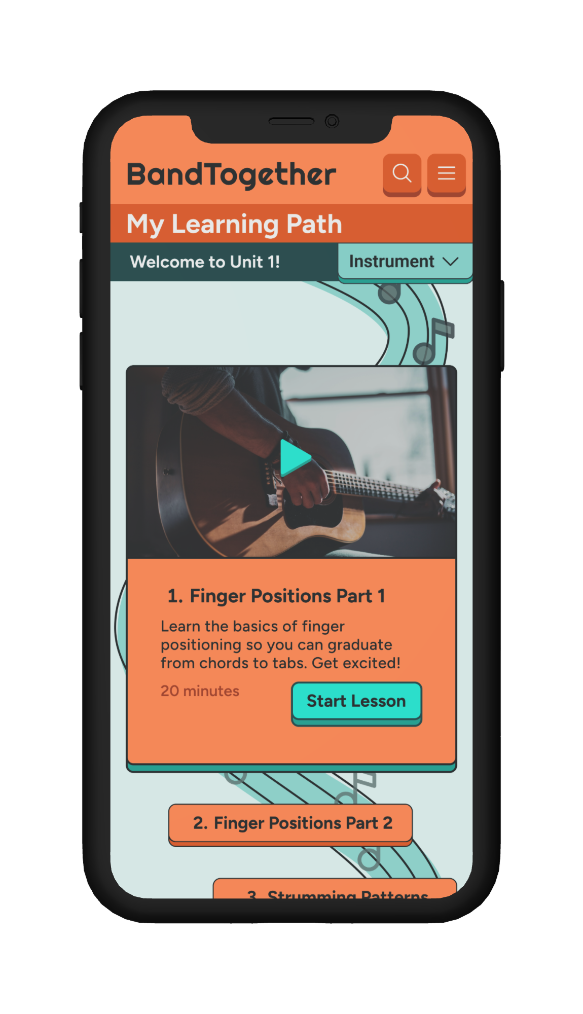
Sketch 1 shows the BandTogether feed in its most straightforward form—users can watch videos from others and decide whether to collaborate, keeping the flow simple and intuitive.
Sketch 2 reimagines the feed in a Netflix-style layout. This approach reduces the size of individual videos but increases the number of options visible at once, testing whether breadth of choice motivates more engagement.
Sketch 3 experiments with interaction design, replacing a large CTA like “BandTogether” with a simple + symbol to explore whether minimalism could streamline collaboration decisions.
Sketch 4 strikes a balance between the previous iterations. It avoids horizontal scrolling, focusing instead on a vertical feed that shows more options than Sketch 3, but fewer than the dense Netflix-inspired layout of Sketch 2.
Together, these iterations explored how layout and interaction design affect the balance between giving users enough options to discover collaborators while keeping the experience approachable and easy to navigate.
In sketching the home page, I explored multiple layouts to balance clarity, focus, and engagement:
Image 9: A visual path made of bubbles, each containing a video preview and a short description, designed to make progress feel playful and inviting.
Image 10: A more structured, linear version of the same page, supported by a vertical navigation bar for easier wayfinding.
Image 11: A collapsible layout showing only the current lesson, created to minimize distractions and keep users focused on one step at a time.
Image 12: A super simplified approach, where only videos and short explanatory text emerge from the visual path, testing how minimal the design could be while still guiding users forward.
Sketches 5–8 Overview: These sketches explore alternate versions of the Learning Path. I invested significant time in this layout because the way lessons are presented directly shapes user engagement and the overall learning experience. Each iteration tested a different balance of clarity, playfulness, and progression to ensure the path felt both motivating and easy to follow.
Final Home Page Sketch: This version evolved into the final design. I reimagined the learning path as a winding strand of sheet music, creating a playful yet structured metaphor for progress. The current lesson is visually highlighted, ensuring users always know where they are on their journey.
Beyond the home page, I also sketched out the collaborative posting flow, breaking it into clear, customizable steps
Step 1 — Video Posting Flow: Users begin by choosing the positioning and proportions of their video in relation to their collaborators, giving them control over how their contribution is displayed.
Step 2 — Audio Balancing: Next, users can adjust the volumes of each collaborator, ensuring their mix feels comfortable and collaborative.
Step 3 — Video Personalization: Finally, users can apply filters to personalize their videos, making the shared performance feel more expressive and unique.
Mid-Fidelity Wireframes
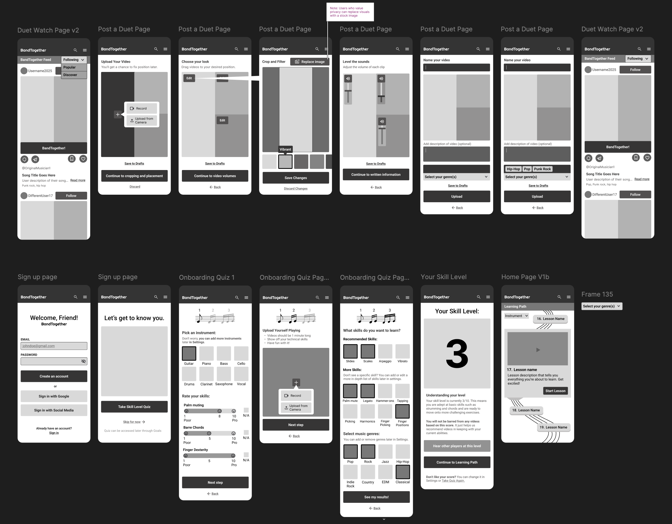
Once the basic structure was in place, I moved into mid-fidelity wireframes to develop the ideas further and catch issues that hadn’t surfaced in the low-fidelity phase—especially since those early sketches lacked real content and copy.
This is where I hit a snag. I'd only sketched out the key low-fidelity screens, and jumping straight into mid-fidelity for the rest turned out to be inefficient. Without a guiding blueprint, I ended up creating what I now call the “Figma graveyard”: 17 discarded screens now rest in peace at the bottom of my file.
Some were too visually cluttered, others had awkward screen-to-screen flow, and a few introduced accidental pain points—like an early version that threw up a paywall before users could even experience the product’s value. That one was a fast track to user drop-off. Lesson learned: let users explore first, it’ll show them why a paid subscription might be worth it.
Mid-Fidelity Flows
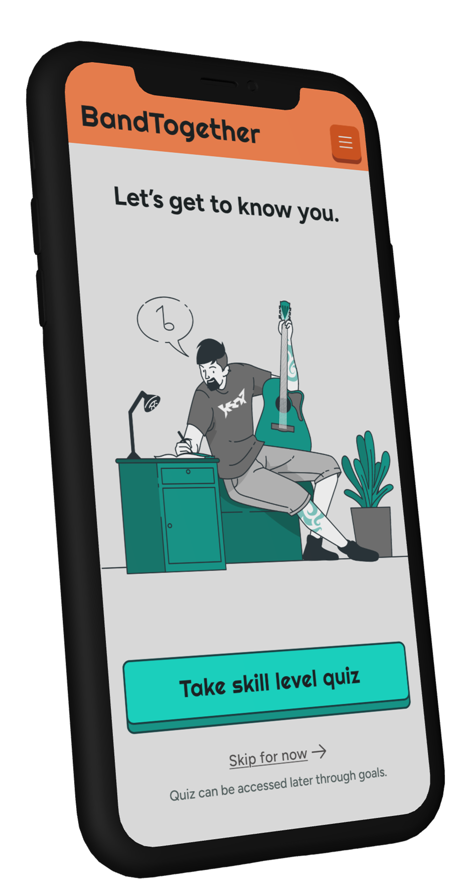
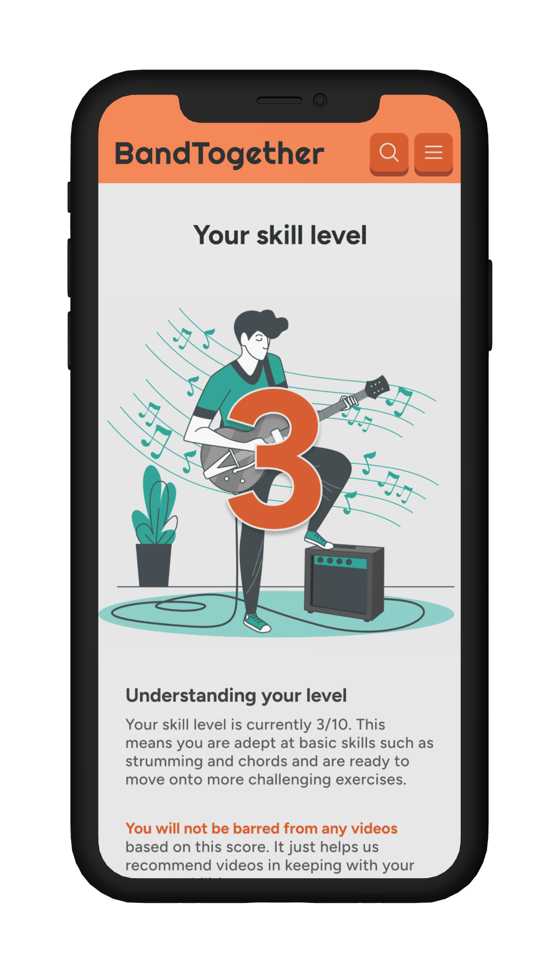
The first flow the user will encounter is the sign-up flow which lets users take or skip the onboarding quiz whose questions help the app create AI-generated personal learning and song suggestions for users once they’ve created an account.
It also teaches users how to upload videos during onboarding in a low-stakes environment before they attempt to upload collaborative videos and BandTogether.
The other flow I designed is the post-a-collaboration flow which lets users choose from a feed of recommended user posts to create a collaborative song.
Users can edit the video and audio to their liking- even upload them separately if they’d prefer not to show their face or they create digital music that isn’t conventionally recorded. They’re able to save their progress at any point so they can fine-tune to perfection before having to upload or lose progress.
Desktop Version
As BandTogether is a responsive website, it was important to consider how the site would look on a larger screen. After designing the mid-fidelity mobile wireframes, it was time to create a mid-fidelity mockup of the desktop version:
Branding
Once the essential structure of the screens had been decided, the next step was to inject the designs with some personality.
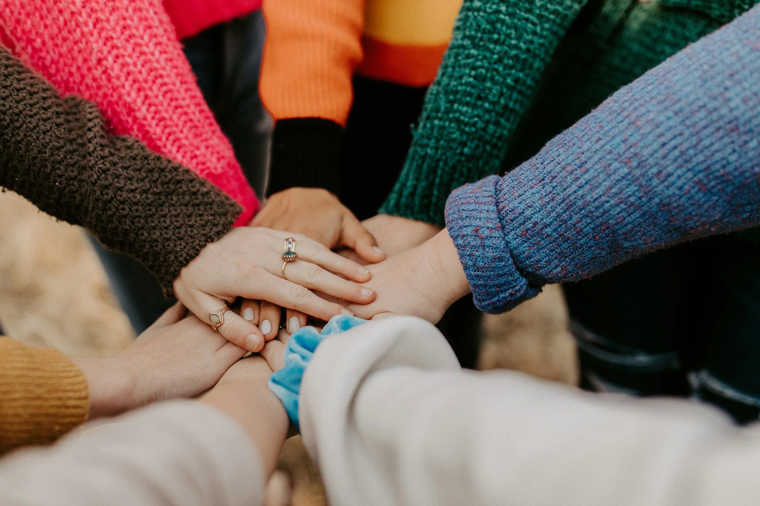
After some brainstorming I decided that the four values that matter most to the BandTogether brand were: Learning, creativity, community, and fun.
I needed to make sure that every aspect of my design- Color palettes, typeface, brand logo, and icon set– would communicate those values.
First came a mood board:
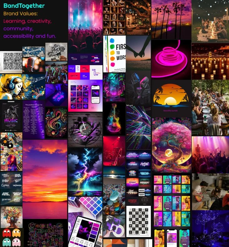
I went through many iterations of color schemes before reaching the final product. My intent was to create a colorful palette that would appear sophisticated yet radiate energy like the images in the mood board.
My original attempts were much too dark and color-saturated, though. After more experimentation, I landed on the color scheme that achieved what I’d intended: vibrancy with a sense of approachability and community.
For this reason I also chose the rounded and friendly shapes of my typeface, Figtree, and the Phosphor icons that would appeal to my personas– all of whom were relatively young and looking for a friendly platform.
Once I finalized these decisions, I created a UI component library which utilized these design choices in building blocks that would help me to build a consistent site quickly.
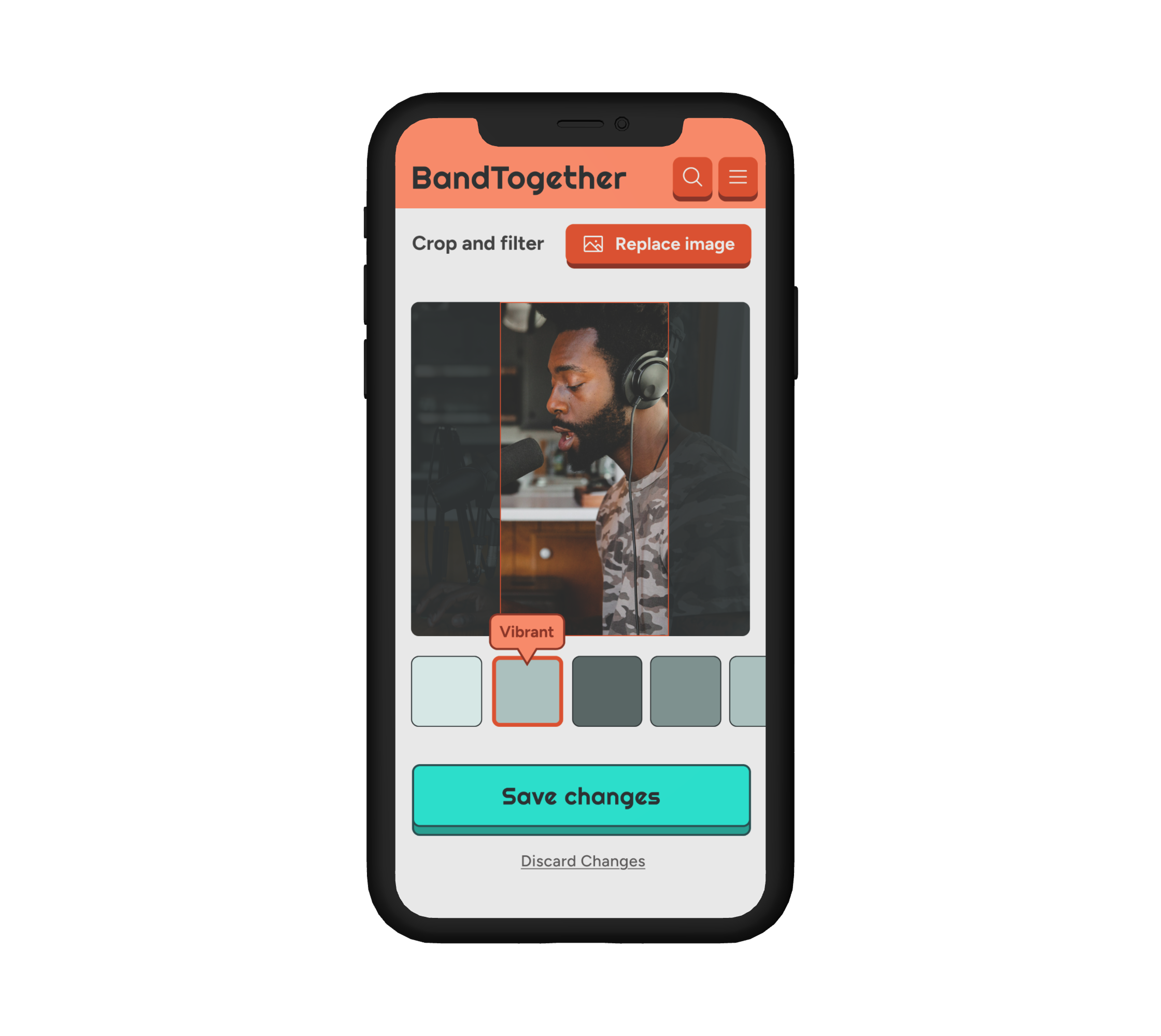
High-Fidelity Prototype
Next came my favorite part: turning mid-fidelity wireframe structures into a polished-looking, (mostly) functional prototype. I wanted it to look and feel as close to the final product as possible so users could interact with it and I could see how they respond.
User Prototype Testing
I tested the high-fidelity prototype with five users- four over Zoom, one in person. I had users share their screen with me and click through my prototype while articulating their thoughts to get as many insights as possible.
And I did, indeed, get a lot of insights.
I gathered feedback on both visuals and usability, then used it to improve the final prototype. Screen by screen, I worked through my original design to refine it within the project’s timeframe. Below is a visual highlighting all changes made based on user feedback (noted in purple sticky notes).
Because no one has the time to read all that…
The most important edits:
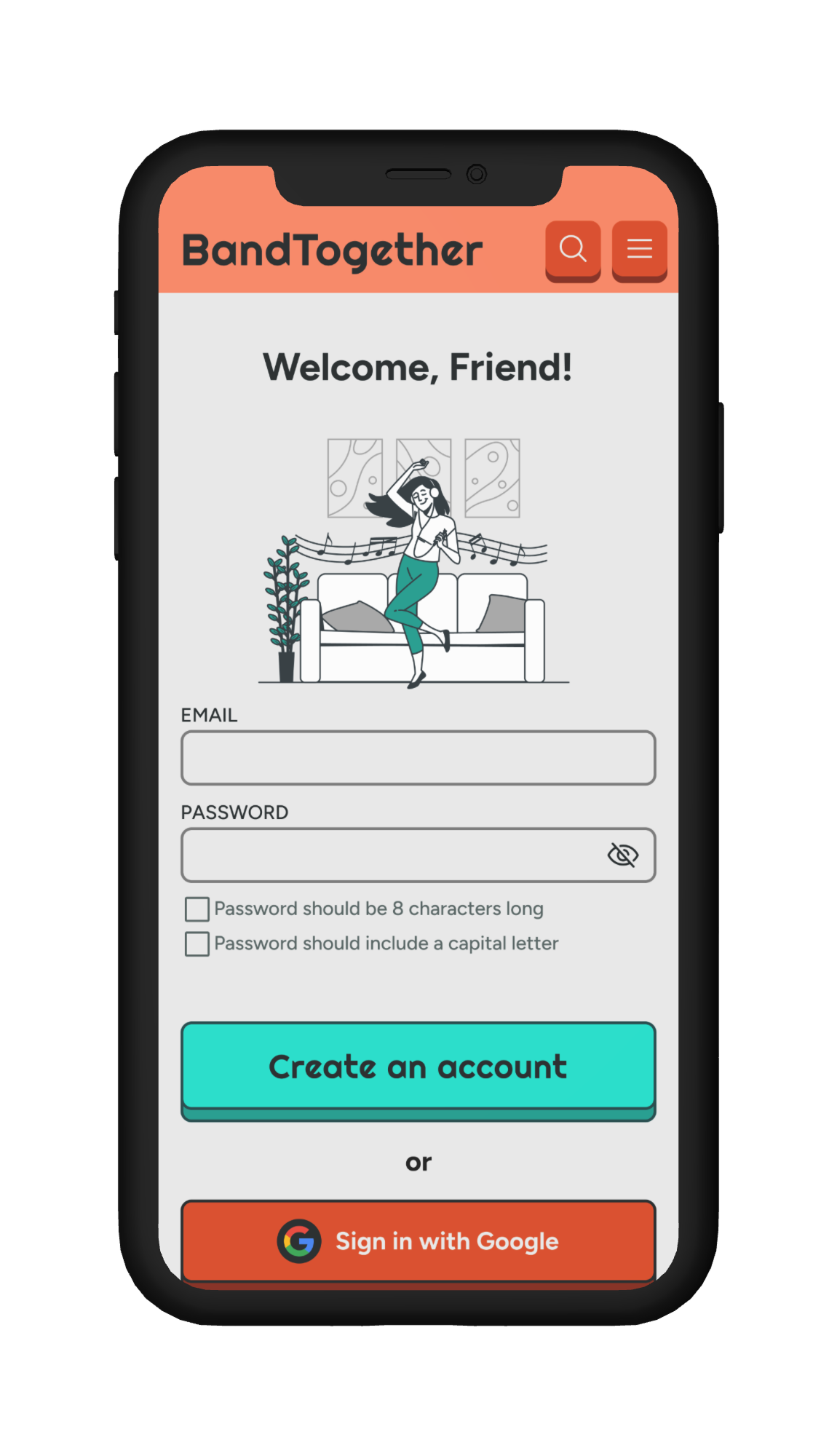
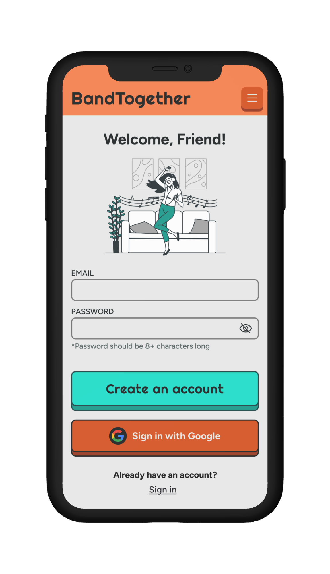
I adjusted the orange hue after testing revealed users mistook it for an error state—removing some red made buttons feel more inviting. I also simplified the sign-in screen layout so all options fit on one screen without scrolling, reducing visual clutter and friction.
1.
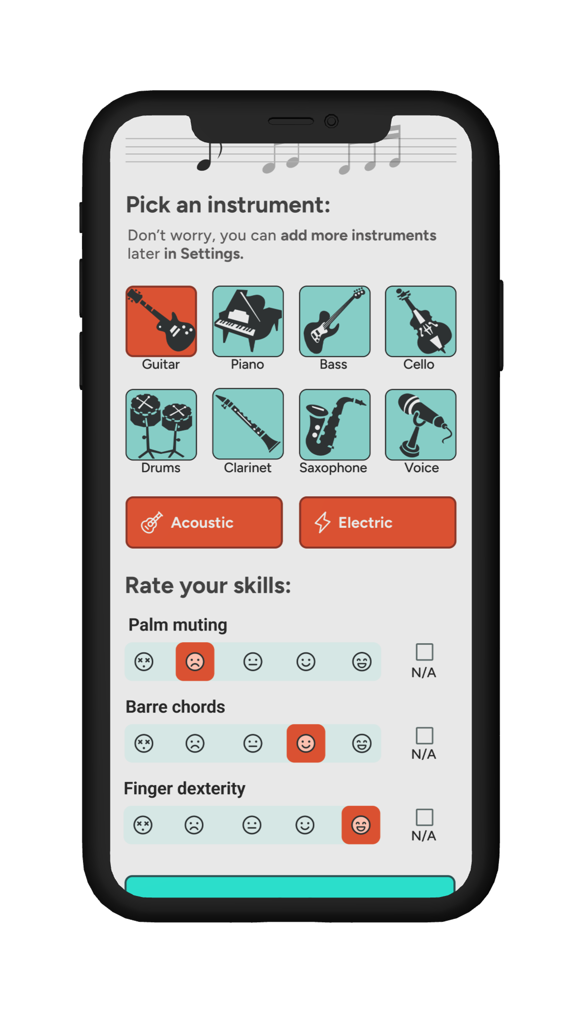
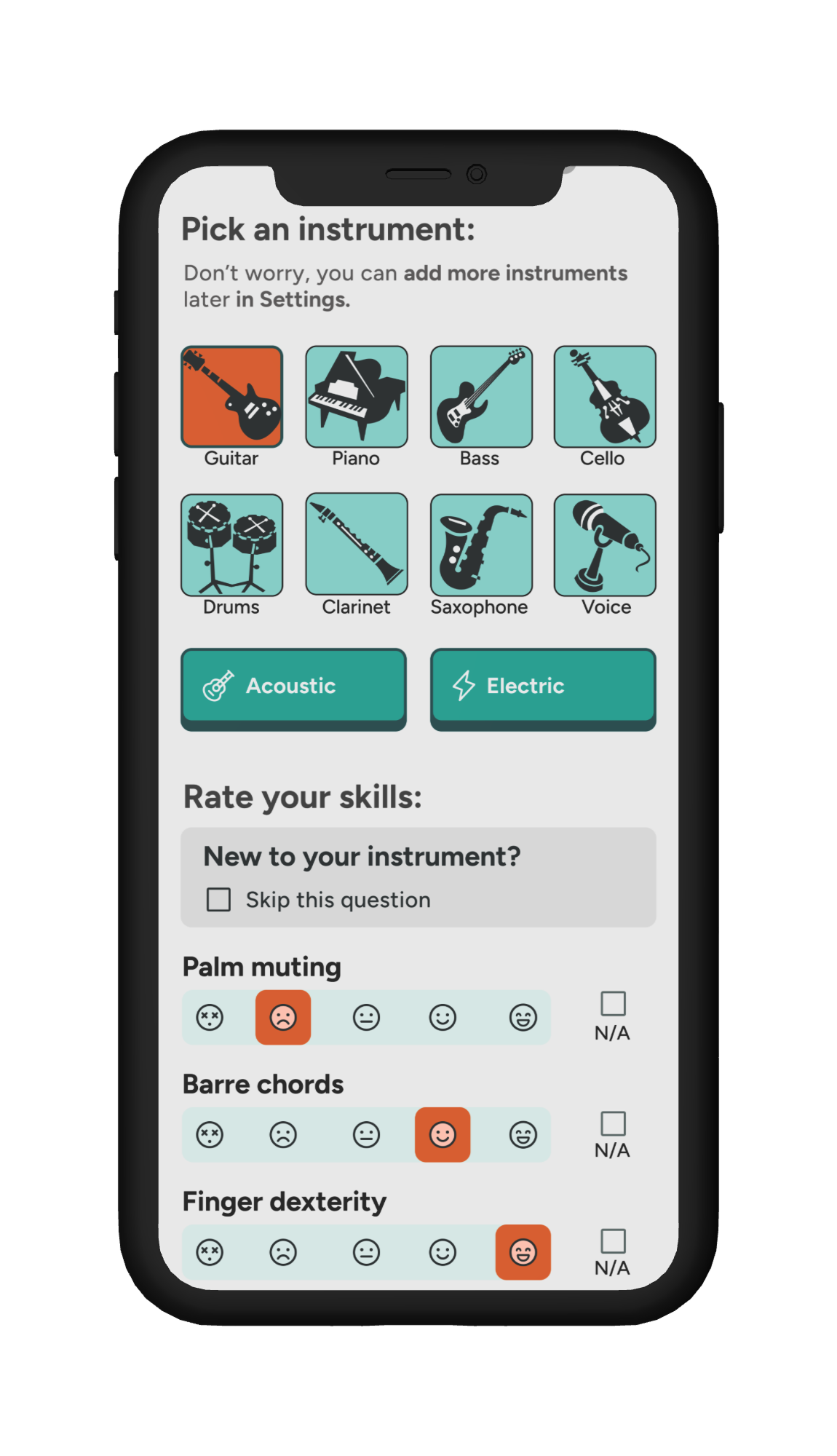
To support brand new musicians, I added a “Skip this question” option for users who might not be familiar with musical terms yet. I also changed the Acoustic/Electric buttons from orange to blue—having the same color as the selected instrument made them look pre-selected, which could confuse users.
2.
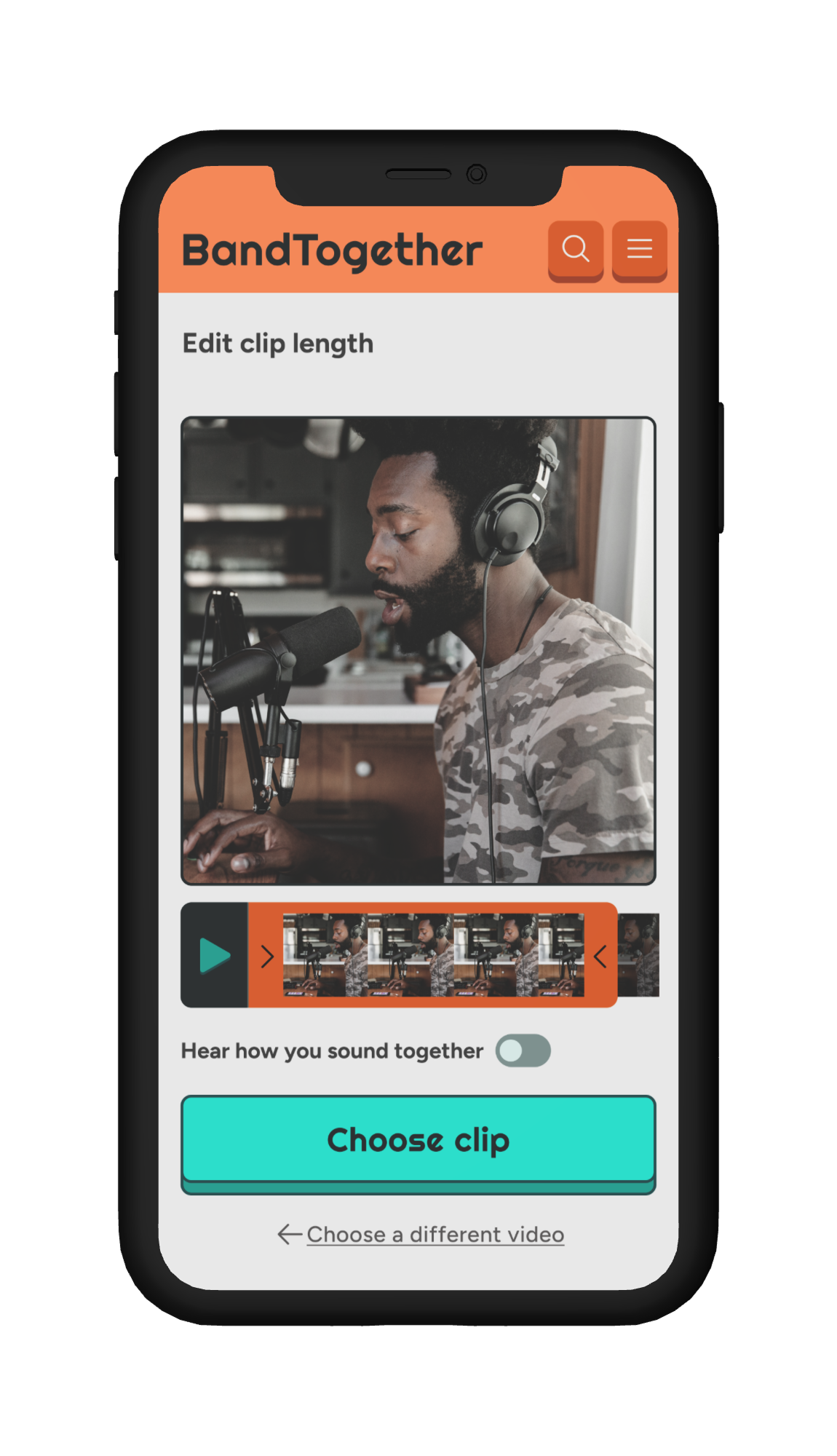
This is the video clip length editor. After selecting a video to upload, users land here to trim their clip and ensure it syncs well with others—especially helpful when using the “hear how you sound together” toggle to preview audio alignment.
I added this screen after usability testing, when a few testers asked, “What if my video is too long—will I get an error?” Including this step answered their question and improved clarity in the upload flow.
3.

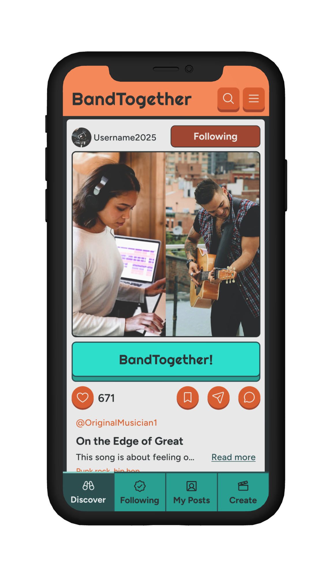
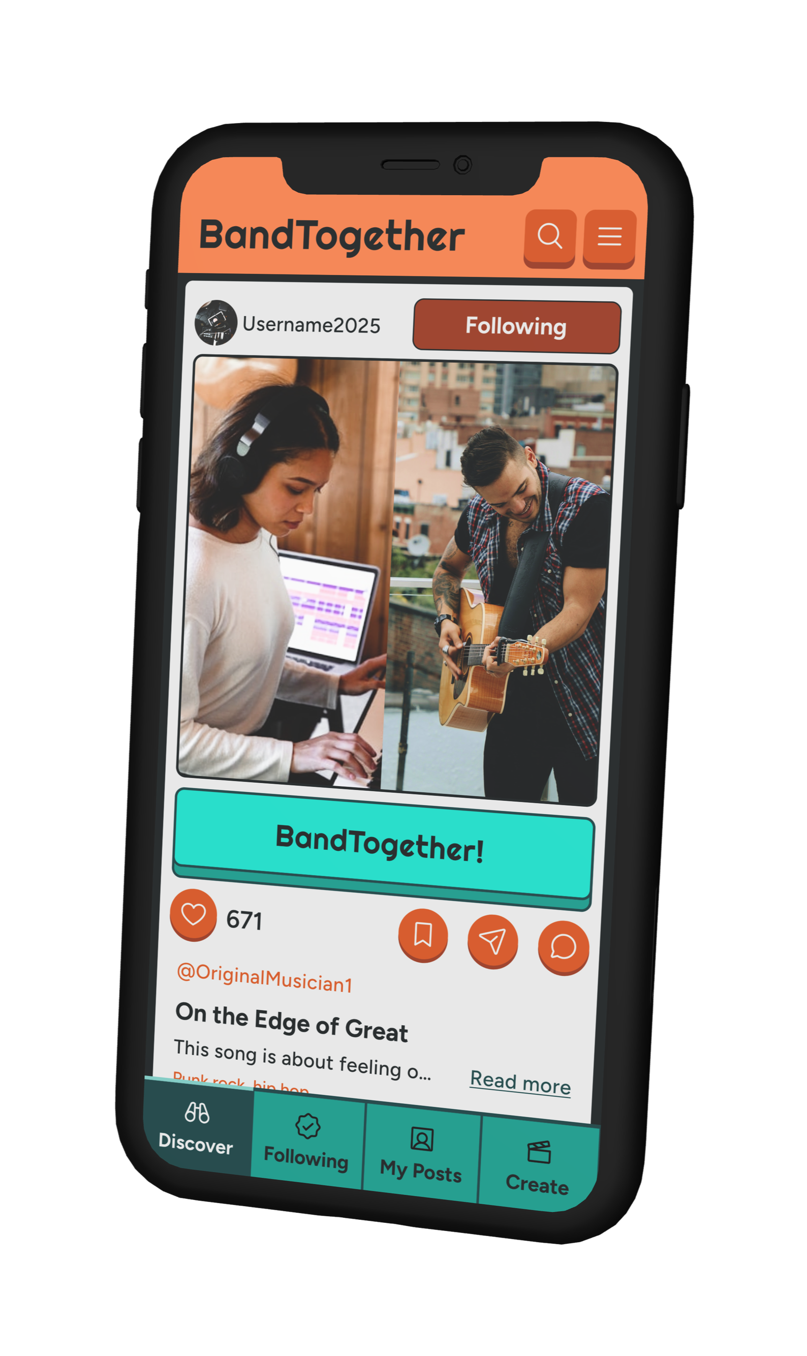
To improve usability, I moved navigation to the bottom of the screen for easier access on mobile. I also updated the colors so the call-to-action stood out as the only bright cyan element on the page, making it easier to spot. Lastly, I rearranged the CTA and reaction buttons into a layout that feels more familiar to social media users, helping the interaction feel intuitive.
4.
Final Version:
Outcome & Next Steps
Outcome
BandTogether helps users stay motivated, track progress, and connect through music by combining personalized learning paths with fun, collaborative features. It brings structure to the learning process—without losing the creativity that makes music meaningful.
This project sharpened my skills in prioritization, research, and iteration, and showed me how powerful it is to design with users, not just for them.
Next Steps
Given more time, I’d love to
Test the latest version of my prototype
Develop the mentorship and feedback systems
Expand my research to reflect even more diverse musical journeys.
Still, I’m proud of how far BandTogether has come—and excited about how it could help more people stick with learning music and rediscover what they love about it.
Want to see more from Kyla?
I draw, too! :)
(See image below)

Created by Yours Truly