Empowering Writers
Grounded in user research, shaped by brand identity—designed to stand out.
How do you take a website overflowing with information and make it feel effortless to navigate? That was the challenge at the heart of this project. By distilling complex content into clear pathways and ensuring resources were easy to search and access, I created a site educators can rely on—without needing to call on the EW team for help.

Background
Project Type:
Mobile-First Responsive Website
Role:
Product Design, UX/UI Design, Research, Information Architecture, User Flows, Prototyping, Testing
Timeline:
8 weeks
Tools:
Figma, FigJam, Figma Slides, Google Docs, Google Sheets, Google Slides, Zoom, Calendly


The Problem:
Empowering Writers had valuable resources for teachers, but they weren’t always easy to find. Educators often got lost in the site, spending too much time searching—or turning to sales staff for help. This created a double strain: teachers felt frustrated and unsupported, while salespeople were pulled away from higher-value tasks. Solving this problem was critical—not only to make educators’ work more efficient, but also to free the EW team to focus on growth, relationships, and deeper support. The challenge was clear: redesign the site so that finding answers felt intuitive, efficient, and seamless.


Before vs. After

Research
To better understand the ELA professional development market, I analyzed four competitors: CKLA Amplify, Heggerty, Wonders, and Step Up to Writing.
While most programs emphasize reading and treat writing as a supporting skill, Empowering Writers differentiates itself by placing writing at the core of its curriculum and using it to strengthen reading comprehension.
Accessibility was another area of concern for some competitors. For example, CKLA’s website is well organized with effective white space and visuals, but its supporting text uses low-contrast colors that reduce readability. Heggerty’s site includes rapidly flashing animations without user controls. While the speed slows over time, the fast-changing color blocks could be distressing for users sensitive to flashing visuals, including those at risk of seizures.
Competitive Analysis
User Interviews
I interviewed nine educators over Zoom. Each fit into one of three categories:
Educators who were familiar with Empowering Writers
Educators who were not familiar with Empowering Writers
Empowering Writers team members

For users unfamiliar with Empowering Writers, I focused my interviews around ascertaining what they understood about the company based solely on the website as well as their first impressions of the company and its offerings based on a quick interaction with the site’s pages.
For Empowering Writers team members, who interacted with the website often, I focused on discovering their pain points and how their clients experience the website.
By synthesizing insights from both educators and internal team members, I identified core usability challenges and opportunities that informed the direction of the site’s redesign.
For users familiar with Empowering Writers, I focused my interviews on their experience using the site to purchase products from the company; the pain points they experienced as well as how the company compares to others the educator has used in the past (if any).
Once the interviews concluded, I organized the insights into the affinity map shown below:
Key Research Findings
89% of users discussed or demonstrated confusion in regard to the organization of the site. Many were unable to find specific pages they were actively searching for.
For example, multiple users could not locate the Student Samples page.
Several users missed the Store, due to its placement below the navigation bar
67% of users described problems with the flow of information on the workshops page.
80% said they did not interact with the Workshops page at all.
Most preferred to contact Empowering Writers team members directly rather than trying to figure out workshop details through the site.
Teachers not familiar with the site did not know what the Literacy Launch was; a descriptive sentence for each workshop would be helpful.
67% of users found the Store difficult to find or navigate.
56% of users felt that page titles and button labels did not accurately reflect what they led to.
For example, users looking for data to support EW’s success had to click a button labeled “Our Partners,” which did not clearly signal the presence of data.
I created two personas using the information I gleaned from user interviews to ensure that I would continue to empathize with and design for my users throughout the design process.
Personas:
-
Evie Edwards
THE EARNEST EDUCATOR
Evie has been teaching 5th grade for six years. Although she loves working with her students, she was never formally trained in how to teach writing. She’s been piecing together her lessons based on state standards and intuition, but she knows her school would benefit from stronger, more consistent writing instruction methods. She discovers Empowering Writers.
PAIN POINTS
–Evie has trouble remembering where to find resources on the site
–She can’t figure out which workshop would be best for her next professional development
–She can’t find the informational writing folders she ordered last year in the store.
-

Simone Shaw
THE SOCIABLE SALESWOMAN
Simone is a knowledgeable sales rep at Empowering Writers who uses the website daily to guide customers. She shares links and answers a wide range of questions, both routine and complex. She needs to quickly find and share the right resources to support customers effectively.
PAIN POINTS
-Simone knows that research and coaching should be highlighted more on the site, to show customers all that the company truly has to offer.
–Her customers are confused by the workshops page and the store.
–She lacks knowledge about ELA and the site explanations don’t always clarify resources enough help her recommend the right aids to teachers with questions.
Define User Problems
-

Site Organization
Users encountered difficulty finding information such as prices for coaching, student sample PDFs, and items in the store. The company had many useful resources for educators- it was a matter of getting them into the educator’s hands with ease.
-

Explanation
The site spoke to its users as if they were already familiar with Empowering Writers terminology. It did not explain things such as “Student Content”- is it BY students or FOR students?– or describe the difference between “Comprehensive Teacher Resources” and the “Teacher’s Toolbox.” Providing users with context would greatly improve usability.
Defining the MVP
Home Page
Workshops Page

The Store
I focused on the Home, Workshops, and Store pages—the core of Empowering Writers’ MVP and the areas generating the most user friction—so the redesign could resolve key pain points while directly supporting the company’s core sales goals.

Prioritize
I then prioritized my list of product features based on what would alleviate the most user pain, taking into account the amount of effort it would likely take to design these things, and came up with 5 “Must Have” Features for my product.
Updated Information Architecture
With improved organization, Evie the earnest educator will be able to access all of the content she needs to teach effectively, and Simone the sociable saleswoman will have more time to address specific client needs now that she’s receiving fewer emails about how to find things on the website.
2. Home Page
With a redesigned homepage, Evie will be able to see all that Empowering Writers has to offer and Simone will be able to showcase her products to customers much more easily.
3. Professional Development Pages
With the Workshop schedule clearly laid out and the order in which teachers should take them explained, Evie will no longer have to contact Simone to find the next workshop near her. Now she can schedule it for herself.
4. Store
With a more organized and searchable store, Evie will be able to locate items she’s purchased in the past with ease, and Simone will easily recommend resources to new clients using the website’s new filtering system.
5. A Search Function
With all this content on the site, users need a quick and easy place to access what they want. The search bar did not appear on the mobile version of the site previously, but my redesign would fix this so Evie and Simone can search for what they need quickly no matter what device they’re using.
User Flows
I began by mapping the flows from the user’s perspective—considering how they would navigate the site, what obstacles they might face, and what alternate goals they might pursue.
Sign Up for a Workshop
For the workshop flow, I considered how users ideally search (prioritizing location, since research showed a preference for in-person workshops) and how they might respond if none were available nearby. I accounted for this possibility in my designs.
Buy an Item in the Store
Building on the site’s existing store categories, I restructured the information to help users locate items more quickly. The original design only allowed filtering by a single trait—for example, selecting Grade 4 resources without the ability to narrow further by location or resource type. To address this, I designed a system that supports multi-trait filtering, enabling users to refine searches with precision while still offering flexibility for those who prefer not to use the search bar.
Store Quiz
In interviews, a team member shared that many educators struggle to identify what they need from the store. To solve this, I proposed an interactive quiz to guide users toward the most relevant resources. Although the feature was cut due to time constraints, I adapted the concept and integrated its core ideas into the store’s filtration system—ensuring users could still find tailored results efficiently.
Organization Step 1: Sitemap
Improving the site’s information architecture was the highest priority. I created a new sitemap that clearly showcased what Empowering Writers offers for first-time visitors while organizing resources around how users would actually use them. To do this effectively, I immersed myself in the full range of the site’s content to understand each resource’s purpose and value, ensuring the structure reflected real user goals rather than internal assumptions.

Design
Learning from past projects—where I initially mapped only the most significant screens—I began this time by sketching low-fidelity wireframes for every mobile screen before moving into mid-fidelity designs in Figma.

The first image explores an alternative layout for the Workshops page. Instead of a list view, it presents upcoming workshops in a calendar format, making it easier for users to plan around their schedules.
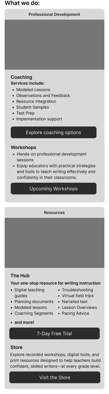
The top-right screen shows the EW Store homepage, where users can quickly search, filter by grade or resource type, and browse bestsellers—helping them find what they need faster.
The bottom-right screen is a simplified version of the store homepage, offering a more streamlined browsing experience.
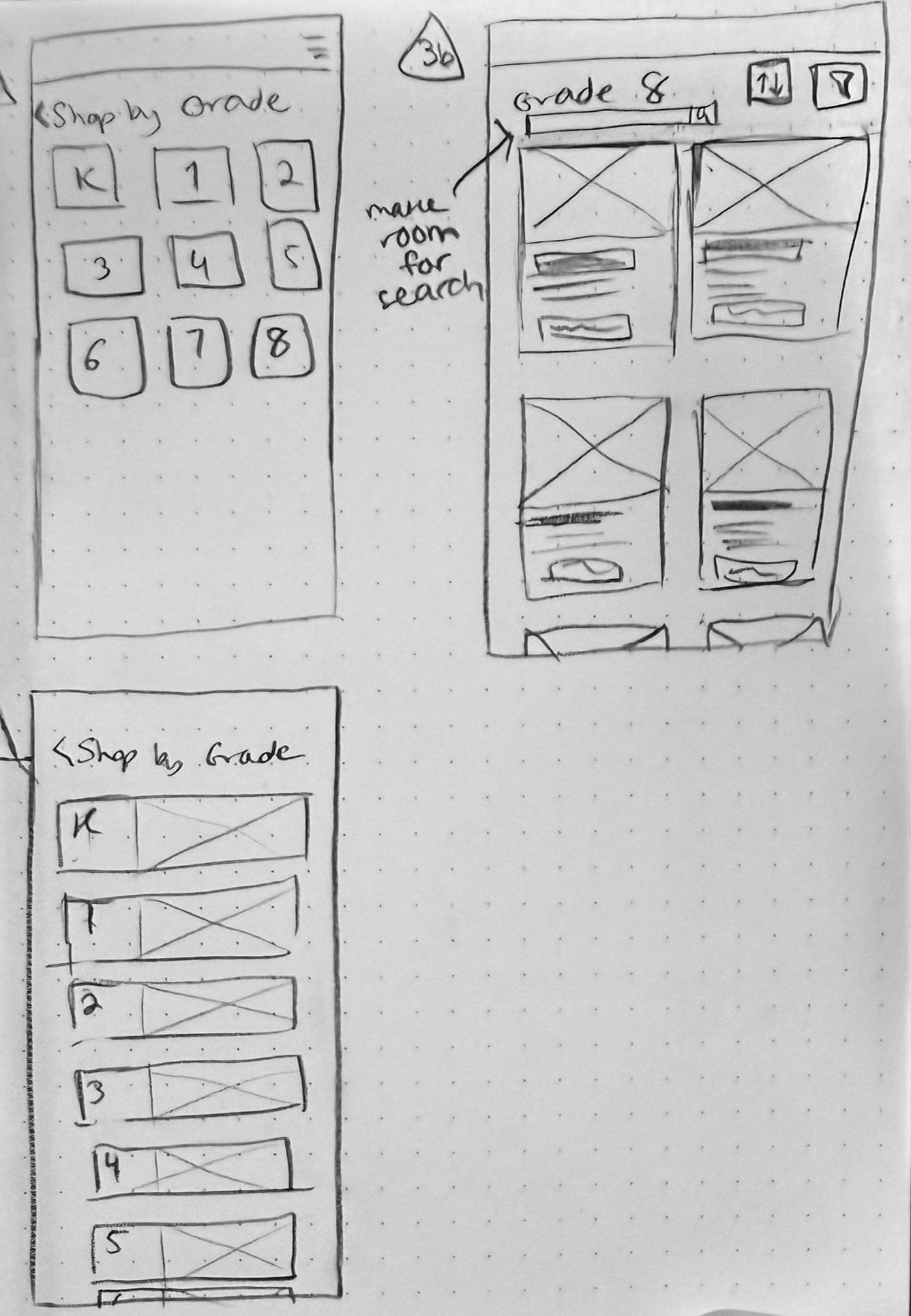
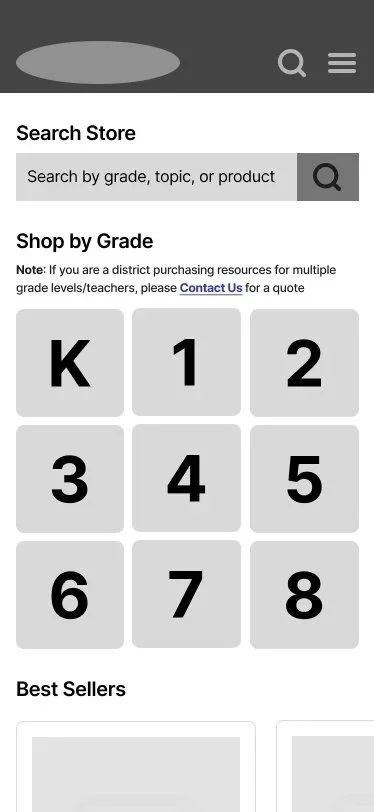
The top-left image shows the “Shop by Grade” view, where users can browse a list of all available grade levels.
The bottom-left image offers the same concept in a horizontal layout, giving users another way to navigate by grade.
The right-hand screen shows what appears after a grade is selected: a product page with a search bar and filter options, allowing users to quickly narrow results and find the most relevant resources.

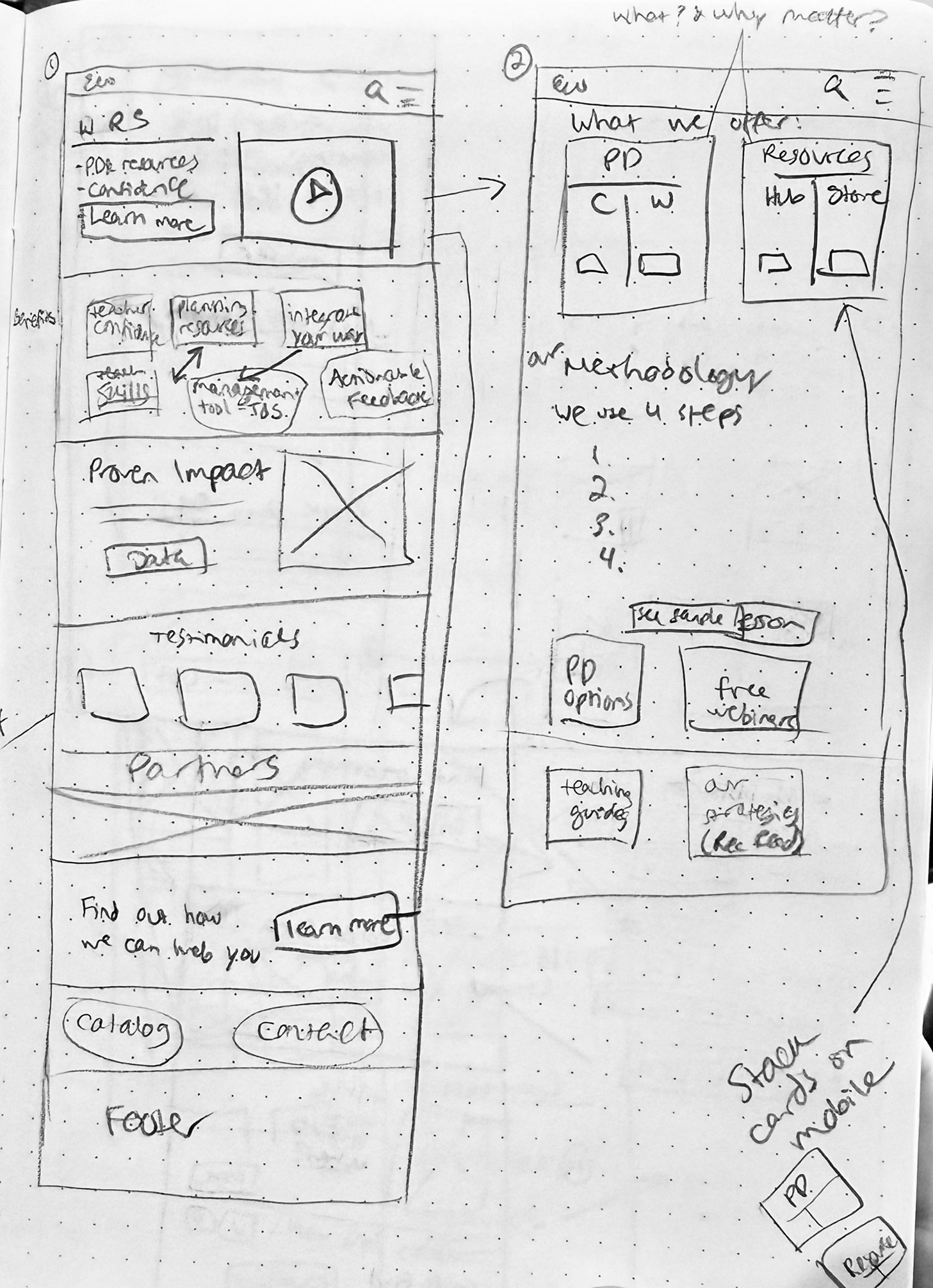
Image 2b shows the mobile version of the “Learn More” page. It gives users a clear, concise overview of what Empowering Writers offers and explains the teaching methodology, formatted for easy reading on a smaller screen.
Image 3b is the Workshops page. Here, users can use the dropdown to quickly understand what each workshop covers and see the recommended learning sequence, but if they already know what they need, the information does not take up too much space and is easy to scroll past. The user can then filter through the upcoming sessions to find and sign up for the ones that best fit their needs.
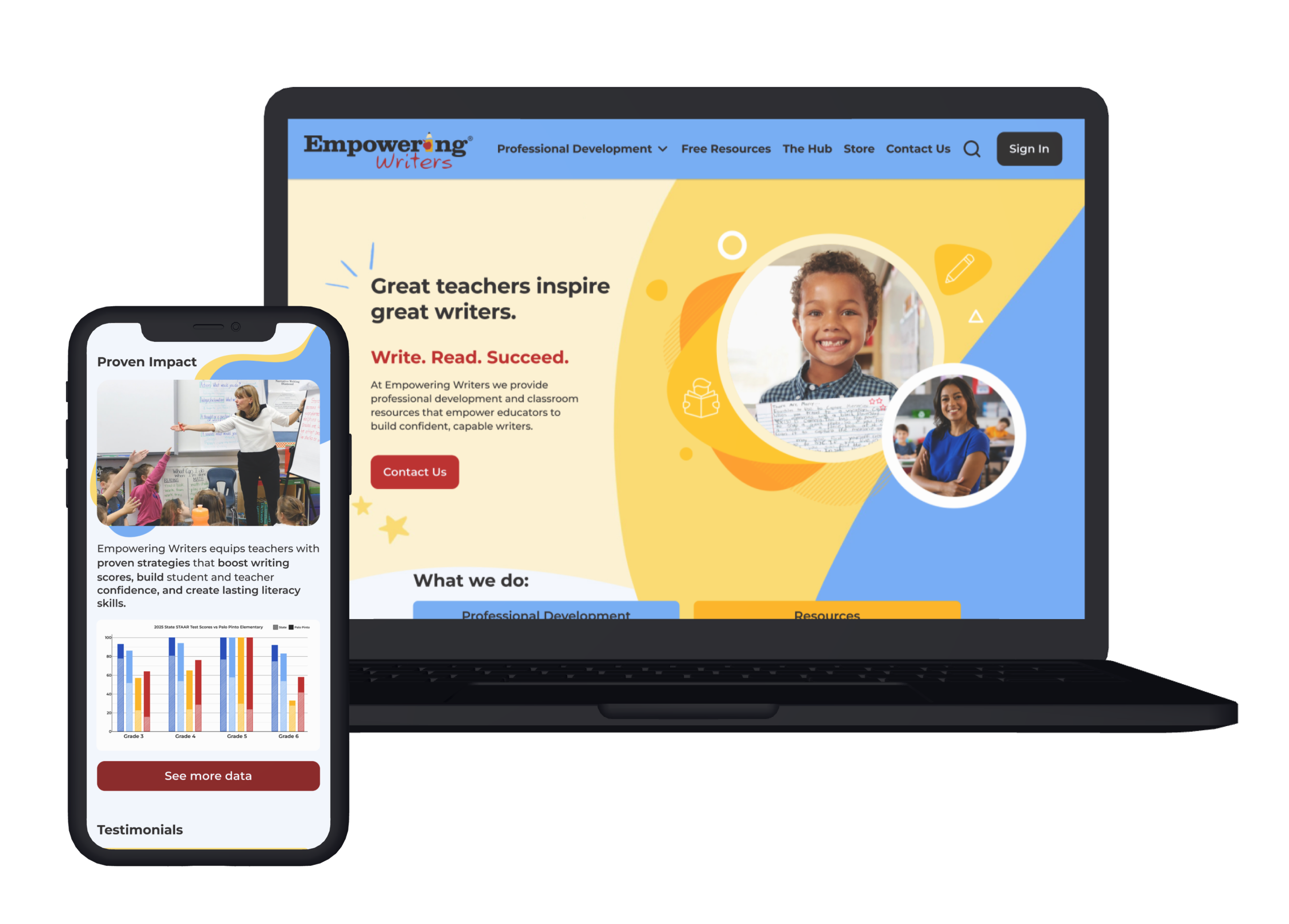
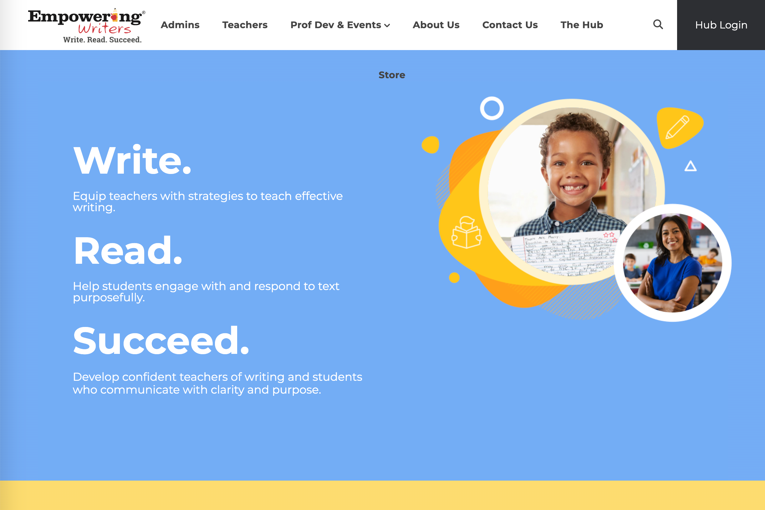
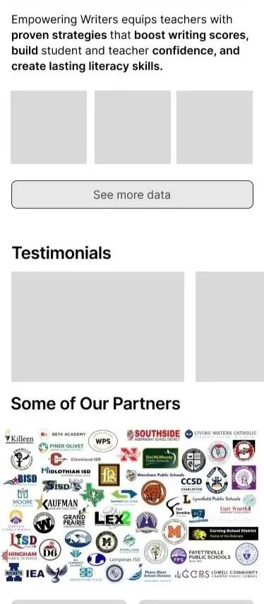
Image 1 shows the home page, featuring the company’s brand video in the hero section, followed by key benefits of the service, supporting data, testimonials, and logos of companies that have partnered with Empowering Writers.
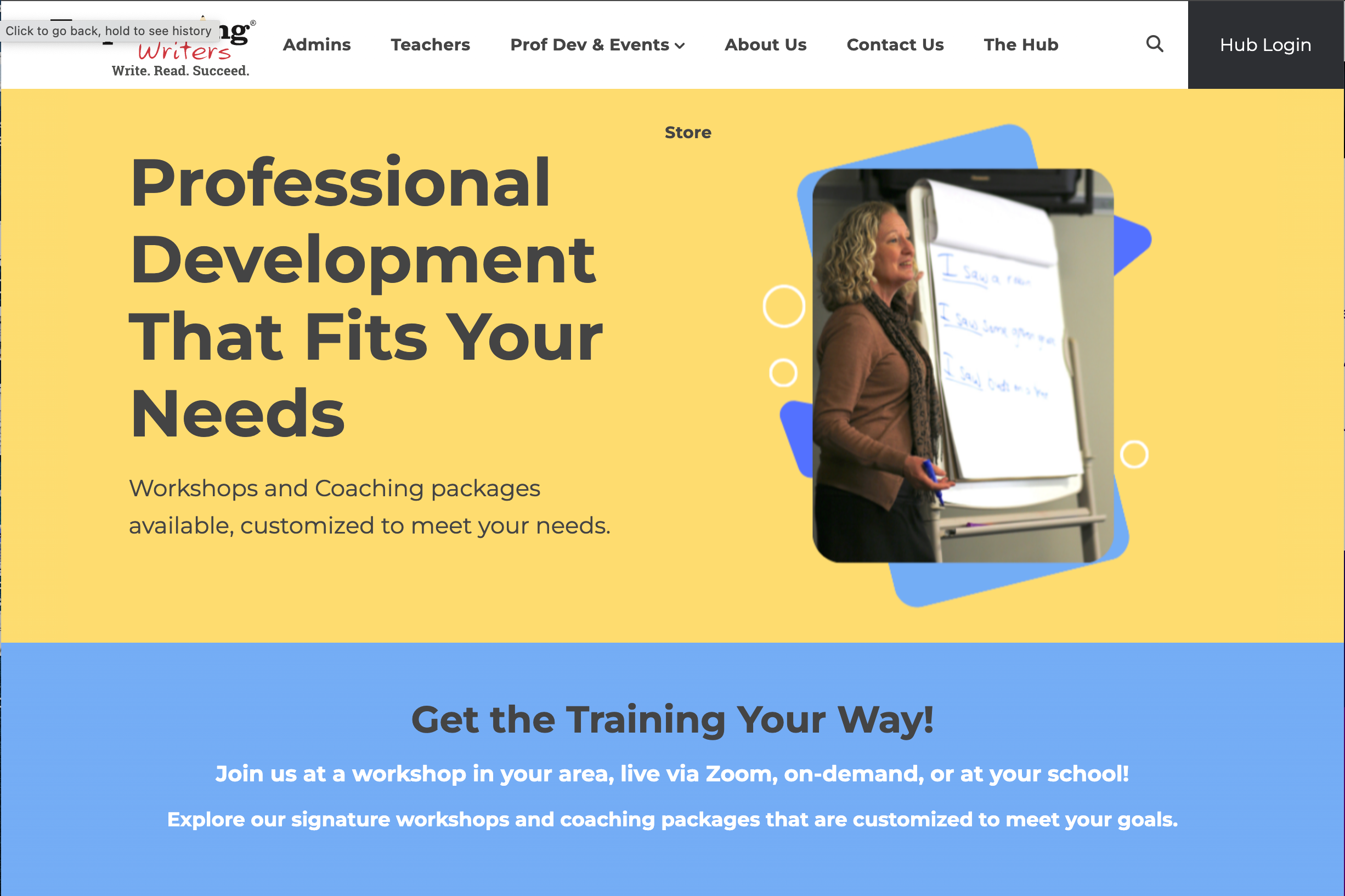
Image 2 appears when a user clicks “Learn More” in the hero section. This page provides a deeper look at what Empowering Writers sells and outlines their instructional methodology.
Mobile Version
In the original mid-fidelity version of the mobile site, I experimented with multiple layouts to order the information consistently and efficiently.
On the homepage I consolidated Workshops and Coaching under one heading: “Professional Development” for clarity, but users indicated they wanted separate sections with images for each type of PD.
I’d initially included the busy colorful school logo layout on the homepage as well, even on the mobile site. It was an asset the company had created for its site before I began designing updates. It did help me to figure out which school logos to put on the final homepage, though, when I later cleaned up the Partners section into a single line infinite scroll.
You’ll notice on the third screen (workshops) that the Upcoming Workshop cards have both a vertical and a horizontal layout.
The grade buttons in the store were initially quite large in the design, taking up a good portion of the screen so this was later refined.
Mid-Fidelity Wireframes

Once the basic structure was in place, I transitioned into mid-fidelity wireframes to refine the ideas and identify issues that hadn’t surfaced in the low-fidelity phase— since those early sketches lacked real content and copy.
User research revealed that most people preferred using the site on desktop rather than mobile. In response, I began shifting the primary layouts from mobile to desktop while still updating key mobile screens to maintain responsiveness.
At the start of the mid-fidelity phase, I focused on carrying forward user-friendly elements from the mobile version while refining layouts for clarity. For example, I preserved the dropdown that explains the recommended workshop sequence—helpful for new users—but kept it minimized so it wouldn’t distract those who already know what they’re looking for. On the Workshop Pricing page, I consolidated the extensive payment details under a “payment options” button to reduce visual clutter and make the page easier to scan.

Mid-Fidelity Testing
Several aspects of the initial design evolved during this stage to better support users.
The home page originally featured a visually busy grid of company logos to showcase Empowering Writers’ reach, but this was simplified into an infinite logo loop on the home page for clarity.
The workshop flow assumed that teachers paid for their own workshops (as the current site implied), but user feedback highlighted the need to adjust this to reflect schools and districts often making purchases.
In the store, filters were initially split across two pages—first grade level, then subject matter and language—but I recognized this added friction and moved toward a more streamlined, flexible filtering system.
Since many educators aren’t always sure which resources will best meet their needs, the EW team wanted to make it easier for them to connect with a salesperson for tailored guidance. To support this, I added a clear CTA in the hero section, encouraging users to reach out for personalized support.
Branding and UI Design
With the structure locked in, it was time to give the designs some personality. Empowering Writers already had a strong visual identity—bright, confident colors that spoke to both education and empowerment. But the site needed more than just color; it needed a look that felt uniquely theirs. I brought in the flowy, organic shapes from their promotional materials to soften the layout and add movement. The result was a design that felt true to their brand while standing apart from the boxy, rigid feel of many competitor sites.
Before

After
High-Fidelity
This video is a quick scroll-through of the home page. To view the full prototype, click the purple button below.
The organic shapes on this page aren’t decorative—they’re designed to guide the user’s eye naturally downward, encouraging continued exploration.
I laid out these cards vertically so that as users scroll, the section title “What we do: Professional Development and Resources” remains visible, guiding them to the most important content.
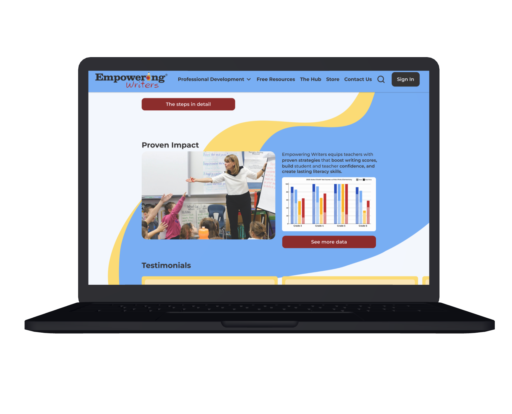
I custom-designed the graph using Empowering Writers’ data to provide a clear, evidence-based visual that builds trust by showing the method is tested and proven effective.
Finally, the scrolling logo section highlights the many companies Empowering Writers has partnered with. By animating this as an infinite scroll, users get a strong sense of scale and credibility without being visually overwhelmed.
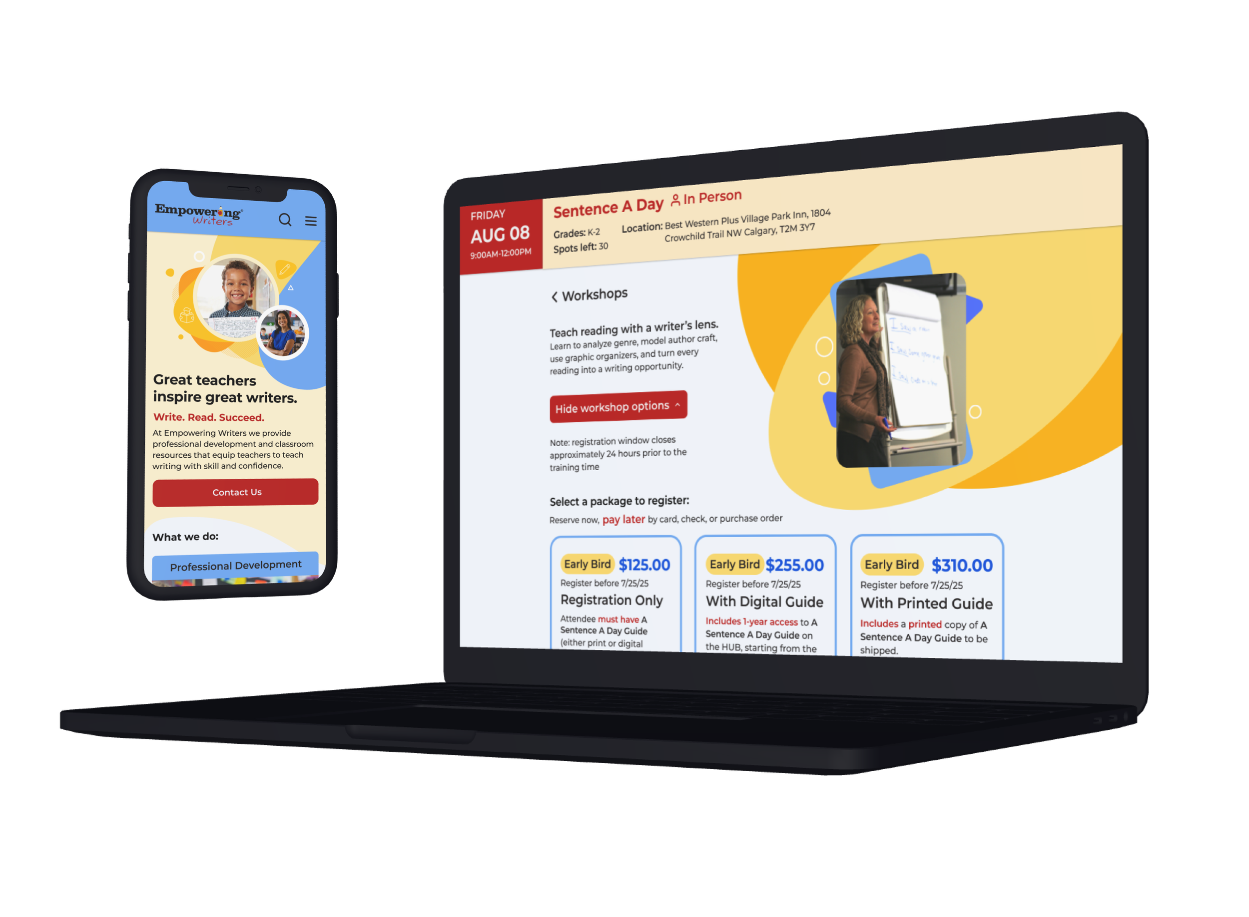
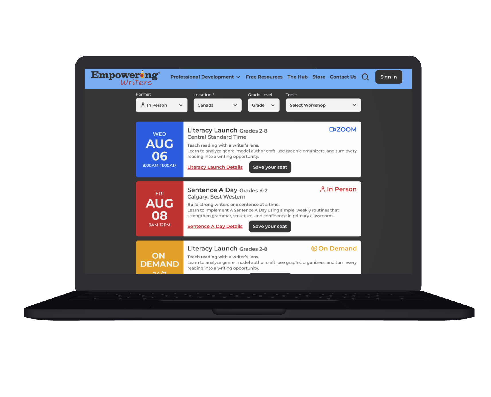
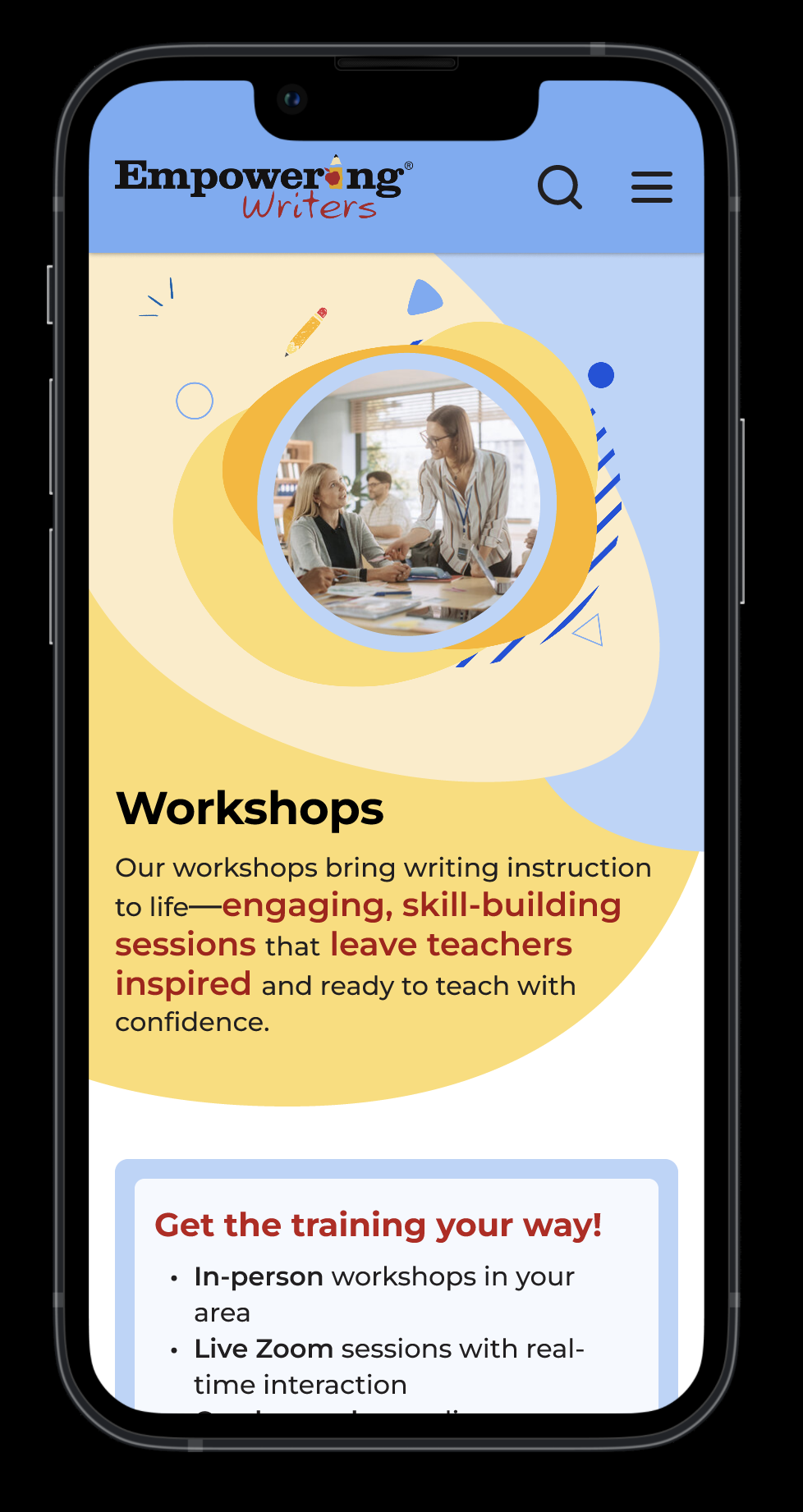
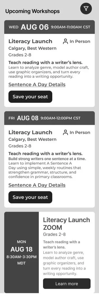
The Workshops page (left) uses a clean, simple layout designed for easy reading. The page dynamically expands with the dropdown, while the black background was a deliberate choice to keep focus on the workshops. After testing alternatives, black proved the most effective for drawing user attention without distraction.
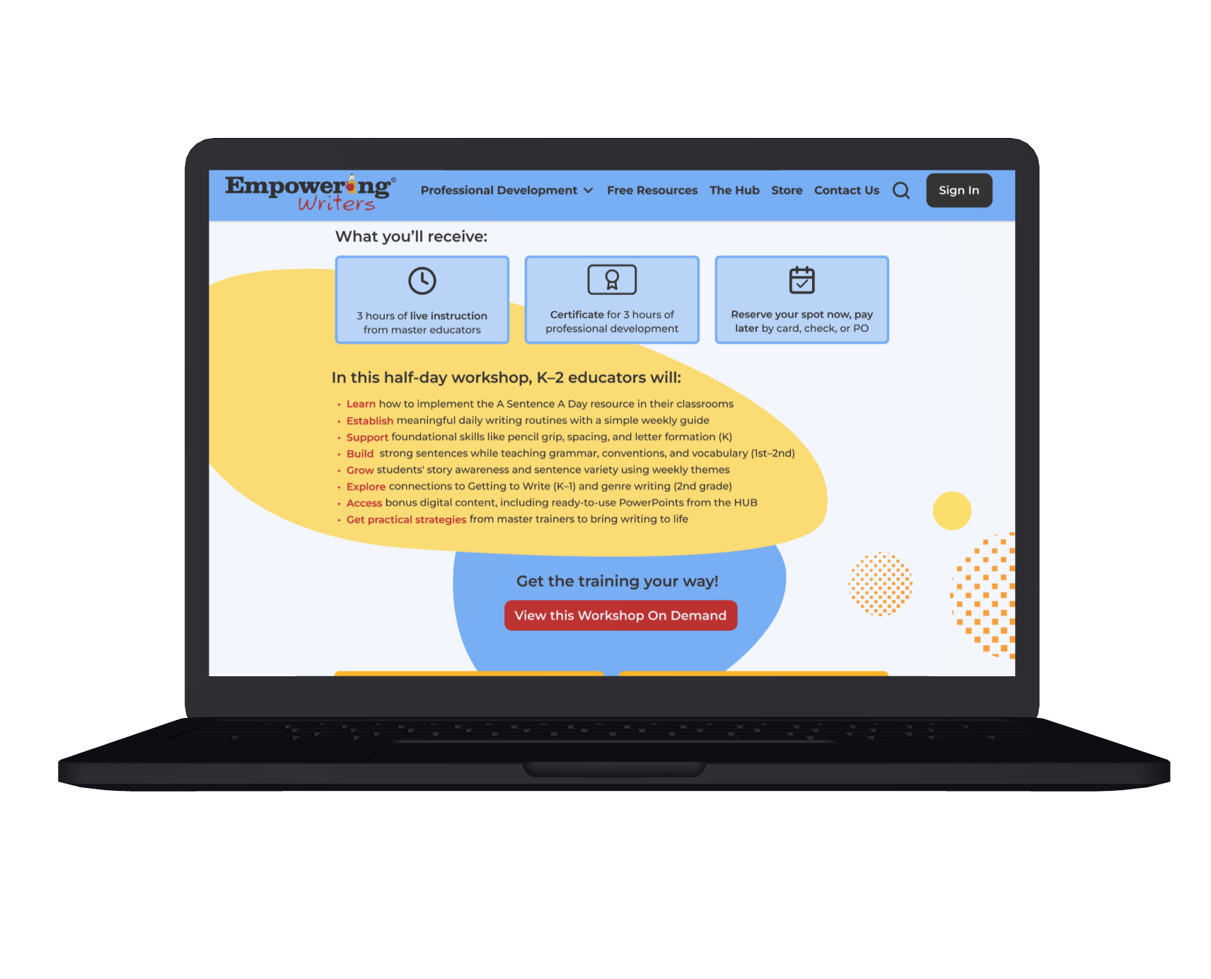
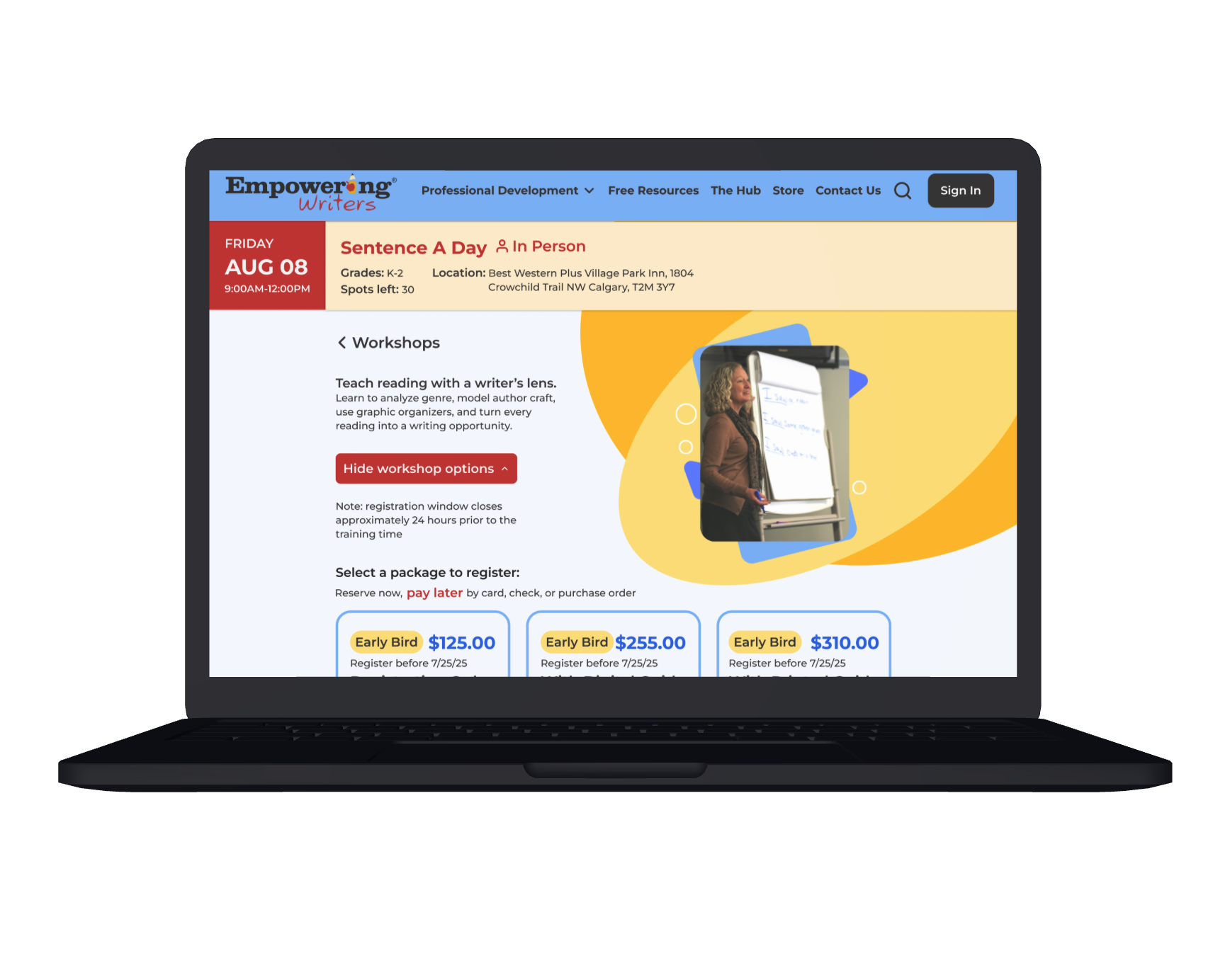
The Sentence A Day workshop (right) shows pricing options revealed through a dropdown. Hiding them by default reduced visual clutter and helped prevent users from feeling overwhelmed. Key details were highlighted with background shapes and colors to direct attention where it mattered most.
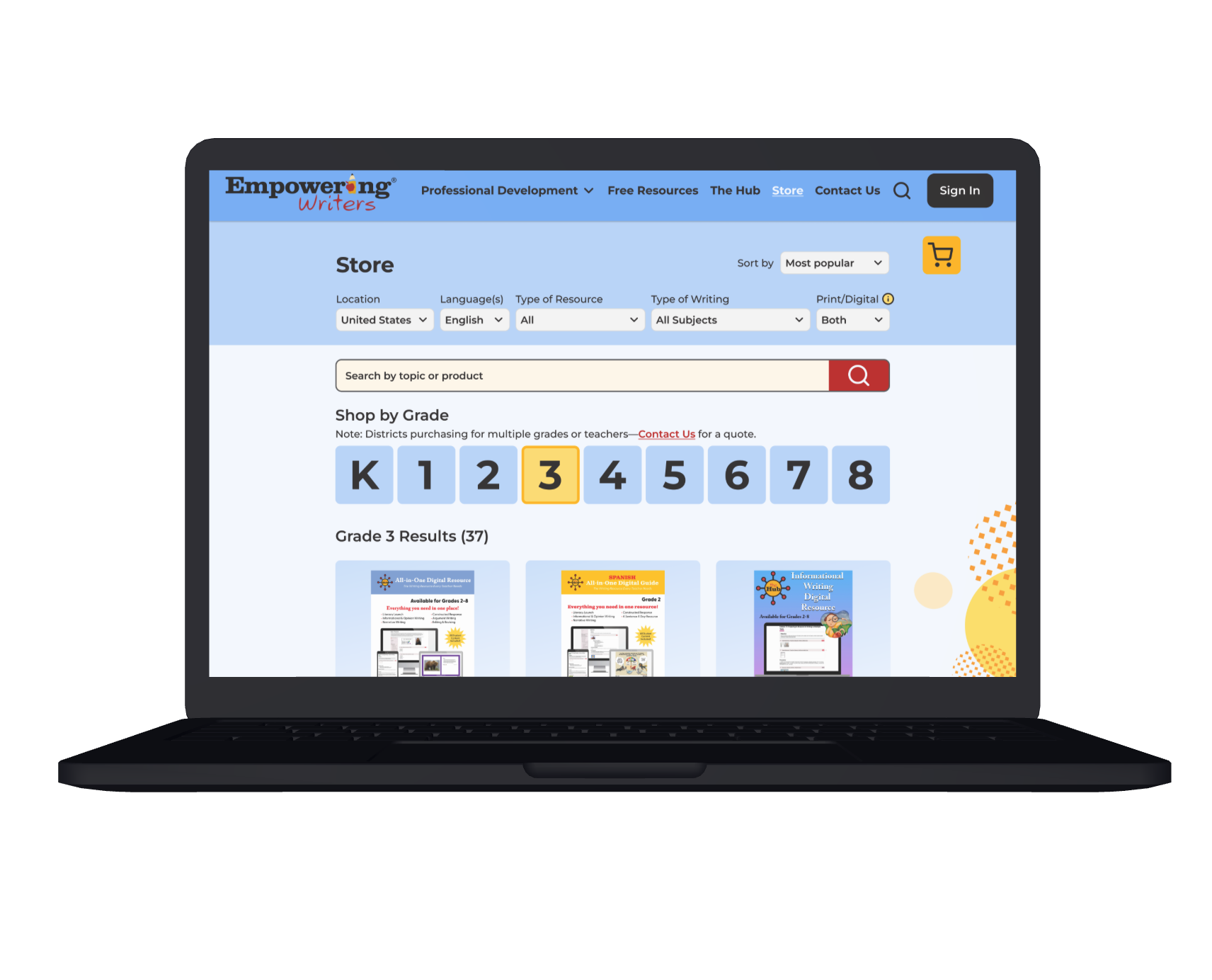
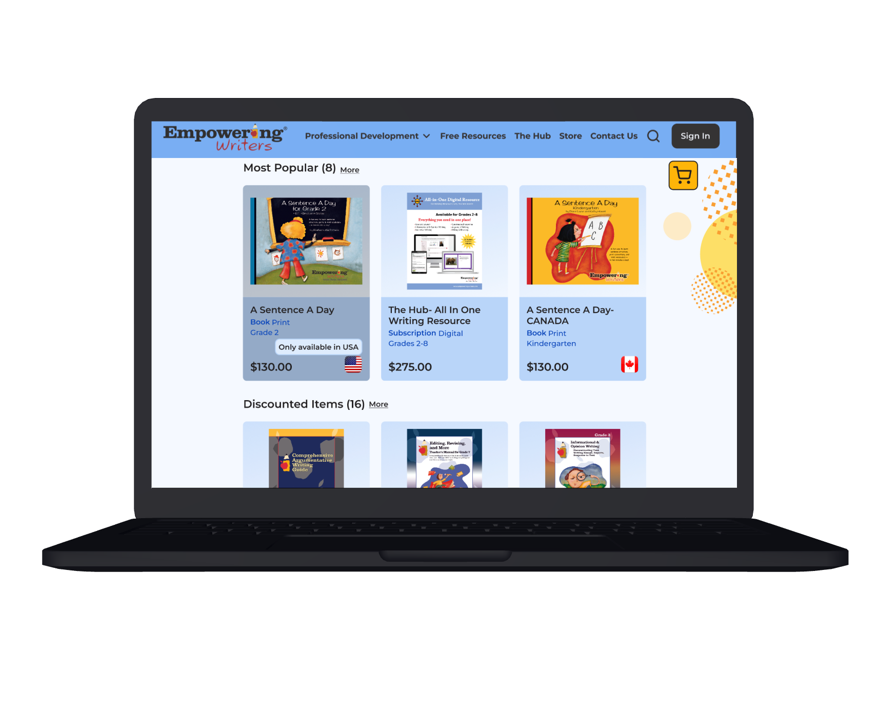
The Store page (left) is organized systematically to match user expectations. Filters are ordered based on how users naturally group items, while products are prioritized according to Empowering Writers’ goals: customer demand, product usage, and items the team wanted to highlight. This approach ensures users can find what they need quickly while emphasizing key offerings.
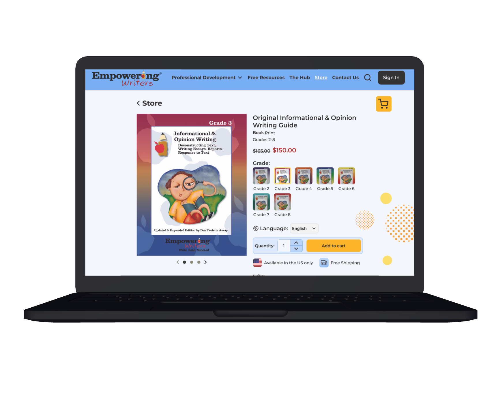
For the Product page (right), I’d originally planned a simpler layout, but I shifted focus to a product with the most UX/UI needs to optimize the design. The page includes filters for grade and language and clearly indicates sale items. “Available only in the US” and “Free Shipping” are separated to avoid confusion between product availability and shipping costs. The colorful shape around “You may also like” draws attention to complementary products, encouraging further exploration.
Although I created the mobile sketches first, I designed the desktop in high fidelity before moving on to mobile, then adapted those layouts for mobile. Most design elements translated smoothly, but the hero sections on the homepage and workshops page required new image backgrounds, since the original designs didn’t scale effectively to a vertical format.
Mobile Screens:
User Prototype Testing
I tested the high-fidelity prototype with five users over Zoom. I had Zoom users share their screen with me and click through my prototype while articulating their thoughts to get as many insights as possible.
Iterations
Overall this round of testing went very well. There were only two major updates I needed to make after testing:
Users overlooked the “don’t see your location? Contact us.” message. So I had to find a way to make sure they couldn’t miss it. I solved this problem by adding an “other” option to the location filter. When someone clicks it, a pop up message will appear which tells users to contact the team to see if they can get a workshop in their location.
Some users were still confused about the workshop sequence since the order wasn’t completely linear. To solve this, I redesigned the dropdown explanation to make the progression crystal clear. After confirming the details with two EW team members, I transformed the information into a clean, easy-to-read infographic in Figma—turning a point of confusion into a quick visual guide.
I also introduced smaller refinements, like adding hover states to the store page flags so their meaning was instantly clear, and replacing the vague “add item” button with a familiar quantity dropdown next to “add to cart” for a smoother shopping experience.
Final Version:
Outcome
The results of these changes were both immediate and encouraging. Every user who tested the redesigned site agreed it felt more intuitive and easier to navigate, while EW team members praised the updates and even shared them with colleagues—clear validation that the redesign delivered both functional and professional impact.
On a personal level, this project pushed me to expand my design toolkit. I learned new techniques like creating an “infinite scroll” animation for partner logos and using Absolute Positioning in Figma to keep navigation steady while expanding dropdowns. I also relished the challenge of incorporating organic, creative shapes into the site without sacrificing clarity or professionalism.
My biggest takeaways:
Every detail contributes to the overall experience.
Sometimes design needs to be bold and obvious to guide users effectively.
Subtlety, restraint, and legibility are just as essential—balancing creativity with simplicity.
De-saturated colors, white space, and thoughtful font hierarchy are powerful tools for usability.
Next Steps
While I was able to redesign the MVP, the next step would be extending these structural and design improvements across the entire site for consistency and clarity. My immediate priority would be the Coaching page—the third major offering from EW—followed by a deeper dive into the HUB free trial experience.
One EW team member mentioned that while many teachers sign up for the 7-day free trial, few convert to paying customers. Since educators I interviewed spoke highly of the HUB itself, this suggests the issue lies in how the trial is set up or presented. Investigating and redesigning that flow could have a significant impact on conversions and would be a natural next focus.
Want to see more from Kyla?
I draw, too! :)
(See image below)