Enabled Talent
Creating an Accessible Path to Employment with Enabled Talent
Enabled Talent is an accessible job-finding platform designed for job seekers with accessibility needs, especially those with vision impairments. The app connects candidates to roles that fit their skills and experience, while ensuring the job search process is inclusive, transparent, and WCAG-compliant.


Background
Project Type:
Mobile-First Responsive Website
Product Design, UX/UI Design, Research, Information Architecture, User Flows, Prototyping, Testing
Role:
Timeline:
7 weeks
Tools:
Figma, FigJam, Google Docs, Google Sheets, Zoom, Calendly
Team:
Collaborated with fellow product designers Joyce Hoang and Emily Zhao
The Problem:
Enabled Talent envisioned a job-finding platform where every candidate, regardless of accessibility needs, could confidently pursue their career goals. For many job seekers with disabilities, traditional job sites create barriers—whether through inaccessible design or a lack of employer support. Enabled Talent wanted to change that by matching candidates with supportive employers while ensuring the platform itself was fully accessible. However, they faced challenges: limited access to target users for research, uncertainty around international hiring regulations, and no clear path to execution. That’s where our team came in—to help transform their vision into a workable, inclusive solution.
User Goals
Quickly build a complete profile by uploading a resume and editing details
Control visibility and choose what information employers can see
Track interview requests and job matches in one place
Understand profile strength and access resources to improve it
Trust that matches are relevant, high-quality, and account for accessibility needs
Business Goals
Increase the number of user profiles created
Boost retention by keeping job seekers engaged (with relevant match notifications and other assets the app has to offer)
Improve the match-to-interview conversion rate
Increase employer satisfaction with candidate matches to drive adoption
Technology Considerations
Use accessible code so screen readers can correctly read and announce content for users with vision impairments
Add scheduling tools so job seekers and employers can coordinate interviews directly on the platform
Strengthen AI features to give users personalized feedback and resources for improving their profiles and skills
Research
Our research aimed to understand how individuals with different abilities navigate the job search and what challenges they face along the way. By uncovering our users’ pain points, we sought insights to design a job-hunting experience that is easier, more accessible, and inclusive for all users.
Research Goals
Click image to enlarge.
Heuristic Analysis
Job Access Before Sign-Up: Interviews revealed that users want to preview job listings before creating an account, but the current design blocks this, creating a barrier to engagement.
Accessibility Gaps: Missing alt text, low-contrast text, unclear page hierarchy, and vague button labels create significant challenges for users with vision impairments and screen readers.
Confusing Language & Navigation: Terms like “For Talent” are unclear, and core actions (like “Get Started”) misroute users to login instead of sign-up, leading to repeated errors.
Form & Error Handling Issues: Error states lack clear instructions or visual cues, input fields don’t meet WCAG size/contrast guidelines, and confirmation messages often disappear too quickly.
Onboarding & Resume Upload: Requiring a resume up front, with no explanation, deters new users. The process lacks progress indicators, hierarchy, and flexibility (e.g., multiple resumes, drag-and-drop).
Profile & Accommodations: Profiles are incomplete (missing education, bio, privacy settings), and there’s no way to edit accommodations later—critical for users whose needs may change.
Help & Messaging: Support features are difficult to find, example questions are misplaced, and low text contrast makes communication tools hard to use.
To better understand the market, we analyzed Enabled Talent alongside four competitors: LinkedIn, Inclusively, Lime Connect and Ability Jobs. These were the key findings:
LinkedIn: No accommodation filters; keyword workarounds produce unreliable results
Lime Connect: Overwhelming signup flow with long forms, many personal questions, and a visually busy interface
Ability Jobs: Large inventory (nearly 1M listings) which shows market demand, but the experience is transactional with minimal matching or guidance; onboarding misses essential information and lacks accommodation-aware tools
Inclusively (closest competitor): Streamlined three-step signup, robust “success enablers” accommodation tags, plus an employer analytics product that tracks benefit usage and retention
Competitive Analysis
We conducted a heuristic analysis of the existing website alongside user interviews to identify pain points and usability issues.

Overall takeaway: While the platform shows strong potential, its current design creates major accessibility barriers and usability frustrations. Addressing these issues—especially around accessibility standards, clearer navigation, and a smoother onboarding experience—will be essential to building trust with job seekers and ensuring inclusivity.
User Interviews
Total: 5 volunteers with prior experience using job-seeking platforms

Gender: 2 men, 3 women

Age Range: 28–65 years old

Accessibility Insights: Some participants had knowledge of how people with disabilities adapt to desktop, tablet, and mobile interactions, including vision challenges (contrast sensitivity, larger text needs)


In our initial interviews, we asked participants about their job-seeking experiences and their perspectives on accessibility—both personally and through others they know. We then observed them navigating the current website, focusing on the sign-up process, profile creation, and the career coach feature
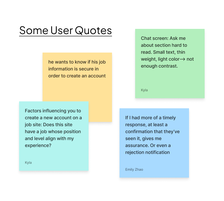
We sorted all of the data into an affinity map:
Key Research Findings
Relevance and Efficiency Drive Engagement
Users need job filters and recommendations that truly match their preferences.
A faster, simpler onboarding process keeps them engaged.
Trust and Transparency Are Essential
Users want platforms they can trust.
Clear, honest communication builds confidence.
Accessibility Benefits Everyone
Readable, high-contrast designs and adjustable text sizes improve usability for all.
Control and Clarity Build Confidence
Users want to decide what profile details employers see.
Clear labels and well-structured forms reduce confusion.
Communication and Human Touch Matter
Human interaction and employer communication make users feel supported.

We created two personas using the information we gleaned from user interviews. These personas ensured that we empathized with and designed for our users throughout the design process.
Personas:
User Journey Map
We created a user journey map using contextual interview data to determine how our two personas would experience the existing website. Our key considerations:
Onboarding shapes first impressions. A smooth, intuitive flow reduces friction and helps users feel confident from the start.
Privacy controls build trust. Users need clear signals about what information is visible, hidden, or adjustable at every step.
Accessibility must be embedded. Interfaces should follow core accessibility standards, with particular attention to screen reader compatibility.
Flexibility supports real needs. Users want seamless ways to update resumes, manage profiles, and explore multiple career interests without disruption.
The journey map’s “Feelings and Thoughts” row reveals a largely negative user experience, prompting deeper analysis to understand the causes and inform effective design solutions.
Problem Statements
We created this chart by synthesizing insights from user interviews. These insights were distilled into clear user needs, which then guided the development of problem statements and “How might we” questions to shape our design direction.
User Problems
-

Control of Information
Users want to decide what information they share, what jobs they see, and what employers can view on their profile. They also need flexibility to avoid redundant or irrelevant application steps, especially when time is limited.
-

Feedback & Communication
Users value feedback—both from employers and directly from the platform—to help them improve their profiles and job applications.
Prioritized Features
We prioritized features by focusing on those that addressed the biggest user pain points while balancing design effort, resulting in eight “Must-Have” features.
Inclusive design system (WCAG, basic semantic HTML, etc)
Both Dani and John will face less difficulty interacting with and understanding the site, and they will be less likely to abandon it due to frustration.
Feedback from computer (error, success states)
John will understand why his interactions are not performing as he intended and be able to easily solve the problem.
Resume upload that auto-fills
Dani will save valuable time setting up her profile by using a document she already created to fill out her information.
Secure sign up and log in
Both John and Dani will trust this website with their information and feel safe and supported signing up for this app.
Privacy and visibility controls
Dani and John will feel secure entering all of their information knowing that the system will use it to help match them to a job, but employers don’t have to see every detail on their profile.
Personalization of career interests, accommodations and job preferences
John and Dani will be able to specify exactly what they need from their job and find the perfect fit for them.
Professional profile page (ability to edit, change, add skills) will aid them in this quest.
Resources for the user to better their profile/resume (career bot)
Dani and John won’t feel lost in between matches from employers. They will know exactly what to do- improve their profile- and how to do it based on personalized suggestions.
Matches/Interview Invites
John and Dani receive interview invites for roles that match their skills, experience, and accommodation needs—helping them discover opportunities that could lead to the next big step in their careers.
Information Architecture
Sitemap
We started with the structure of the existing product but adapted it to reflect user research insights, integrate new features, and optimize the experience for a mobile application rather than a desktop site.
This sitemap went through several iterations as the product vision evolved—from a LinkedIn-style job application process, to a match-based approach similar to dating apps, and ultimately back to a refined job application platform. Below is an earlier version that ended up helping to shape the final design.
User Flows
We began by mapping the flows from the user’s perspective—considering how they would navigate the site, what obstacles they might face, and what alternate goals they might pursue.
Sign Up and Onboarding
Click image to enlarge.
This flow was designed to be simple and intuitive. The main challenge was balancing the need to gather accurate user information for strong job matches while keeping the process quick and engaging, rather than overwhelming.
Initial Flow: Job Search and Discovery
Click image to enlarge.
This flow was designed to help users quickly find relevant jobs through fast search and customizable saved filters, making it easy to adjust and revisit their preferences.
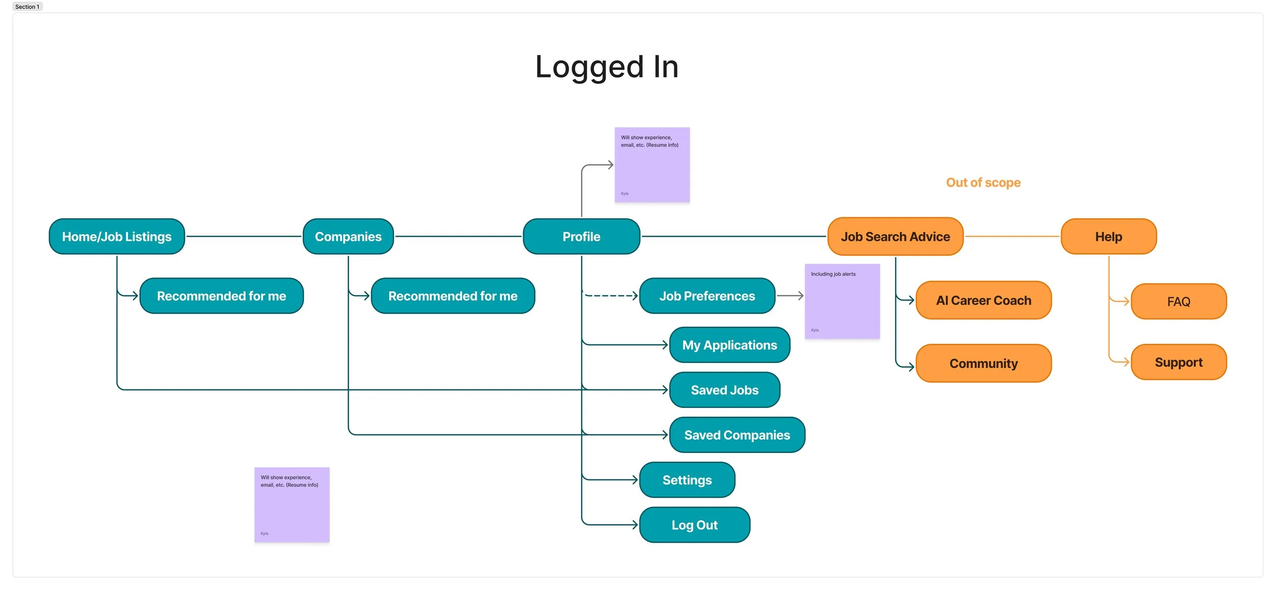
Updated Flow: Job Search and Discovery
Click image to enlarge.
After the client shifted toward a match-based job tool rather than “another LinkedIn,” we created a flow that mapped the user’s experience when receiving a job match—covering how notifications appear, what job details are shared, and how users can respond to interview offers.

Design
Low Fidelity- Select Screens
To maximize ideation, each team member sketched at least one version of every flow. We then came together to review, discuss, and combine the strongest ideas for the next phase.
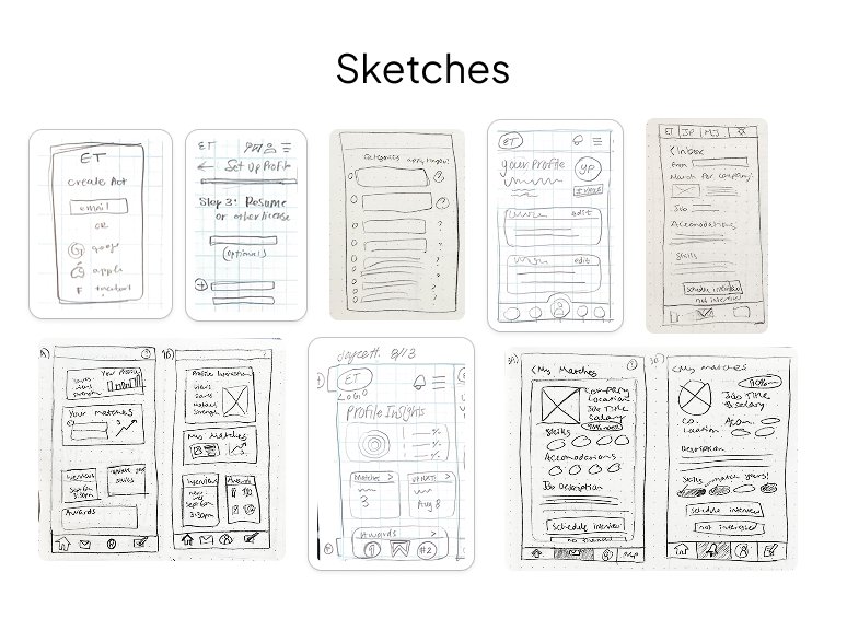
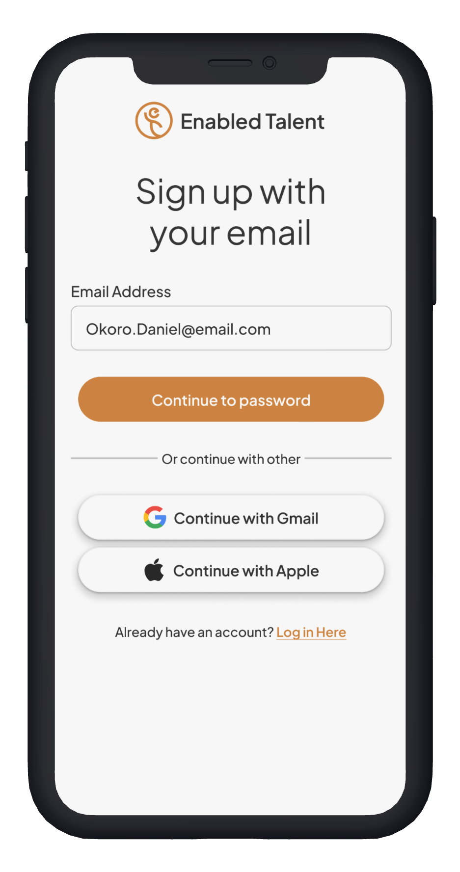
The top-left screen shows the app’s login page, including social sign-on options for quick access.
The second screen represents Step 3 of profile setup, where users enter their résumé details and qualifications such as licenses.
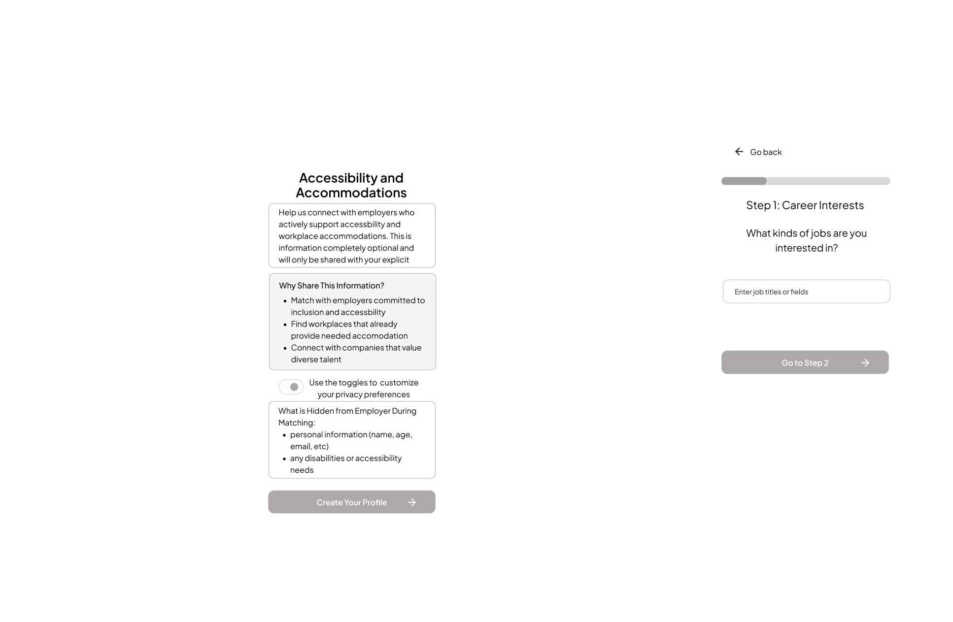
The third screen originally asked users to select categories of accessibility needs. However, after research, we learned this approach was not legally appropriate in the U.S., since candidates cannot be required to disclose disabilities to potential employers online—so this flow was redesigned.
The fourth screen is a user’s profile page.
The fifth screen shows an interview invitation message from an employer, giving candidates a clear next step.
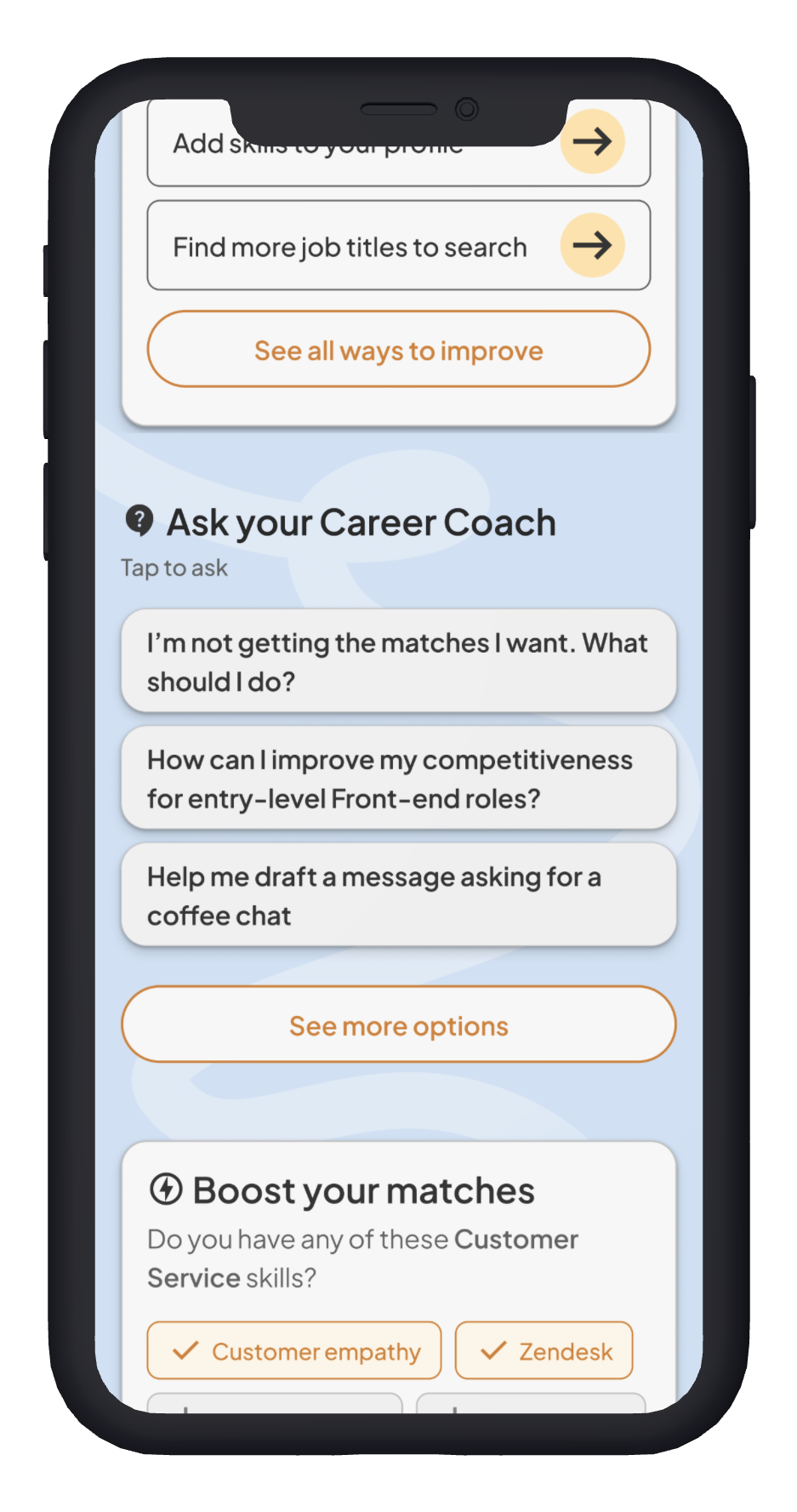
The sixth screen (bottom-left) is a proposed home page design. It helps users take action beyond waiting for matches—strengthening their profile, browsing daily job tips, or chatting with an AI career coach for guidance.
Screens 7 and 8 show alternative layouts of the home page concept.
Screens 9 and 10 are variations of the interview invitation message, with added context such as how well the role matches the candidate’s skills and accessibility needs.
Mid-Fidelity Wireframes
These mid-fidelity wireframes brought together the strongest ideas from our low-fidelity designs, representing our best organizational and user engagement strategies. While each team member took ownership of a specific flow—I focused on job matching and notifications—we collaborated closely across all flows, providing feedback, design input, and later, prototyping support.
To ensure our wireframes felt cohesive and represented a single product, we established a design system early in the process. This included consistent font styles and preliminary color styles, which we applied as soon as we began designing in Figma.
User testing revealed that, although the wireframes were functional and well-structured, they felt a bit too utilitarian—more “here’s the information” than an enjoyable, engaging experience. This feedback highlighted the need to inject more personality and delight into the design as we moved toward the final product.
Mid-Fidelity Testing
-
![]()
Onboarding Feedback
-
![]()
Home Page Feedback
-
![]()
Job Match Page Feedback

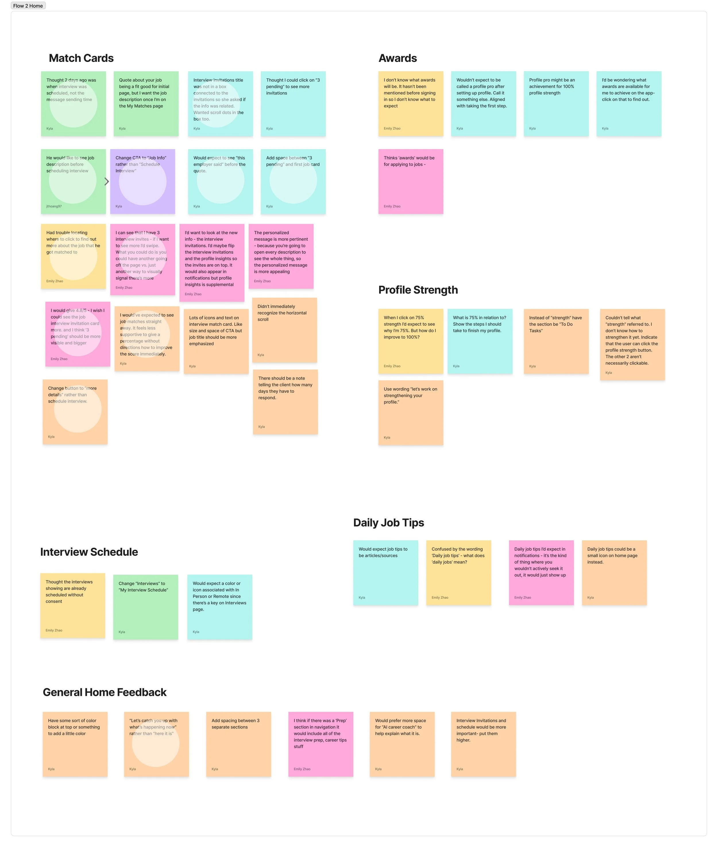
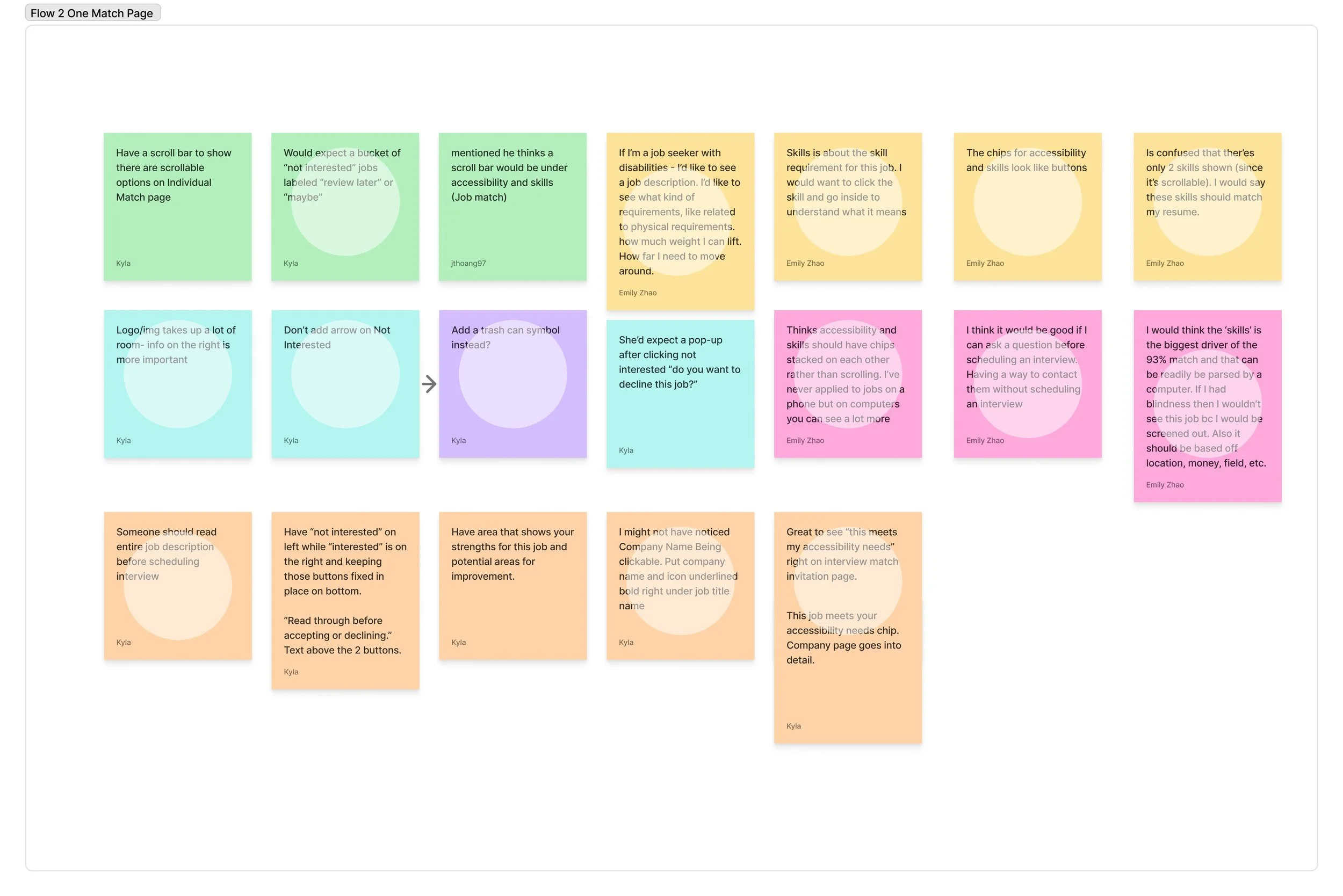
Key Mid-Fi Testing Insights
Onboarding
Clearly explain the platform’s unique approach (matching vs. applying) to build trust and preserve user agency.
Shorten onboarding with skips or progressive disclosure.
Encourage users to input accommodations (vs. free text or disability labels) and clarify how this data impacts matches.
Ensure skills are captured accurately from resumes and prompt users to add more over time.
Job Invites
Highlight when a job meets the user’s accommodation needs.
Emphasize previewing job details before scheduling interviews.
Provide a way to revisit jobs previously marked as interested or declined.
Add safeguards like undo options and feedback prompts when users mark “not interested.”
Allow users to track interviews.
Skills & Matching
Increase transparency by showing how skills and accommodations influence matches.
Replace vague match percentages with skill-based indicators (e.g., “8 of 10 skills matched”).
Prompt users to strengthen profiles by adding relevant skills.
Career Coach
Expand the AI chatbot to guide users in improving their match quality, preparing for interviews, and understanding how to get better results—making the platform feel less like a “black box.”
Mid Fidelity Feedback in Note Form

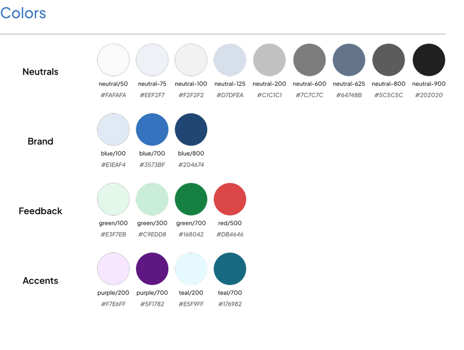
Branding- Colors
This project went through three different color iterations. The company already had branding on their website, but user testing had determined that their palette needed a little more contrast in order to truly be considered accessible.
Version 1

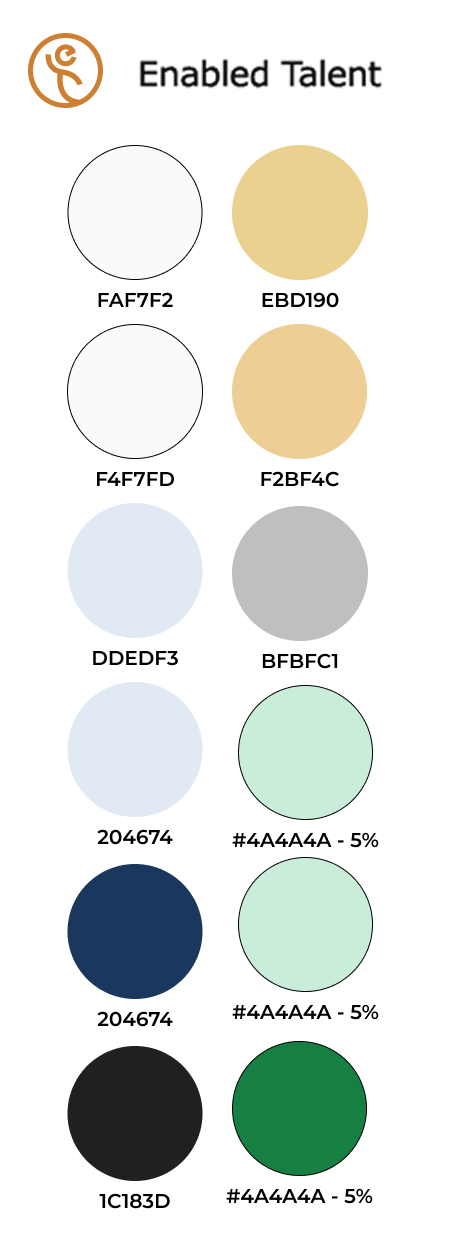
Our initial color palette drew inspiration from Enabled Talent’s existing branding. We deepened the primary blue for a more professional feel and softened the orange-yellow into a warmer wheat tone, creating a look that balanced professionalism with approachability.
Version 2
Some testers responded positively to the initial palette, but one teammate raised a concern that the blue might appear almost black from a distance. She shared her perspective with us over Discord and introduced a new color variable system in our Figma file, which the rest of us implemented across our assigned screens.
This adjustment improved color readability, but it also introduced a new challenge: the revised blue closely resembled shades already associated with major brands like Google, Walmart, LinkedIn (a direct competitor), and even Oreo.
When we presented this version to the client, they questioned the shift in direction. In an earlier meeting, they had emphasized wanting to stay close to their established branding unless changes were necessary for accessibility. Since this palette deviated a bit too far from that guideline, they asked us to explore alternatives.
Version 3- Final
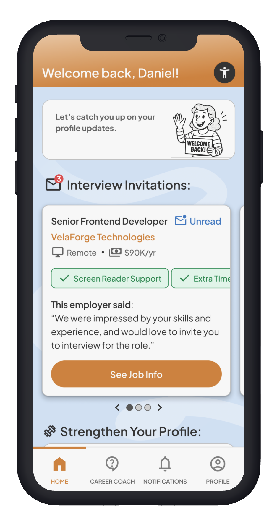
We took one more pass at the colors, using a different mode on the same color variables to speed up the re-coloring process.
This final version stayed truest to the brand’s original palette, with subtle edits for legibility and contrast. The refreshed blue conveys balance and trust, while the softened orange adds warmth, energy, and creativity. Together, the colors delivered a professional yet approachable look—honoring the client’s branding while improving accessibility and user experience.
Branding - Logo
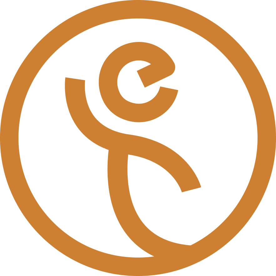
Enabled Talent had already developed their logo before our collaboration and had no intention of changing it. The design cleverly uses a head shaped like an “E” and a body shaped like a “T,” together forming the image of a person raising their hand in triumph. This aligns well with Enabled Talent’s core values of inclusion, accessibility, diversity, and empowerment—they focus on recognizing ability, removing barriers, and giving overlooked professionals a platform. It’s a simple yet thoughtful concept that reflects both the company’s initials and its mission.
Branding - Images

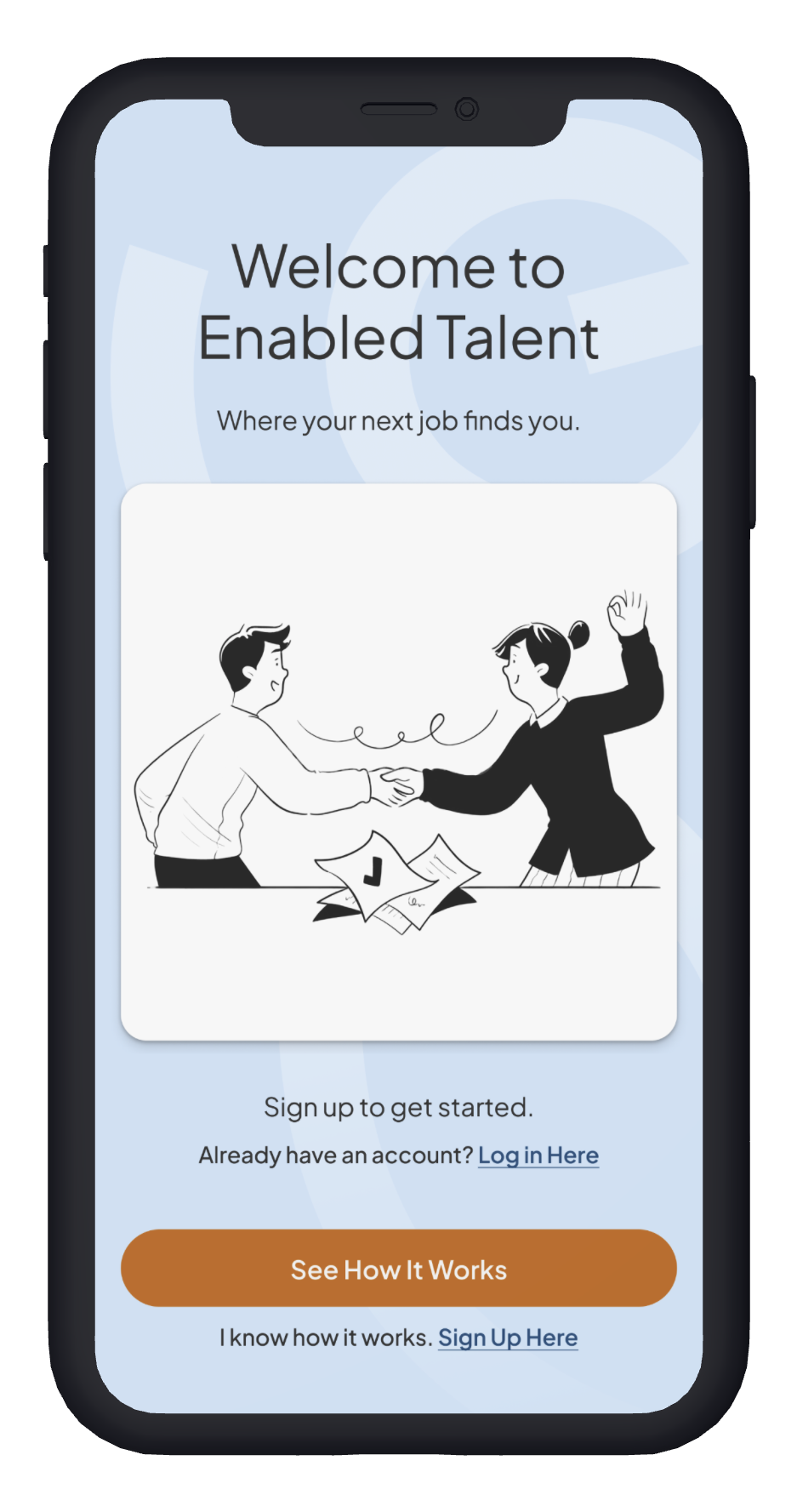
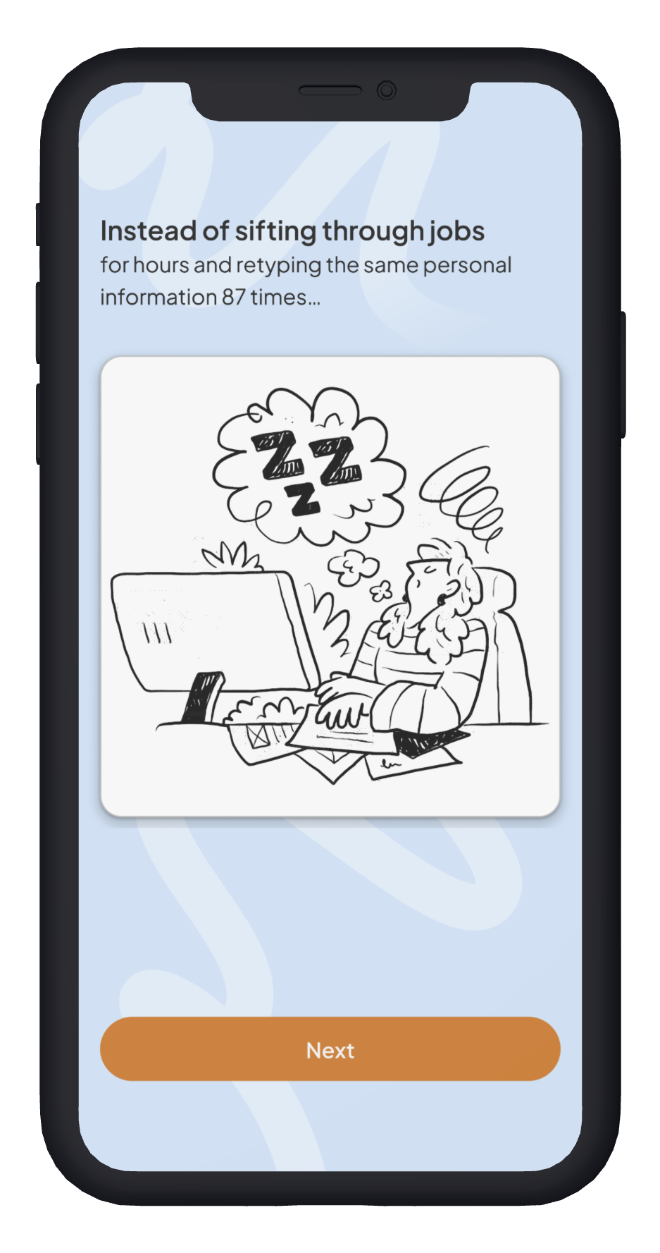
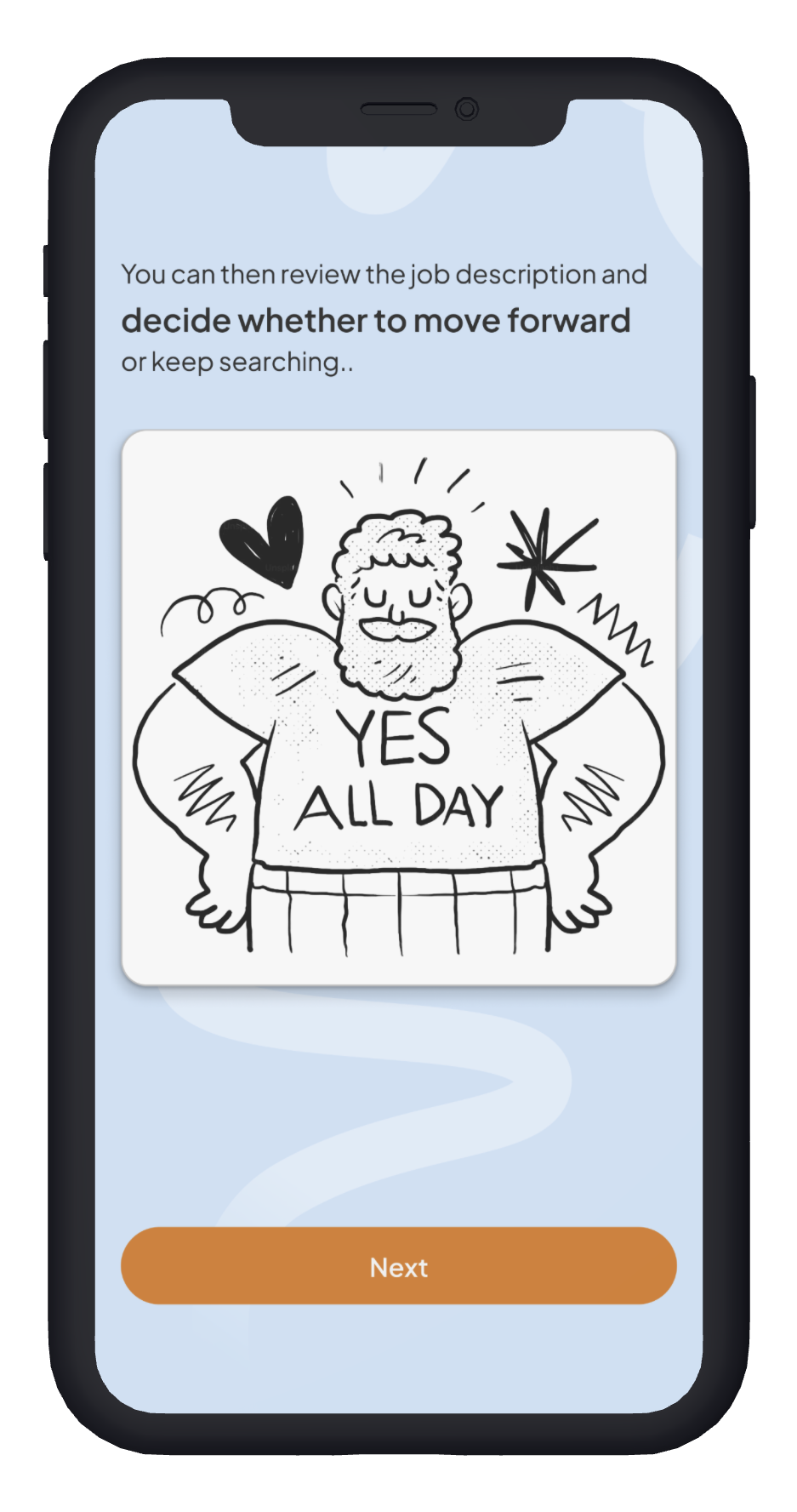
The imagery style for this project began with the challenge of helping users quickly understand what Enabled Talent is—and what it isn’t. Early user tests revealed that participants often mistook it for another LinkedIn, so we designed a pre-onboarding flow to clearly explain how the app works in a fun, approachable way.
As an illustrator, I initially sketched concepts that captured the playful yet professional tone we were aiming for. However, given the tight project timeline, I decided illustration wasn’t the most efficient use of our time. Instead, I searched for royalty-free visuals that aligned with my sketches and discovered a set from Getillustrations that perfectly reflected the energy I’d envisioned.
When I incorporated these illustrations into the pre-onboarding flow, my teammates responded positively—and user testing confirmed that the visuals helped make the app feel both engaging and accessible. We extended this imagery across the product to create a cohesive, consistent experience.
UI Kit
Our UI kit was comprehensive, covering components, spacing, grids, corner radii, and more. We documented every detail to ensure consistency across the design system. For a closer look, explore the Figma file here: https://www.figma.com/design/hNiXiCgDhZND2eC4wTWtH9/Enabled-Talent?node-id=2559-63738&t=k8GUq3nc5W9FbmNi-1
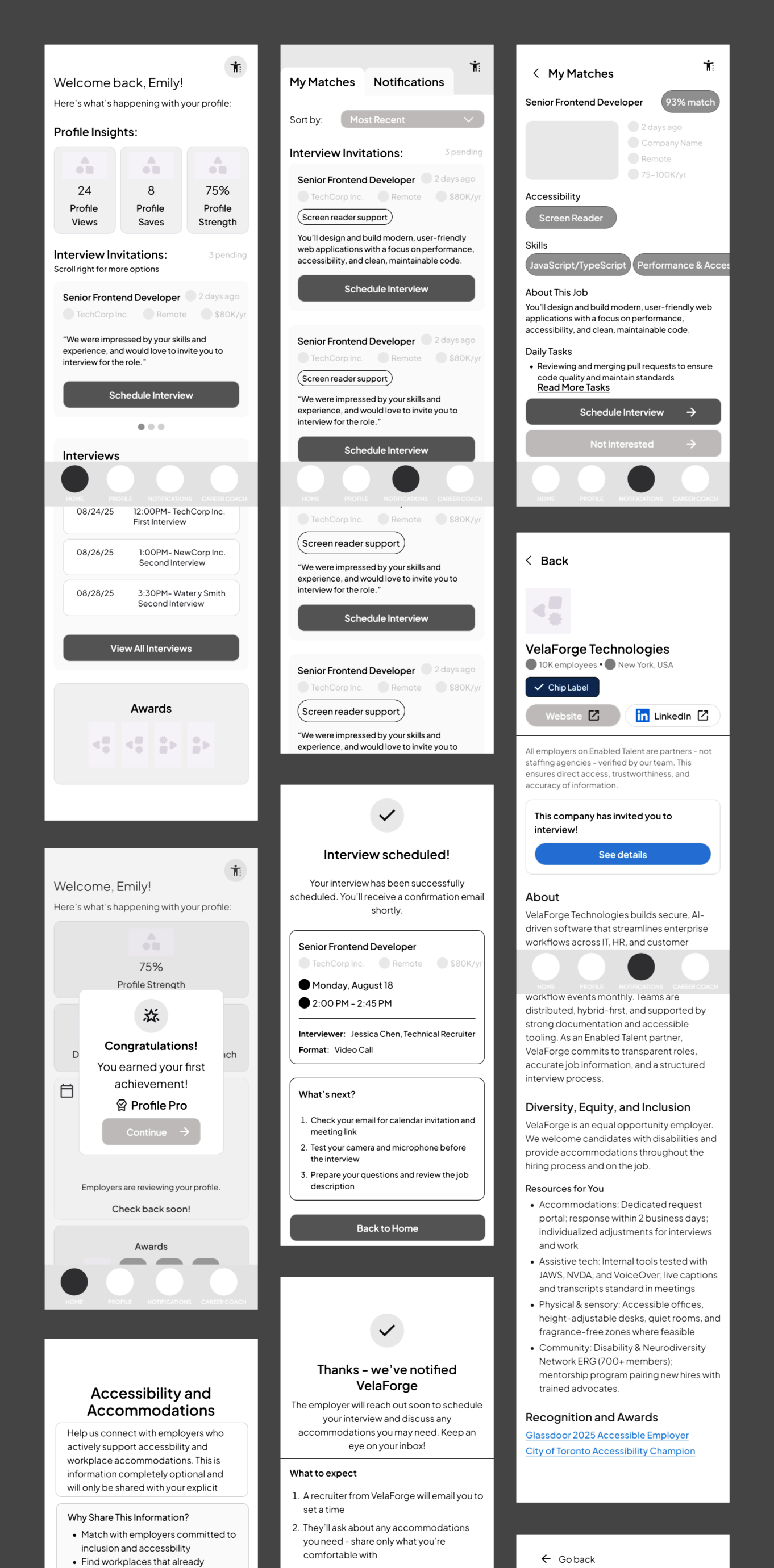
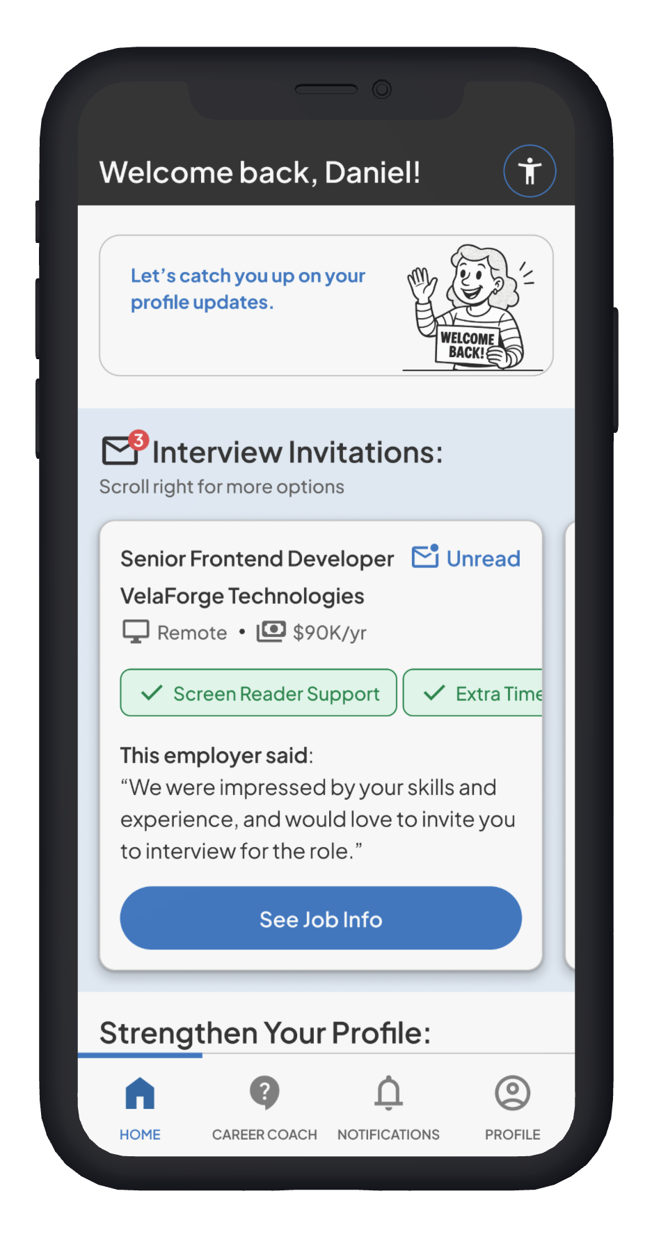
High-Fidelity Wireframes (Version 1)
As a team, we created dozens of high-fidelity screens, each shaped by our collective input. Since there are too many to showcase here, I’ll highlight six screens where I played the most significant role in their design.
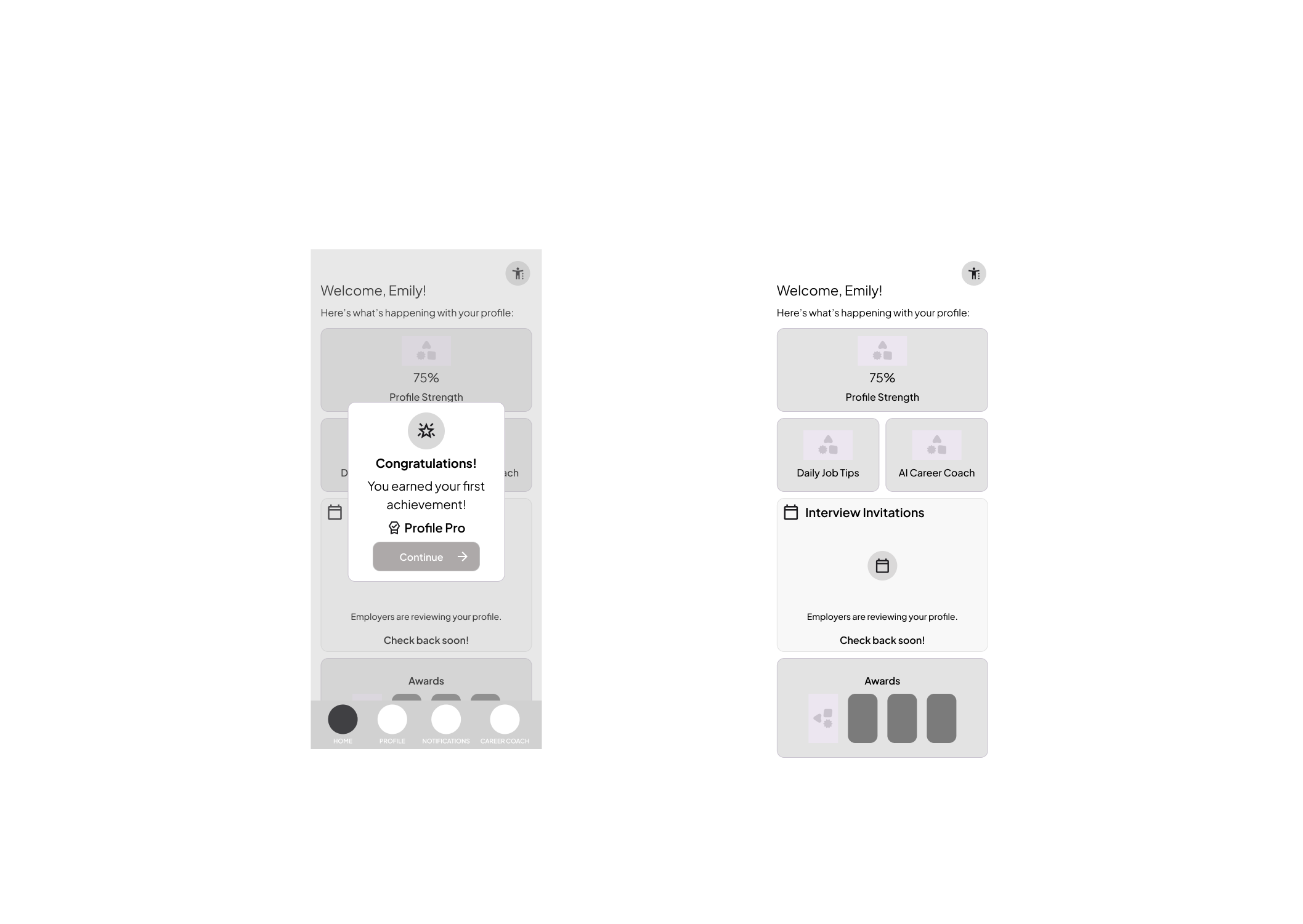
This is one of our pre-onboarding frames. Based on user feedback, I later digitally edited the character so he looked happy about the invitations rather than surprised—small details that made the flow feel more welcoming.
I designed this page to let users improve their job matches by sharing why they declined an interview invitation. This feedback helps the system adjust to their needs. I later added a skip option for users who didn’t have time to provide input but still wanted to move forward quickly.
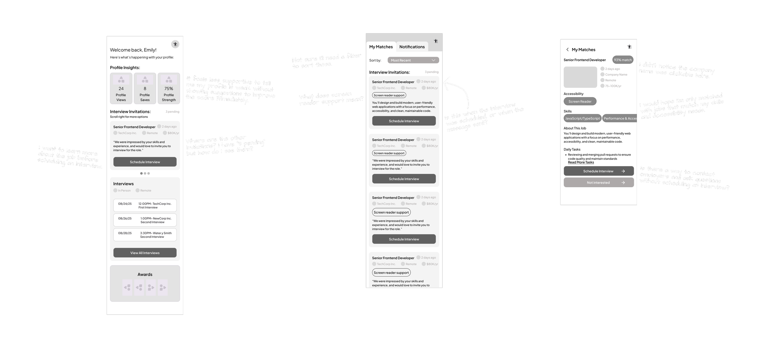
This page presents all active interview options at a glance. It shifts the focus from employer feedback (seen in notifications) to the responsibilities of each role, preparing users for the full job details they’ll see after selecting “See job info.”
In this iteration of the home page (before final refinements), my goal was to highlight actions beyond simply waiting for interview invitations. Still, I kept interview invitations at the top since users consistently said it was the first thing they wanted to check when opening the app, and I added a “3 pending” pill to make it clear and clickable so users could quickly view their full list of matches. These choices laid the groundwork for later refinements, where I focused on balancing priority information with broader opportunities for engagement across the platform.
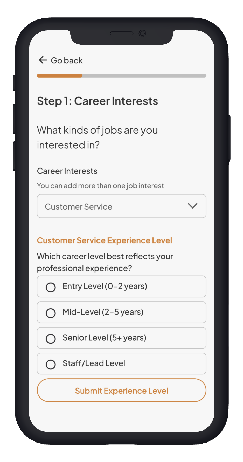
I collaborated with Joyce to ensure the user had no difficulty interacting with this page. The radio buttons are single-select and align with the job level standards Enabled Talent was already using. I also introduced the secondary yellow color in the progress bar to reinforce clarity and hierarchy.
For accessibility, I initially used a Google Material icon, but testing showed it wasn’t intuitive, so we replaced it. We also simplified “93% match” to “8/10 skills match,” since users preferred more concrete metrics. Accommodations were consolidated into one button that reassures users their needs will be met, with details available on click. I also added a “Contact Employer” option and a confirmation step for “I’m not interested,” so users retain more control and don’t lose opportunities by accident.
We tested the high-fidelity prototype with five individuals—two of whom had participated in earlier research. Although this version still used our second color scheme rather than the final one, the sessions provided valuable insights into the app’s functionality, feel, and illustrations.
Key Fixes from High Fidelity Testing
From our high-fidelity testing, we uncovered several usability gaps that needed to be addressed before handoff. The most critical fixes focused on building trust in resume parsing, clarifying profile and skills flows, and improving job-matching functionality.
Top Priorities
Resume parsing clarity – Show what’s extracted, let users review/edit, and clearly label pre-populated fields.
Profile wording & structure – Replace confusing labels, clarify privacy toggles, and ensure accommodations appear consistently.
Skills & accommodations flow – Improve categorization, reduce overwhelm, and allow quick add/edit from the profile.
Job matching filters – Add clarity around job level, industry, and title flexibility.
Secondary Improvements
Onboarding flow – Shorter steps, clearer button labels, progress indicators, and better password/error handling.
Job interactions – Provide quick “Interested / Not Interested” actions, reduce stress of permanent choices, and clarify saves/views.
Interview scheduling – Offer structured scheduling (calendar-style or time blocks) instead of relying solely on email.
UI & Accessibility Enhancements
Larger body text, improved spacing, consistent colors and padding.
Clearer icons for accessibility and awards.
Career Coach chatbot redesigned to encourage next steps, clarify role, and distinguish links.
Iterations
Our high-fidelity testing provided rich insights, which we distilled into eight key iterations that guided the final phase of the project.
Onboarding Iterations:
Multiple Career Interests
We clarified in how input will be used, labels, sub helper texts
Added instruction on how input will allow multiple career inputs
Simplified the follow up questions regarding experience level and adds more specification of jobs that will match their level of experience.
By allowing multiple inputs, users will be able to match to different jobs and allows user to add specific skills.
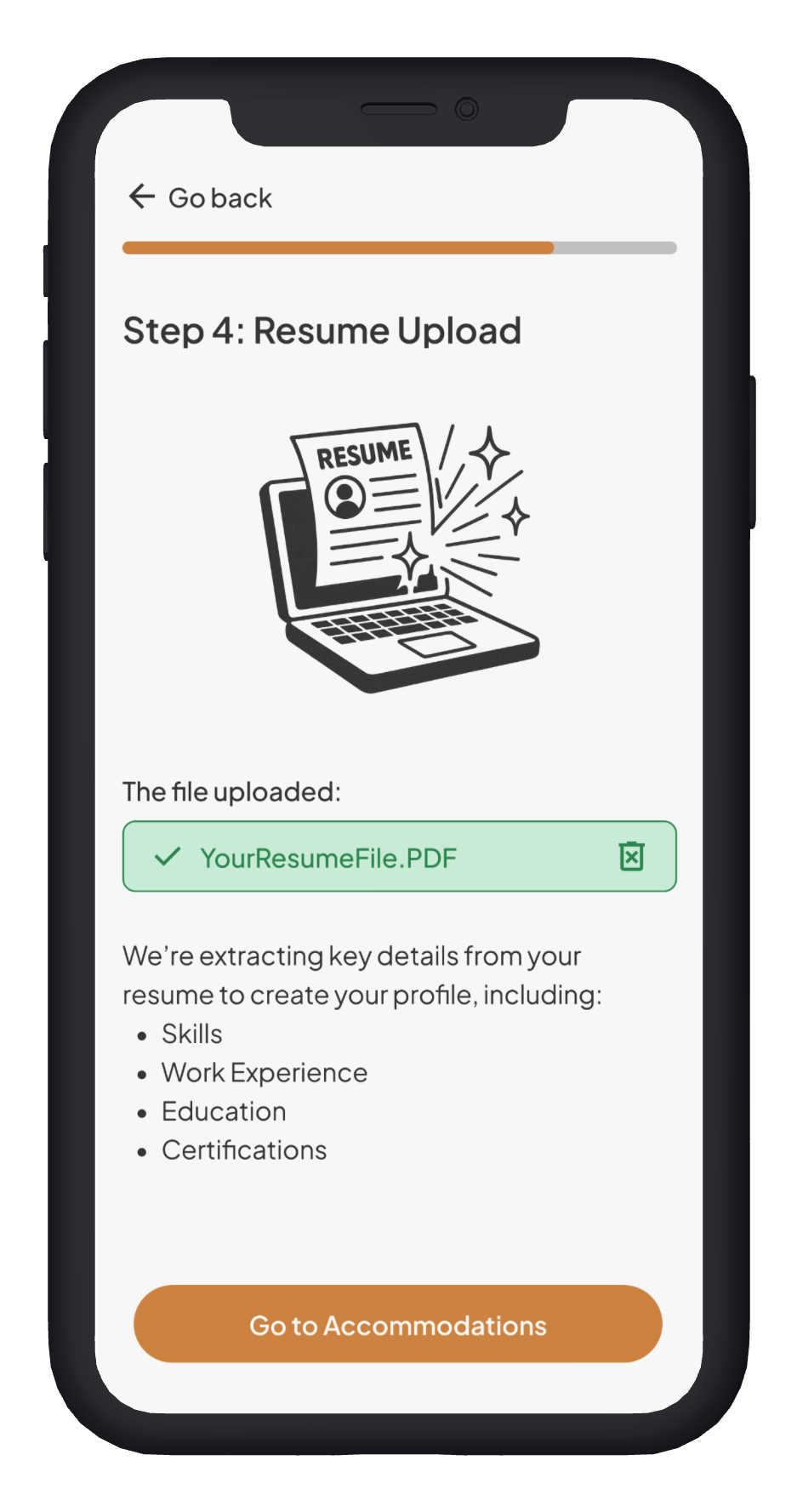
Trust & Readability
File complete indicated by the checkmark icon, label and a color fill
Detailed description listing all the items that are being used from resume to make up their profile
Rewording was done to clarify why importing a resume will be necessary for onboarding
We gave control to users by giving options to skip and enter manually later.
Reasonable Accommodations
Legally required to provide reasonable accommodations for pre-interview and interview job processes.
State the need to create an accessible and inclusive onboarding process for all users.
Created screen reader friendly expandable lists to select from.
Provided clear examples of accommodations; users needed more explanation of what can be provided for them.
Profile Iterations:
Privacy and Activity
Helped users to understand the reason and use for the toggle for making profile active or not
Needed more clarity on what would be private/kept hidden
Reworded the “Profile is not active and hidden” label to ensure no confusion about the profile status
Created an interactive information icon to get users to find more details to further help users understand what will be kept hidden from employers
Profile Customization
Users need control on what they have displayed on their profile and when they make the profile active
There is more organization of sections, resume items on first “About” section
Skills will be easily found and available for users to go to add to/ edit the skills list
Having a separate page for skills will allow users to see full list of skills, place to edit/delete, and find recommendations specific to their career interests
Home and Confirmation Iterations:
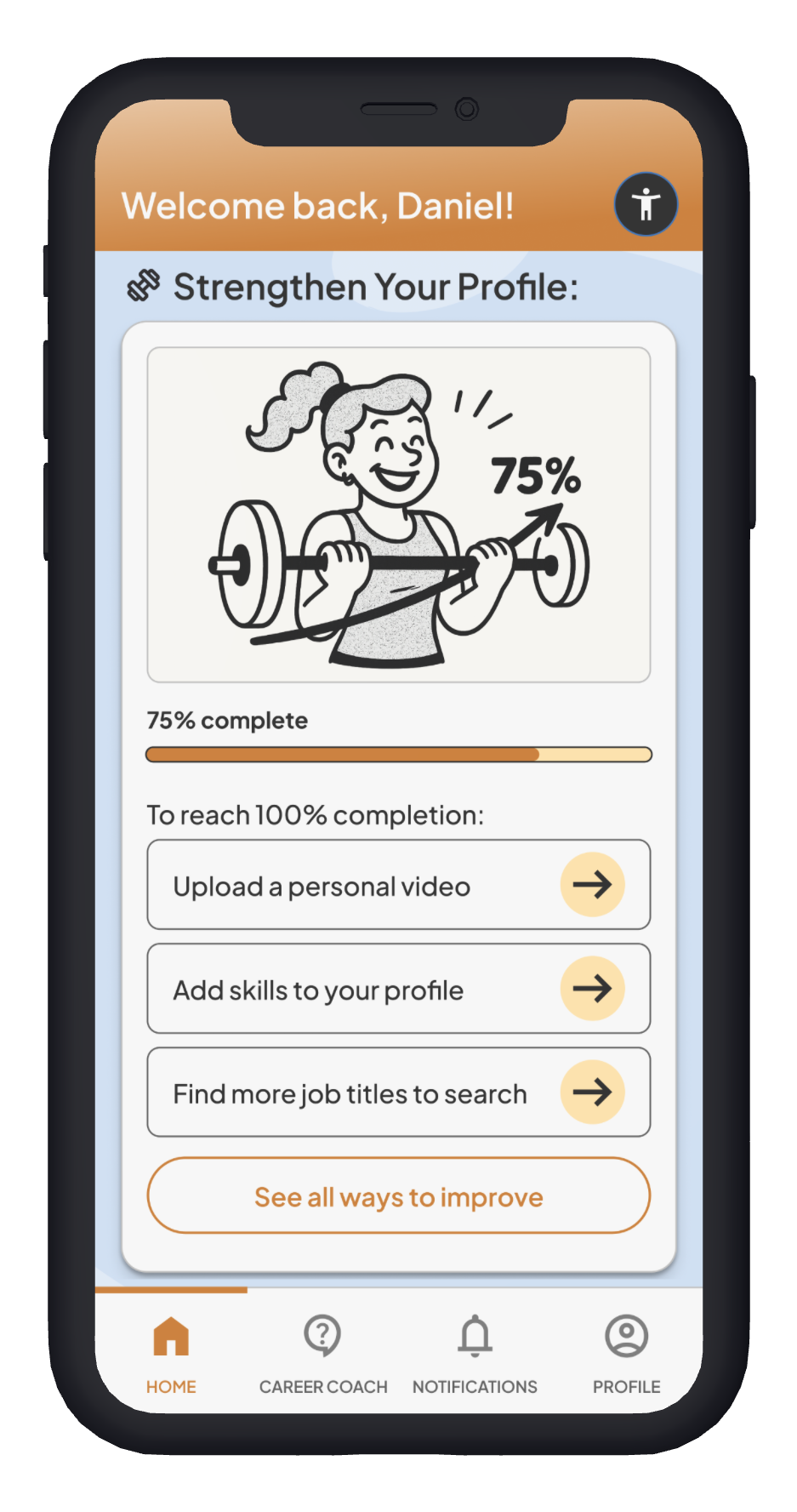
Invitations and Profile Strengthening
Accessibility icon was changed from “settings” to Material Symbols Accessibility icon for user recognition purposes
Altered the opening so users feel welcomed into the app instead of berated for what their profile lacks.
Condensed interview invitations section so users are less visually overwhelmed
Increased consistency on accessibility features in job listings so users know jobs meet all their criteria.
Added a progress bar and “see all” button so users will be able to see (or hear via screenreader) what completion percentage their profile is at, and all the ways to improve it.
Career Coach, Profile Insights & Awards
Varied chatbot prompts and shortened explanatory text to increase usability and reduce cognitive strain on users
Added “see more” buttons on profile insights and awards so users can learn more about what these stats mean and how to improve/achieve them.
Interest Confirmation Page
Accessibility button ensures that all users will be able to interact with the information how they need to.
Adding specification on employer information such as email address to keep users safe from fraud
Clarified that the information below what to expect is requests the user can make of the Career Coach
Provided variation in chat prompts so users understand the many different ways the tool can benefit them
This video walks through the matches flow when a user accepts an interview invitation.
Final Version:
Outcome and Next Steps
Outcome
Users moved through the flows efficiently—the longest taking no more than six minutes, even with detailed inputs. They reported high trust in the app’s ability to match them with relevant jobs, described the experience as comprehensive without being mentally demanding, and felt confident completing tasks with little to no guidance.
At project close, the company shared that stakeholders were seeking greater employer visibility. As a result, the platform was likely to shift away from a purely match-based model toward a more traditional search-and-apply approach, closer to LinkedIn’s structure.
Key Personal Takeaways
This was my first post-college experience collaborating with a team of designers, and it proved invaluable. Working together pushed me to communicate clearly, share ideas openly, and contribute to a product that was stronger than anything one of us could have created alone. I deepened my understanding of accessibility—moving beyond color contrast into WCAG standards—and gained hands-on experience with the CVS handoff notation system. Through this, I learned how to bridge the gap between designers and developers, refining my ability to communicate design decisions in ways that support a smooth build process.
Next Steps
Blend matching with browse & apply
Instead of relying solely on automated matches, Enabled Talent can combine their unique matching system with a more traditional job board. Matches would act as a discovery filter—ranking roles by fit—while still giving users the freedom to browse and apply directly.
Enable in-app interview scheduling
Users emphasized the importance of scheduling within the app to reduce anxiety around ghosting and maintain control over their job search. Calendar integrations (Google/Apple) could help users avoid conflicts and stay organized.Test accessibility beyond WCAG
While WCAG compliance is a baseline, real-world testing with low-vision and screen-reader users would ensure the app meets true accessibility needs. Moderated sessions could validate typography, contrast, focus order, and information density.
These next steps would allow us to evolve the product in a way that balances stakeholder goals with user needs, while staying true to Enabled Talent’s mission of accessibility and inclusion.
Want to see more from Kyla?
I draw too! :)
(See image below)